Tooltip
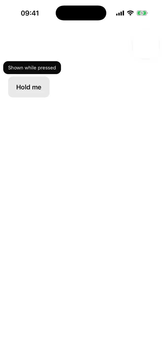
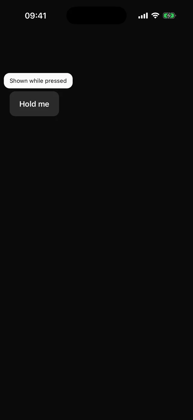
Label shown while the trigger is held. Mirrors into the accessibility hint.
npx @eoria/cli add tooltipUsage
import { Tooltip, TooltipContent, TooltipTrigger } from '@/components/ui/tooltip'
<Tooltip>  <TooltipTrigger asChild>    <Button size="icon" icon={<Copy />} accessibilityLabel="Copy" />  </TooltipTrigger>  <TooltipContent>Copy to clipboard</TooltipContent></Tooltip>
Notes
Phones have no hover. The tooltip opens on long press and closes on release, and the child’s own onPress still fires on a plain tap. Screen readers never long press, so string content is also set as the trigger’s accessibilityHint. Content is non-interactive and hidden from assistive technology, since the hint already carries it.