Progress
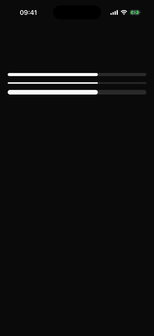
Determinate progress bar with an accessibility value.

npx @eoria/cli add progressUsage
import { Progress } from '@/components/ui/progress'
<Progress value={72} accessibilityLabel="Profile completeness" /><Progress size="sm" value={uploaded} max={total} />
Props
| Prop | Values | Default |
|---|---|---|
value |
number, clamped to 0..max |
|
max |
number | 100 |
size |
sm 4pt, md 8pt, lg 12pt |
md |
The indicator width animates over 150 ms and jumps under reduce motion. The root is a focusable progressbar with min, max and now.