Stepper
Number input as minus, value and plus, with press-and-hold repeat and screen-reader adjust actions.
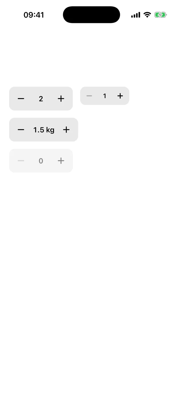
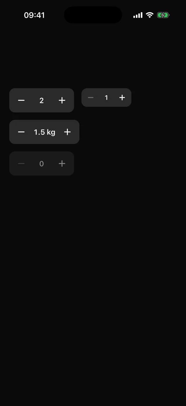
npx @eoria/cli add stepperUsage
import { useState } from 'react'import { Stepper } from '@/components/ui/stepper'
export function Quantity() {  const [quantity, setQuantity] = useState(1)  return (    <Stepper      value={quantity}      onValueChange={setQuantity}      min={1}      max={10}      accessibilityLabel="Quantity"    />  )}
<Stepper size="sm" defaultValue={0.5} min={0} max={5} step={0.5} formatValue={(n) => `${n} kg`} />
Props
| Prop | Values | Default |
|---|---|---|
value |
number; controlled | |
defaultValue |
number | min |
min, max |
number | 0, 100 |
step |
amount one press moves | 1 |
onValueChange |
(value: number) => void |
|
formatValue |
(value: number) => string, shown and announced |
String |
size |
sm, md, the heights of theme.control |
md |
disabled |
boolean | false |
styles |
override root, rootDisabled, button, buttonPressed, buttonDisabled, glyph, value |
Notes
A press moves the value by one step. Holding a button for 400 ms starts a repeat at 160 ms that shortens by 15% per tick down to 40 ms. It stops on release and at a bound. A button at its bound dims and stops taking presses.
The value is set in tabular figures with a minimum width, so the buttons hold still while the digits change. Steps such as 0.1 are rounded to the decimals of step and min, so 0.1 plus 0.2 shows 0.3.
For screen readers the whole control is one adjustable element. It reports formatValue(value) as its value and answers the increment and decrement actions by one step. The two buttons are for touch only. Give the Stepper an accessibilityLabel. The defaults of 0 to 100 follow UIStepper.
The minus and plus are drawn with bars from the glyph slot, so the file has no icon dependency. Buttons under 44pt get hitSlop upwards, downwards and outwards.