Toast
Imperative toast() store and a Toaster rendered through the portal. Top or bottom, per toast.
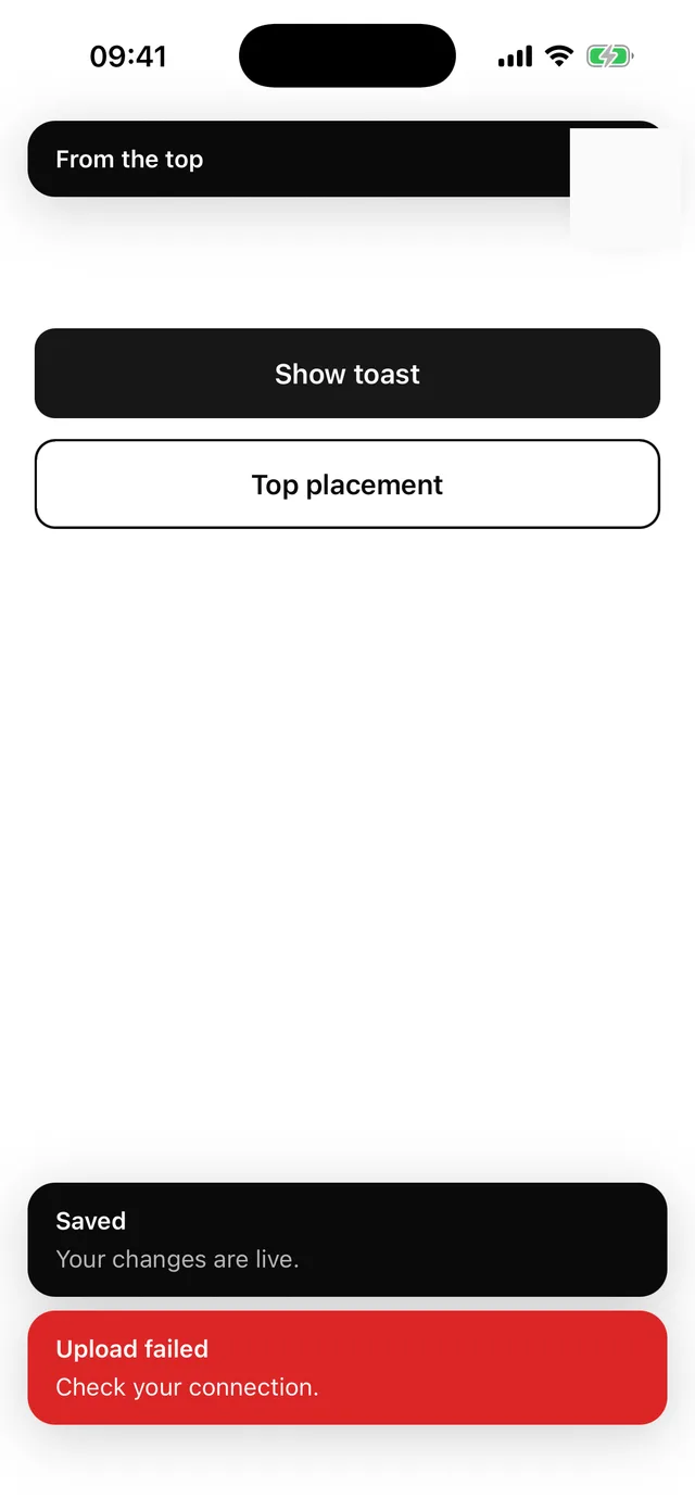
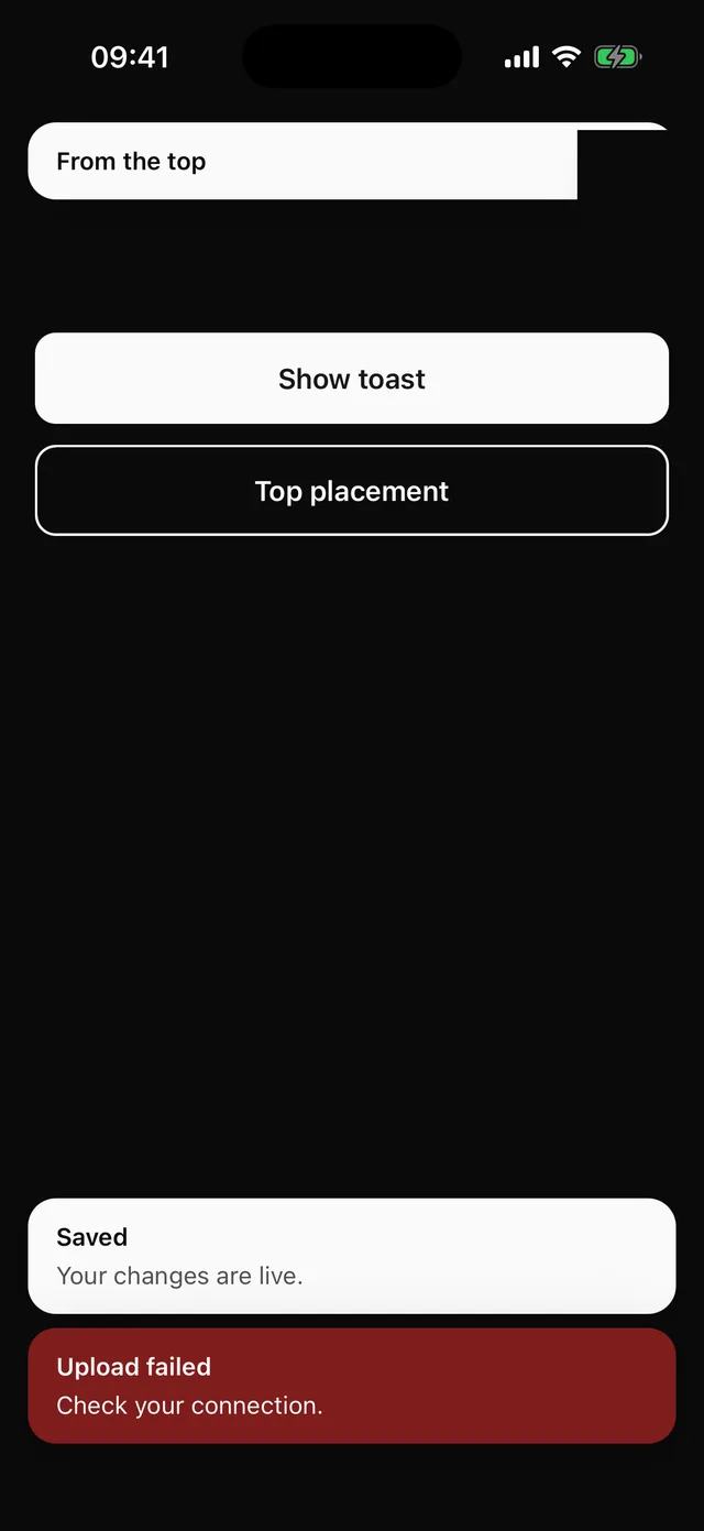
npx @eoria/cli add toastUsage
import { toast } from '@/components/ui/toast'
toast({ title: 'Saved', description: 'Your changes are live.' })toast({ title: 'Upload failed', variant: 'destructive' })toast({ title: 'Archived', duration: Infinity, action: { label: 'Undo', onPress: restore } })toast({ title: 'From the top', placement: 'top' })toast.dismiss()
Mount one Toaster after the PortalHost:
const insets = useSafeAreaInsets()<Toaster offset={{ top: insets.top + 8, bottom: insets.bottom + 16 }} />Options
| Option | Values | Default |
|---|---|---|
title |
string, required | |
description |
string | |
variant |
default, destructive |
default |
placement |
top, bottom |
Toaster’s |
duration |
ms, Infinity to keep |
4000 |
action |
{ label, onPress } |
Toaster takes placement, offset (number or per edge), max (default 3) and styles.
Notes
- The store lives outside React, so
toast()works from anywhere. Timers and the visible cap live in the store too, so a toast beyond the cap is dropped rather than hidden and resurfaced later. - Toasts announce themselves with
announceForAccessibility, since live regions do nothing on iOS. - Newest toast sits nearest the screen edge at both placements. Tap a toast to dismiss it.
- Rendering through the portal means a toast fired after a dialog opened sits above the dialog.