Slider
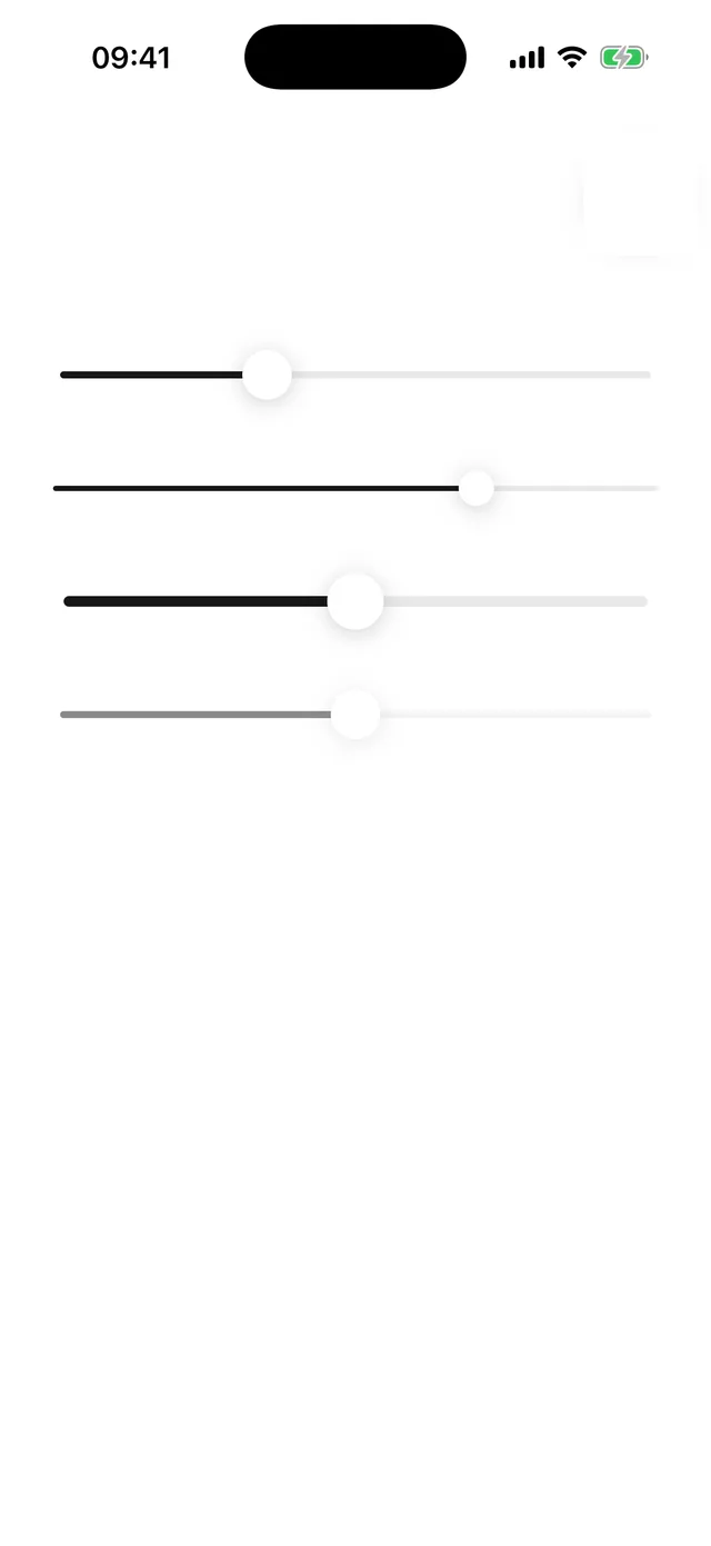
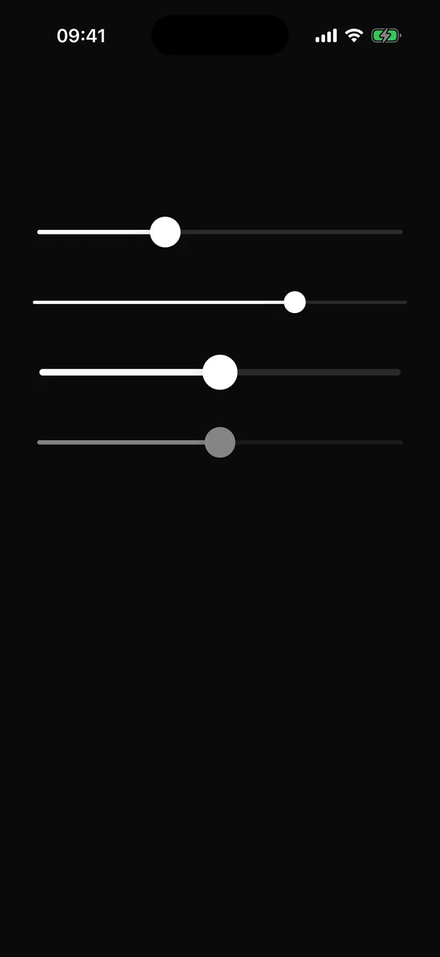
Single-thumb slider with step snapping, drag and tap, and screen-reader increment and decrement.
npx @eoria/cli add sliderNeeds react-native-gesture-handler and a GestureHandlerRootView around the app, which Expo Router projects usually already have. The CLI installs the package as a dependency of the item.
Usage
import { useState } from 'react'import { Slider } from '@/components/ui/slider'
export function Volume() {  const [volume, setVolume] = useState(40)  return (    <Slider      value={volume}      onValueChange={setVolume}      onValueCommit={(v) => save(v)}      accessibilityLabel="Volume"    />  )}
<Slider defaultValue={2.5} min={0} max={5} step={0.5} size="lg" />
Props
| Prop | Values | Default |
|---|---|---|
value |
number; controlled | |
defaultValue |
number | min |
min, max |
number | 0, 100 |
step |
snap increment | 1 |
onValueChange |
fires on every change while dragging | |
onValueCommit |
fires once when the finger lifts | |
size |
sm, md, lg |
md |
disabled |
boolean | false |
styles |
override track, range, thumb, rootDisabled |
Notes
The root is the 44pt touch target and stretches to its container. Grabbing the thumb drags it without a jump; a press anywhere else moves the thumb to the finger and drags from there. The gesture is a gesture-handler Pan recognised natively, which is what keeps it from triggering the stack’s swipe-back on iOS 26, where that swipe works from anywhere on the screen. A clear vertical movement fails the pan so a parent ScrollView still scrolls. Programmatic changes animate over 120 ms; the thumb scales up slightly while held. The root has the adjustable role with min, max and now, and answers the screen reader’s increment and decrement actions by one step. The thumb is white on every theme with a soft shadow; change styles.thumb if your palette needs otherwise.