AlertDialog
Centred dialog that waits for an answer. Overlay taps and Android back only close it when there is a Cancel.
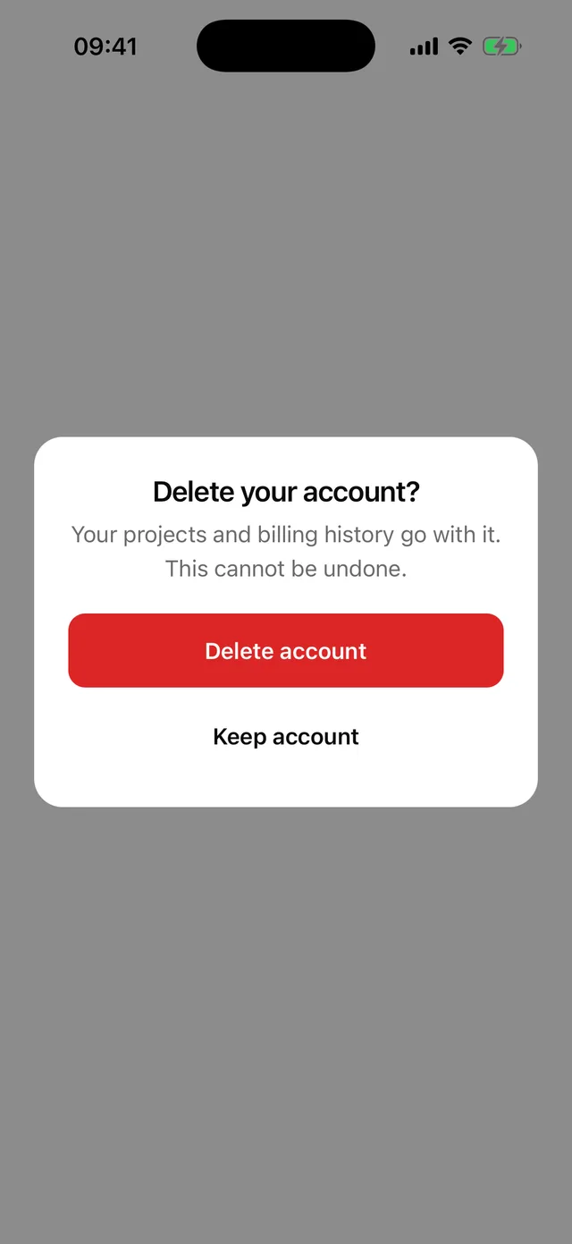
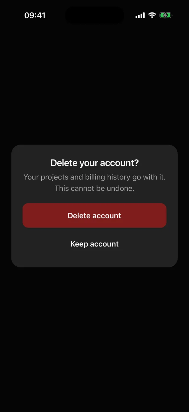
npx @eoria/cli add alert-dialogUsage
import {  AlertDialog,  AlertDialogAction,  AlertDialogCancel,  AlertDialogContent,  AlertDialogDescription,  AlertDialogFooter,  AlertDialogHeader,  AlertDialogTitle,  AlertDialogTrigger,} from '@/components/ui/alert-dialog'
<AlertDialog>  <AlertDialogTrigger asChild>    <Button variant="destructive">Delete account</Button>  </AlertDialogTrigger>  <AlertDialogContent>    <AlertDialogHeader>      <AlertDialogTitle>Delete your account?</AlertDialogTitle>      <AlertDialogDescription>Your projects and billing history go with it.</AlertDialogDescription>    </AlertDialogHeader>    <AlertDialogFooter>      <AlertDialogAction variant="destructive" onPress={remove}>        Delete account      </AlertDialogAction>      <AlertDialogCancel>Keep account</AlertDialogCancel>    </AlertDialogFooter>  </AlertDialogContent></AlertDialog>
Props
| Part | Props |
|---|---|
AlertDialog |
open, defaultOpen, onOpenChange, styles (the Dialog slots) |
AlertDialogTrigger |
asChild injects onPress into a single child |
AlertDialogContent |
closeLabel for the overlay (default Close dialog) and any View prop. There is no dismissable; a mounted Cancel decides it |
AlertDialogAction |
every Button prop, plus closeOnPress (default true). width defaults to full |
AlertDialogCancel |
every Button prop. variant defaults to ghost, width to full |
AlertDialogHeader, AlertDialogTitle, AlertDialogDescription and AlertDialogFooter take the same props as the Dialog parts.
Notes
- Use it when the user has to answer before going on, such as a delete confirm or a discard prompt. For anything the user may wave away, use Dialog.
- With no
AlertDialogCancelinside, a tap on the overlay does nothing and Android back is swallowed. The only way out is an Action. Once a Cancel is mounted, the overlay and Android back close the alert too, which matches a cancelable alert on Android. - Overlay and back close through
onOpenChange(false). They do not call the Cancel’sonPress. Put code that must run on every way out inonOpenChange. AlertDialogActionis a Button, sovariant="destructive"is the whole difference between a confirm and a delete confirm. PasscloseOnPress={false}to keep the alert open while a request runs, then close it throughopen.- The content has the
alertrole. iOS reads nothing out for that role, so the title is announced when the alert opens. - The recipe extends the Dialog recipe with centre placement and centred copy. The 120 ms fade and 0.97 scale, the overlay and the portal are Dialog’s. Title and description align left again with
styles={{ title: { textAlign: 'left' }, description: { textAlign: 'left' }, header: { alignItems: 'flex-start' } }}.