Dialog
Bottom sheet by default with a grabber, or a centred card. Portalled above navigation.
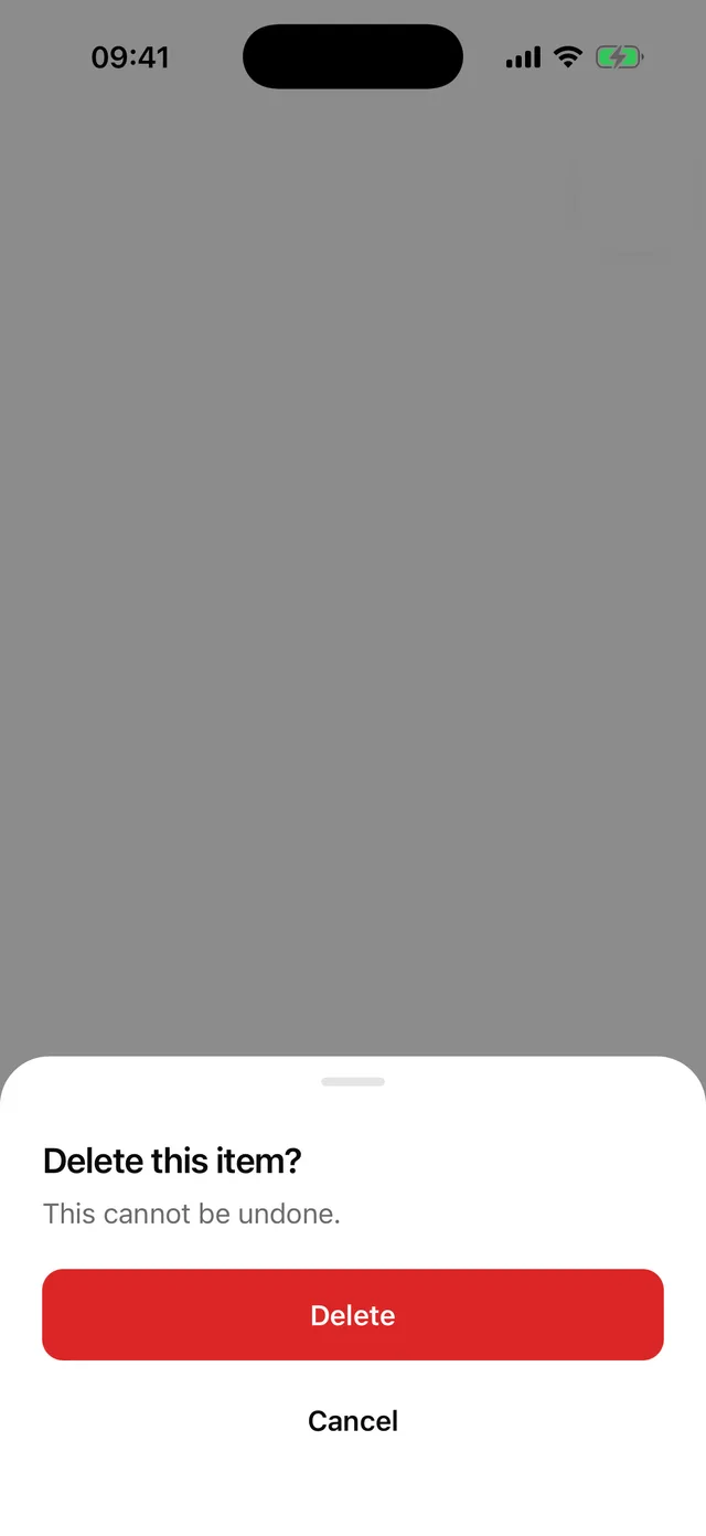
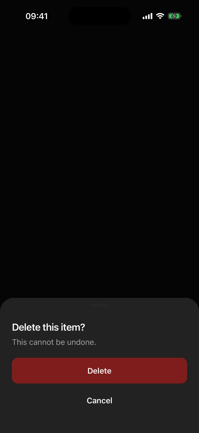
npx @eoria/cli add dialogUsage
import {  Dialog,  DialogClose,  DialogContent,  DialogDescription,  DialogFooter,  DialogHeader,  DialogTitle,  DialogTrigger,} from '@/components/ui/dialog'
<Dialog>  <DialogTrigger asChild>    <Button variant="destructive">Delete account</Button>  </DialogTrigger>  <DialogContent>    <DialogHeader>      <DialogTitle>Delete your account?</DialogTitle>      <DialogDescription>This cannot be undone.</DialogDescription>    </DialogHeader>    <DialogFooter>      <DialogClose asChild>        <Button variant="destructive" width="full" onPress={remove}>          Delete        </Button>      </DialogClose>      <DialogClose asChild>        <Button variant="ghost" width="full">          Keep account        </Button>      </DialogClose>    </DialogFooter>  </DialogContent></Dialog>
Props
Dialog takes open, defaultOpen, onOpenChange and placement (bottom default, center). DialogContent takes dismissable (tap outside closes, default true) and closeLabel, what TalkBack reads for the overlay (default Close dialog). Trigger and Close accept asChild to inject onPress into a single child.
Notes
- The footer stacks actions full width, primary first, which is the pattern on phones. Center placement keeps the same order.
- Bottom placement slides 24pt and fades in 120 ms. Center scales from 0.97. No springs.
- Android back closes it. The overlay is a button named by
closeLabelfor TalkBack; on iOS the portal host is marked modal so VoiceOver stays inside. Pass a translatedcloseLabelin a localised app. - Context does not cross the portal, so
DialogContentre-provides it. If you build your own portal content, do the same. - For a draggable sheet with snap points, use Sheet, which wraps
@gorhom/bottom-sheet. Dialog stays dependency-free.