Alpha Built for the New Architecture
Components that feel like the phone they run on.
eoria is a React Native component library you copy into your project. Built on Unistyles 3 and Reanimated 4, styled after the apps people already use, and yours to change once the files land in your repo.
npx @eoria/cli add buttonPick a theme. Colours, corners, weights and typeface change together, here and in the app.
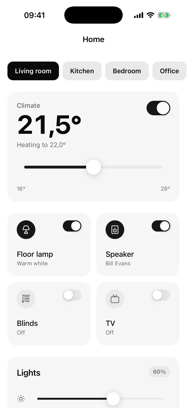
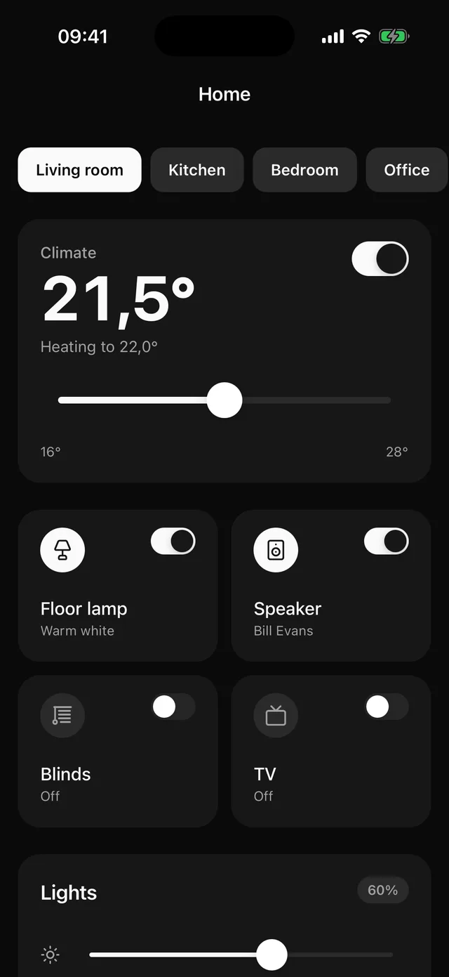
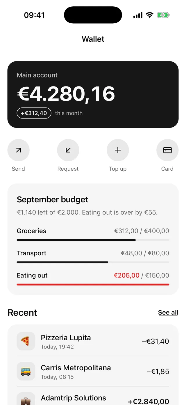
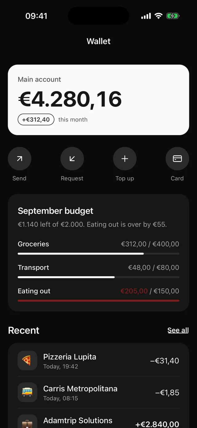
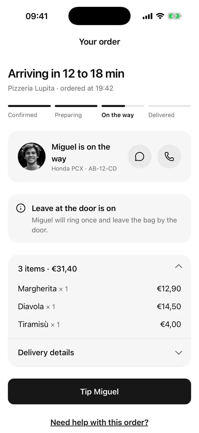
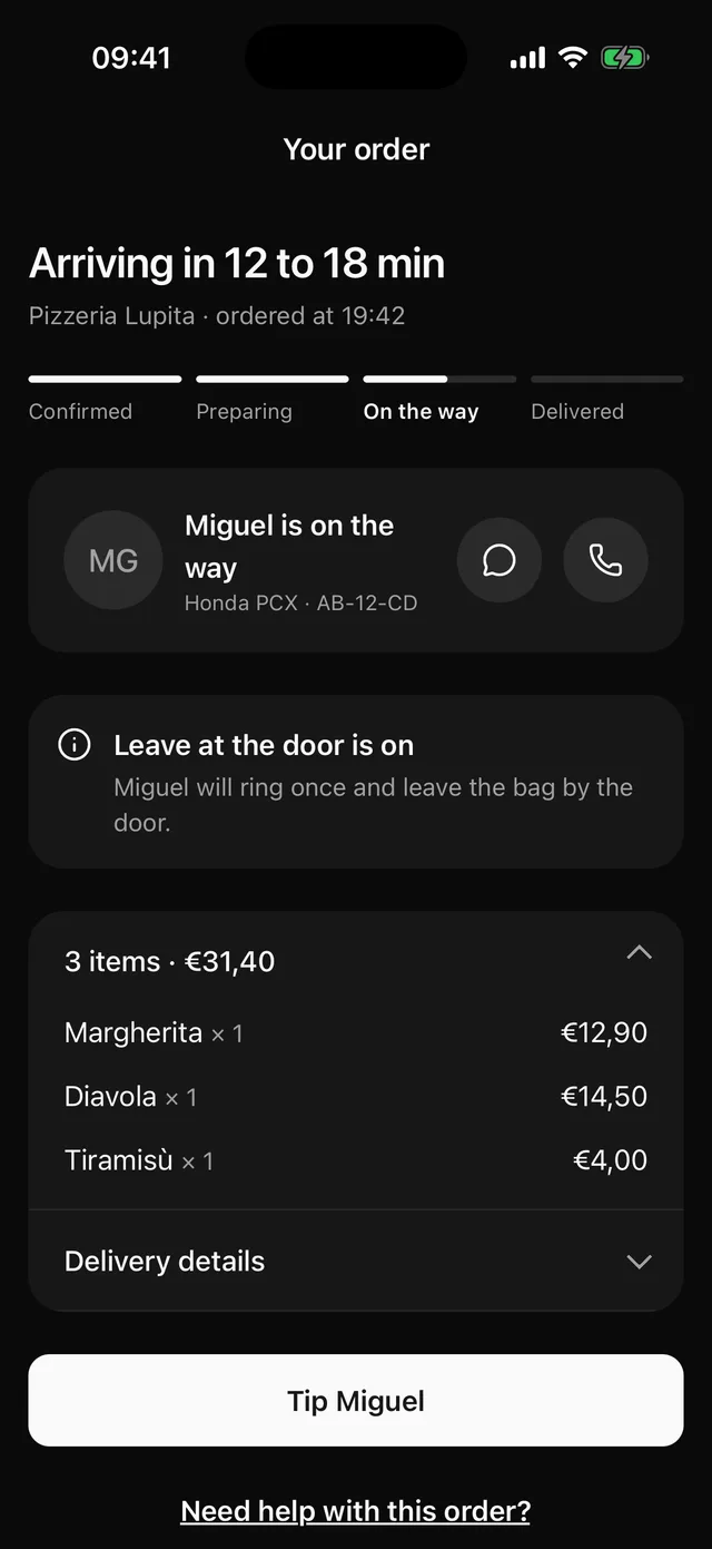
Real screens, not mockups.
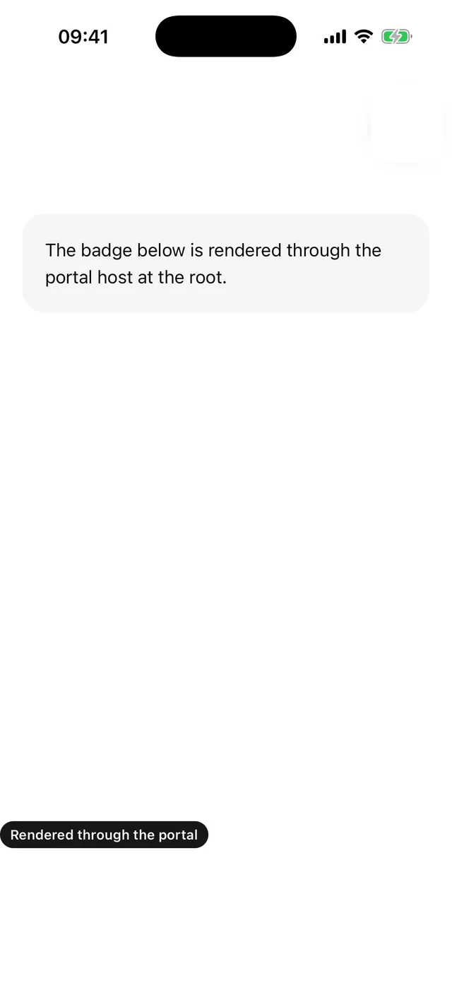
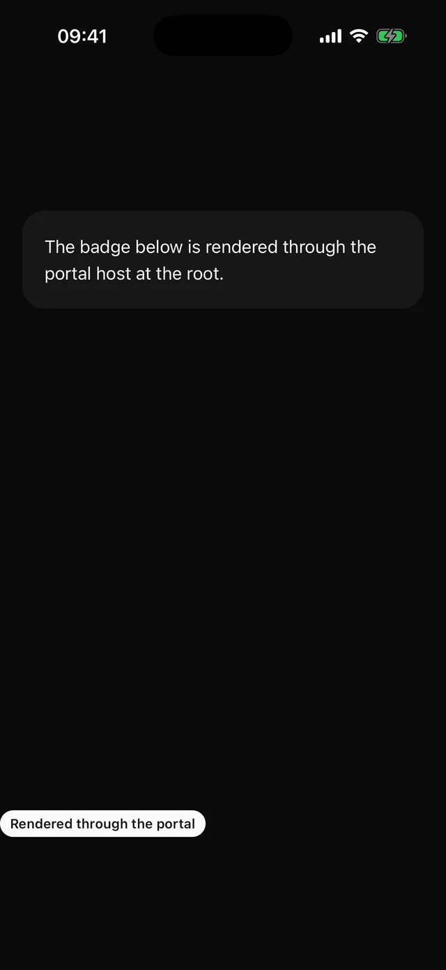
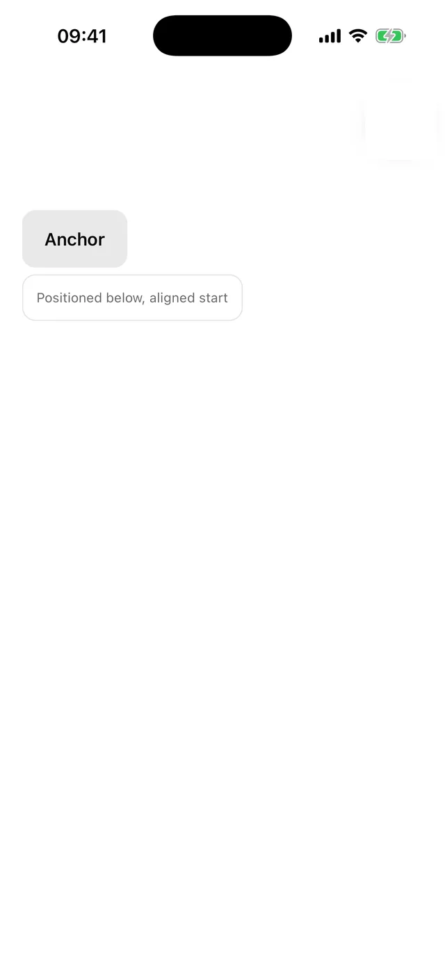
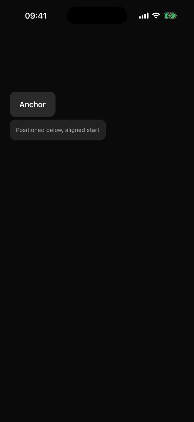
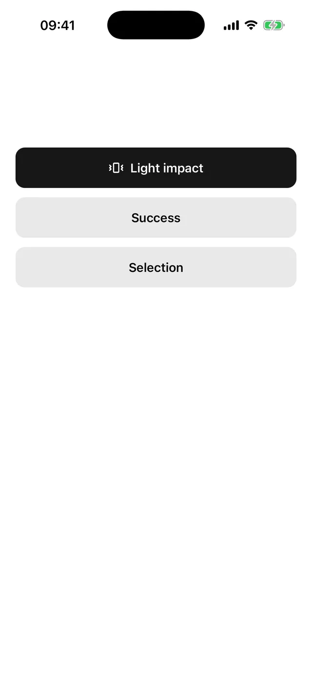
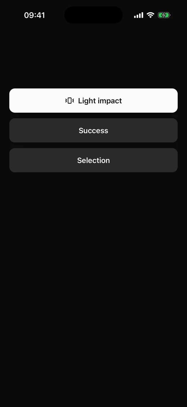
Every component page shows the component captured from the example app on an iPhone, in light and dark. Open one.
Copy it, then own it.
The registry hosts source, not a package. Four commands move a component into your repo and tell you when upstream changes.
npx @eoria/cli initRegisters the themes with Unistyles, adds the Babel plugins and the path alias, and installs the peers.
npx @eoria/cli add buttonCopies button.tsx and everything it depends on into components/ui, in dependency order.
components/ui/button.tsxNow a file in your repo. Change a token, add a variant, or rewrite the recipe. Nothing to override.
npx @eoria/cli diff buttonShows what moved upstream since you copied it, and which derived files that may affect.
What native feels like.
- Native-first look
- Tall buttons, filled fields, chips, bottom sheets and pill toasts. The patterns people already know from their phone.
- Snappy by design
- Timings of 90 to 150 ms and no springs. Reduce motion is honoured because Reanimated defaults to it.
- Themes that swap in place
- Six presets, each a full look: palette, corner radii, type weights and typeface, in light and dark. Styles resolve in native code, so a preset change does not remount your screen.
- One construct, typed all the way down
- Every component is a slot recipe: slots, variants, defaults. Variants and theme keys are inferred, and a recipe you extend tracks its base.
52 components, each one a file.
Grouped the way the sidebar groups them. Every tile is the component's own capture.
Layout
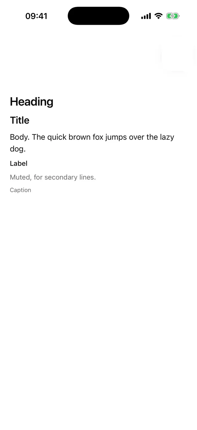
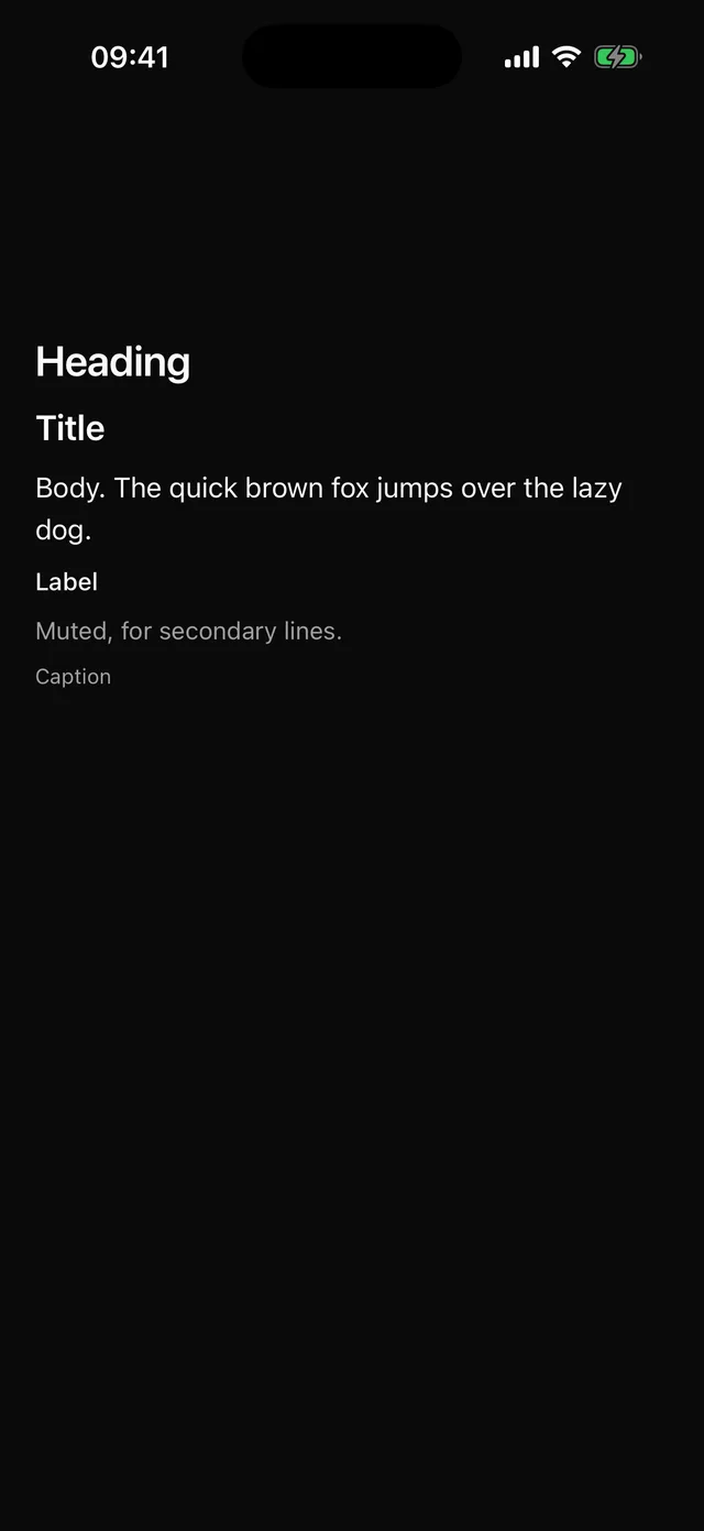 TextThemed text with typography variants and capped dynamic type.
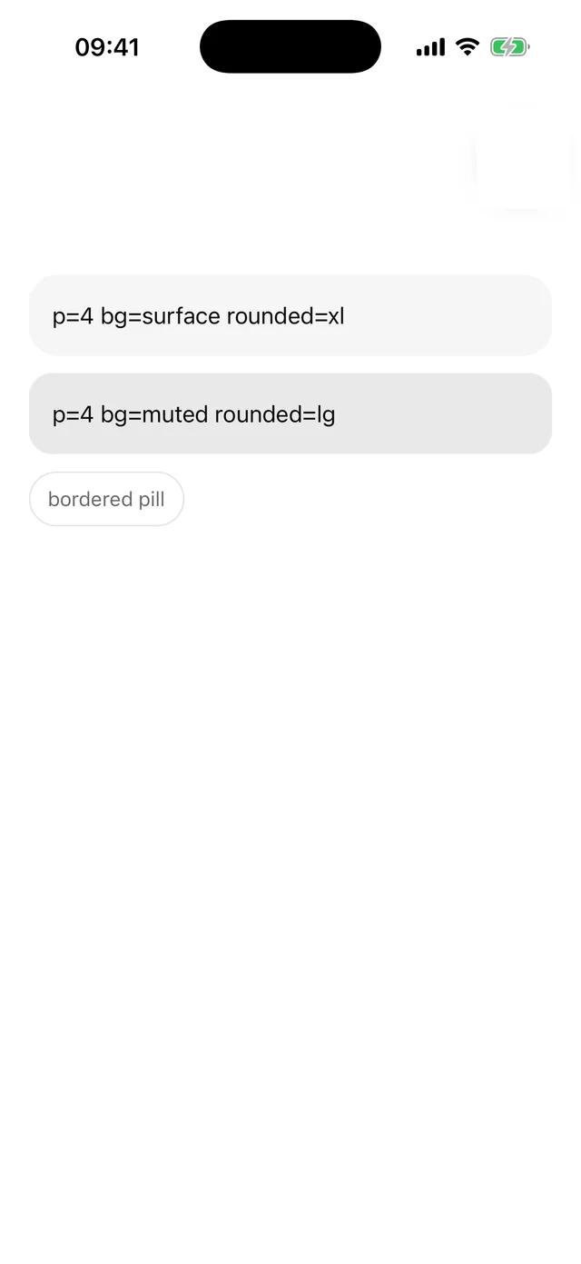
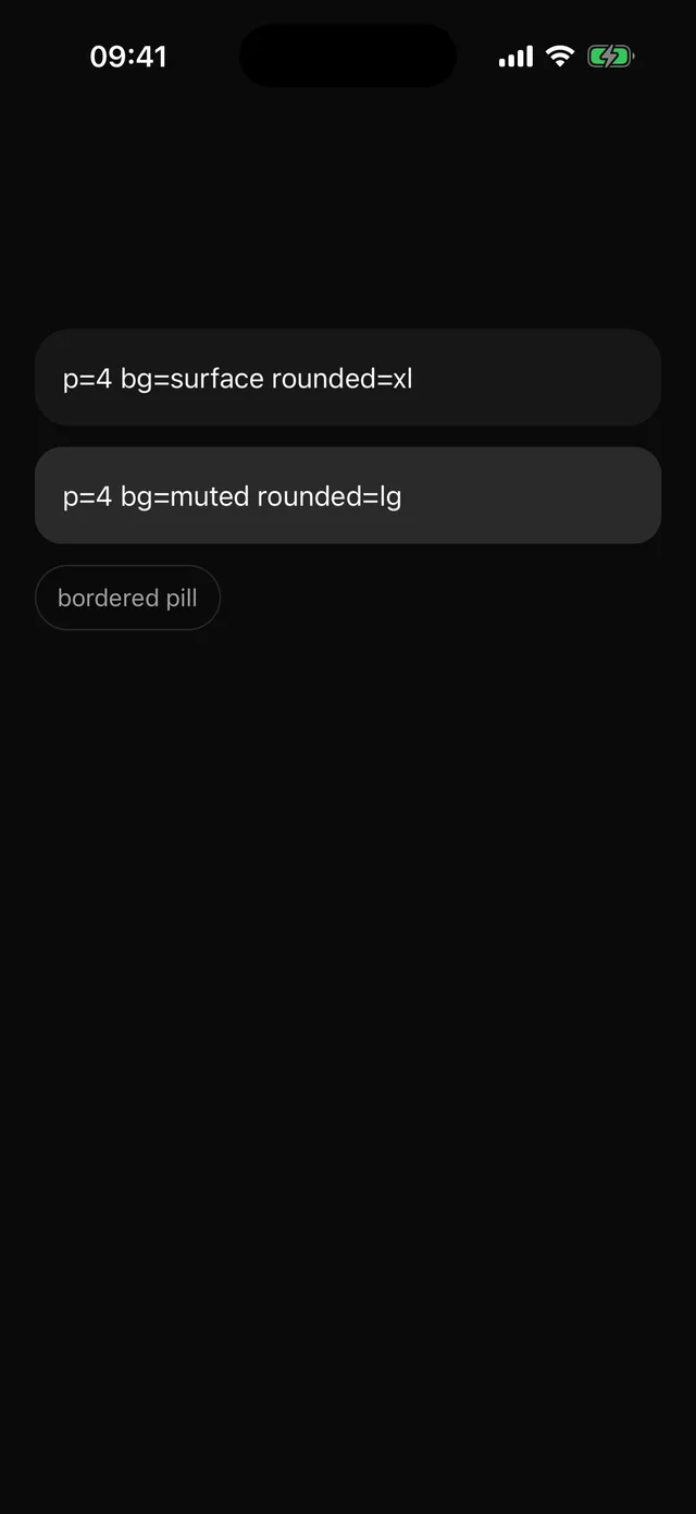 BoxView with theme token props for spacing, colour and radius.
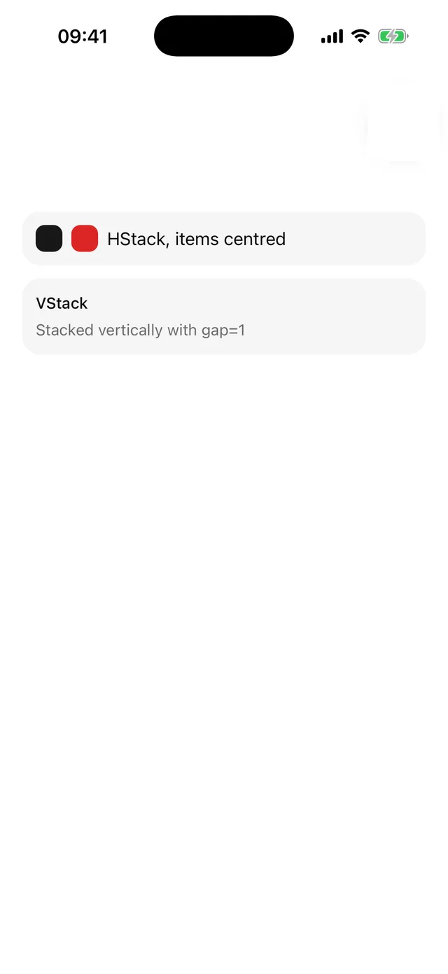
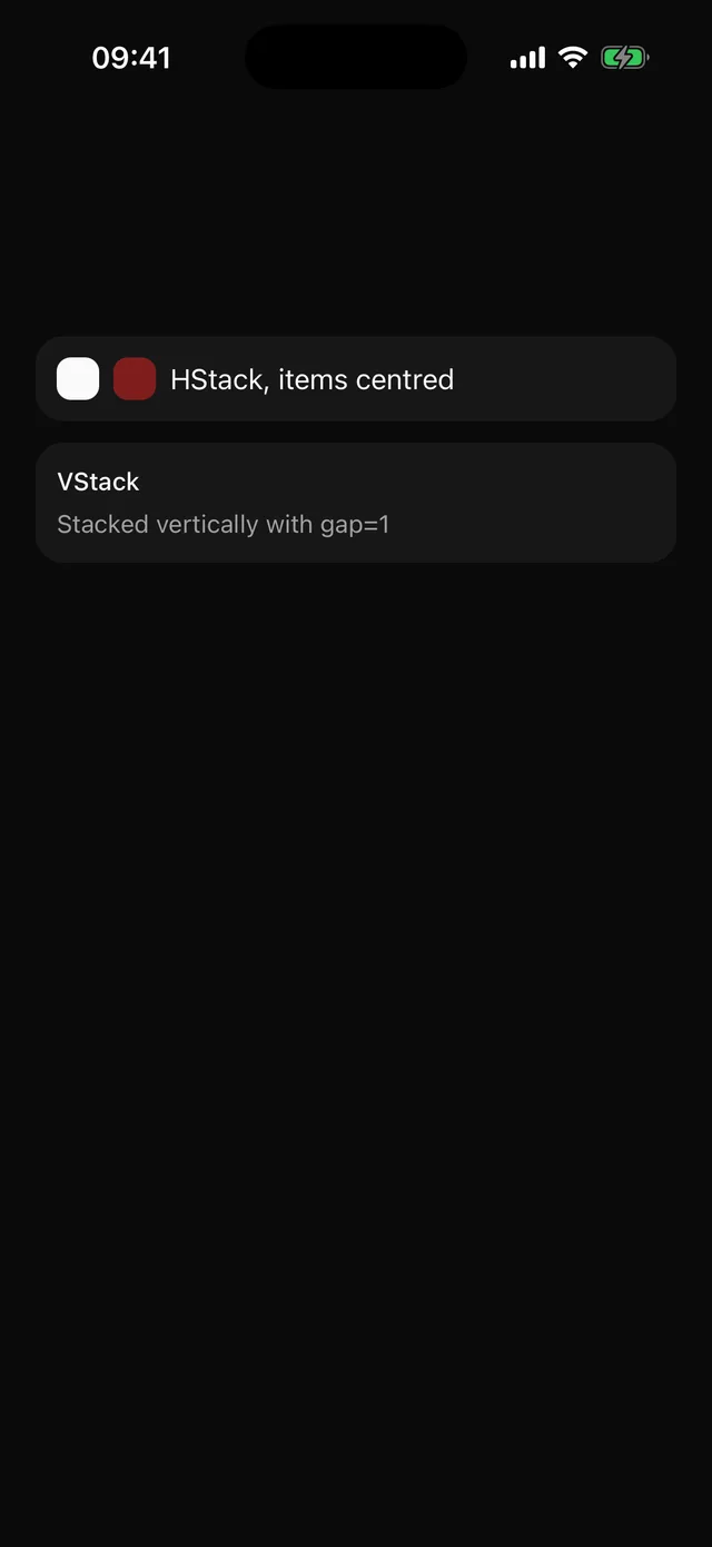 StackBox with direction and alignment shorthands. Exports Stack, HStack and VStack.
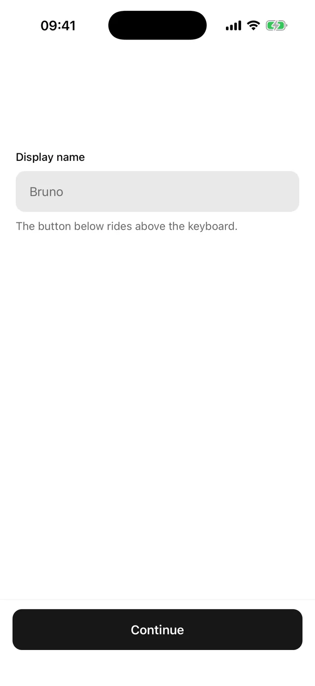
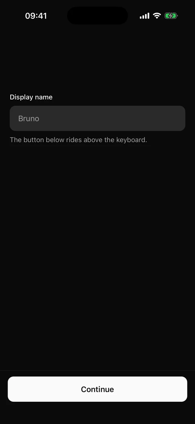 KeyboardKeep the focused field visible, pin an action above the keyboard, and move between fields.
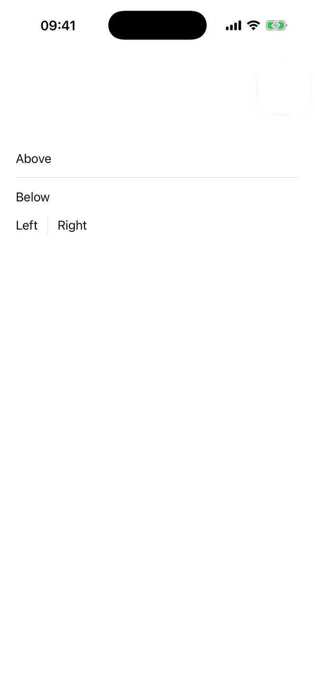
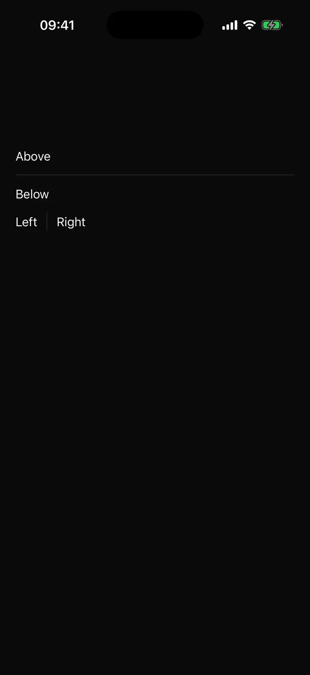 SeparatorHorizontal or vertical rule, decorative by default.
Forms
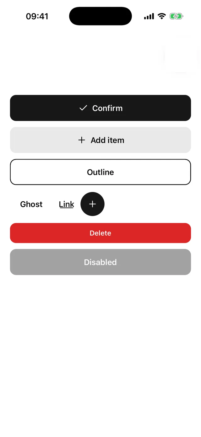
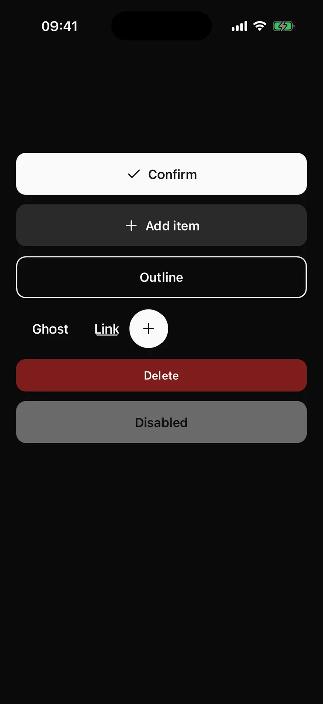 ButtonPressable with variant, size and width, an icon slot, and a press that scales instead of fading.
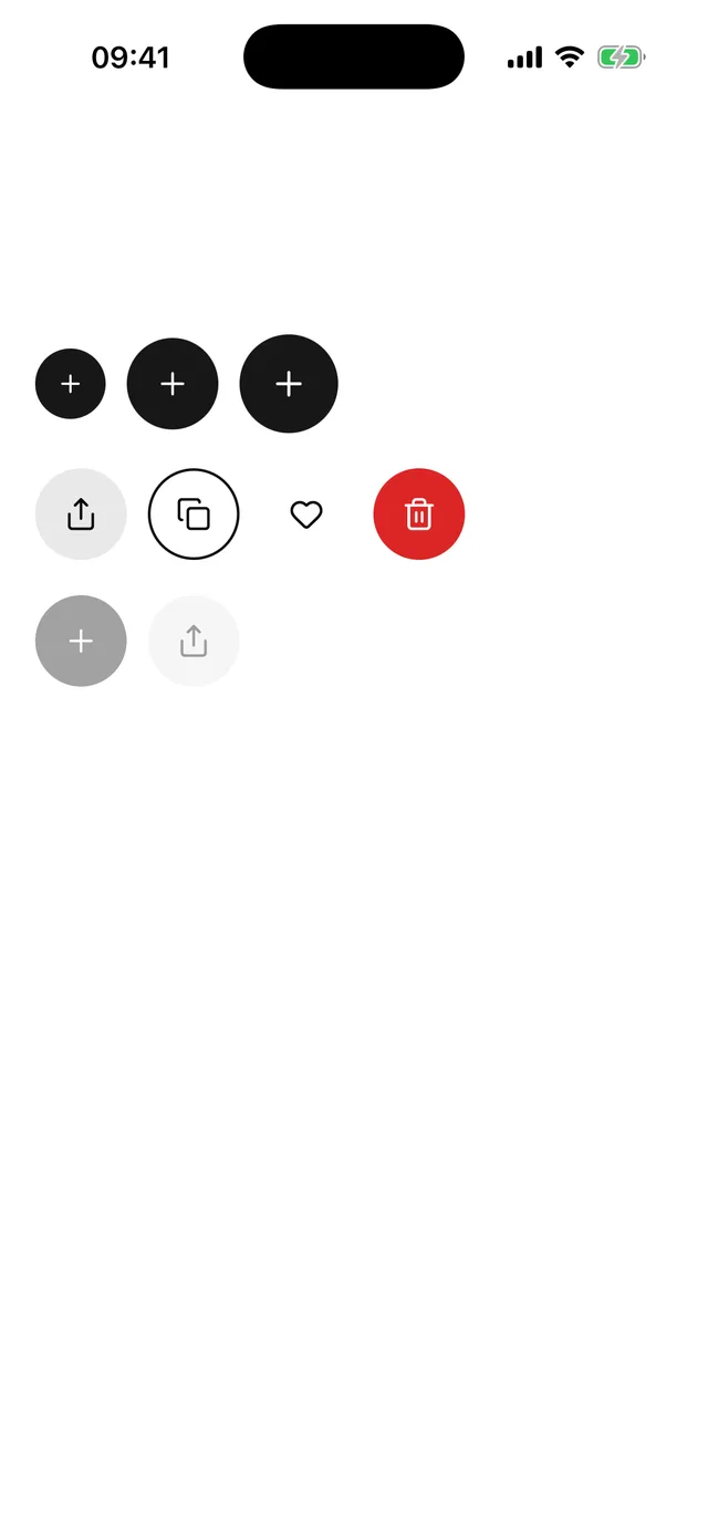
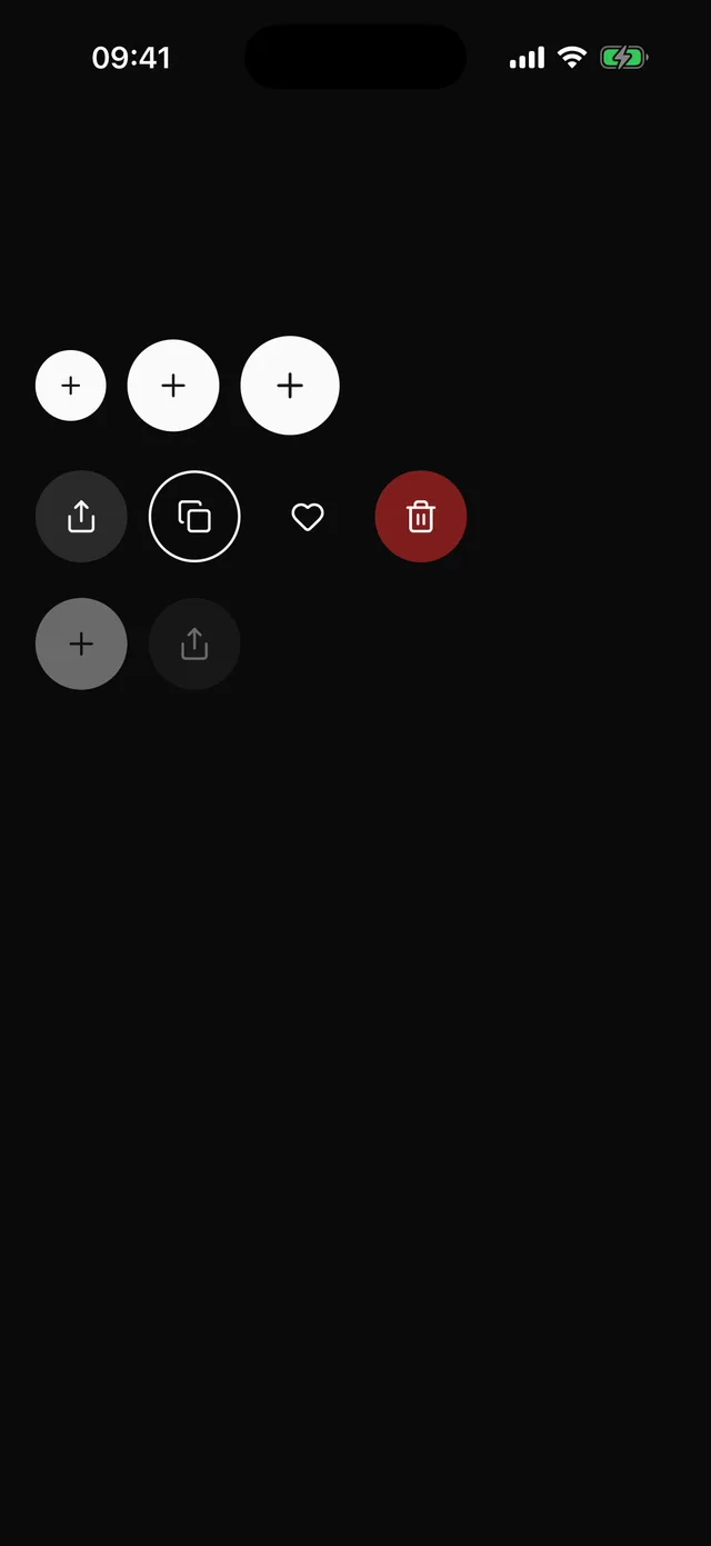 IconButtonRound icon-only button. Same variants and press as Button, and the type requires a label.
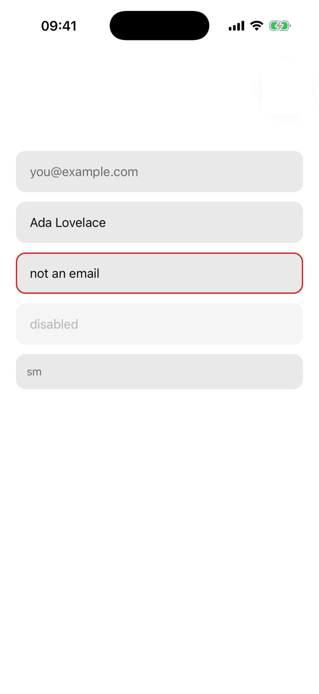
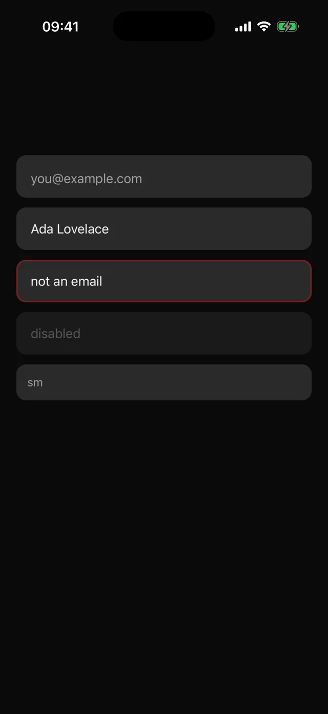 InputFilled single-line text field with focus, invalid and disabled states.
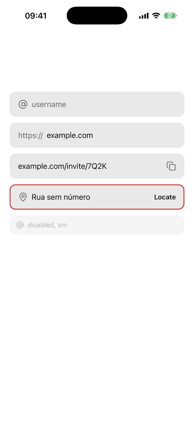
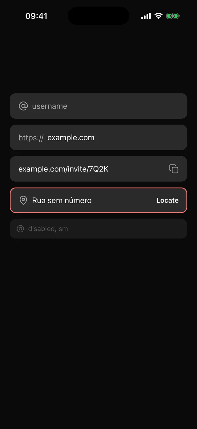 InputGroupThe Input frame around a text field plus icons, text and buttons inside it.
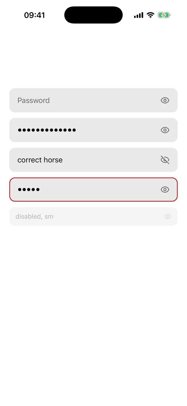
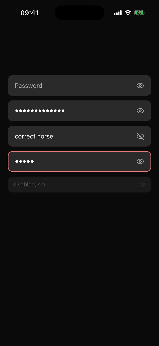 PasswordInputSecure text field with a reveal toggle and password autofill hints.
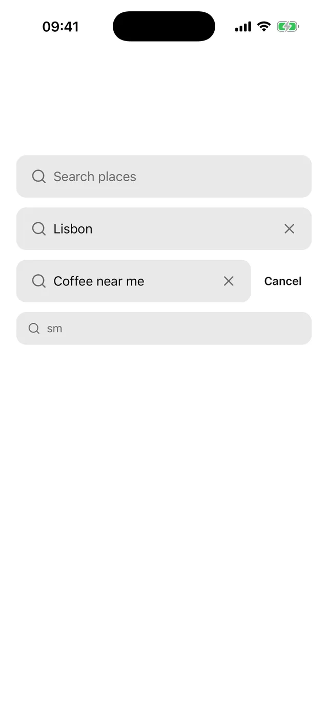
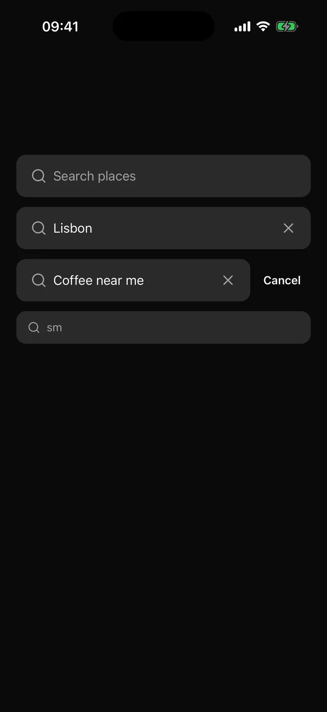 SearchBarSearch field with a magnifier, a clear button and an optional Cancel that appears on focus.
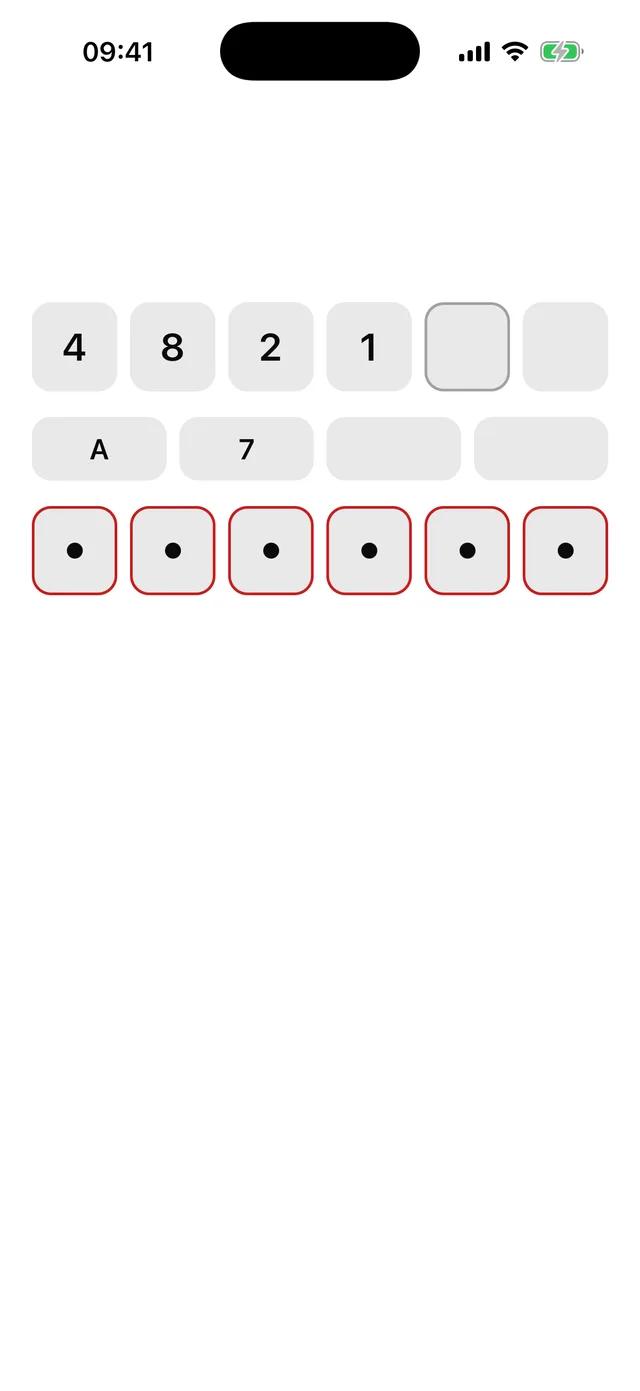
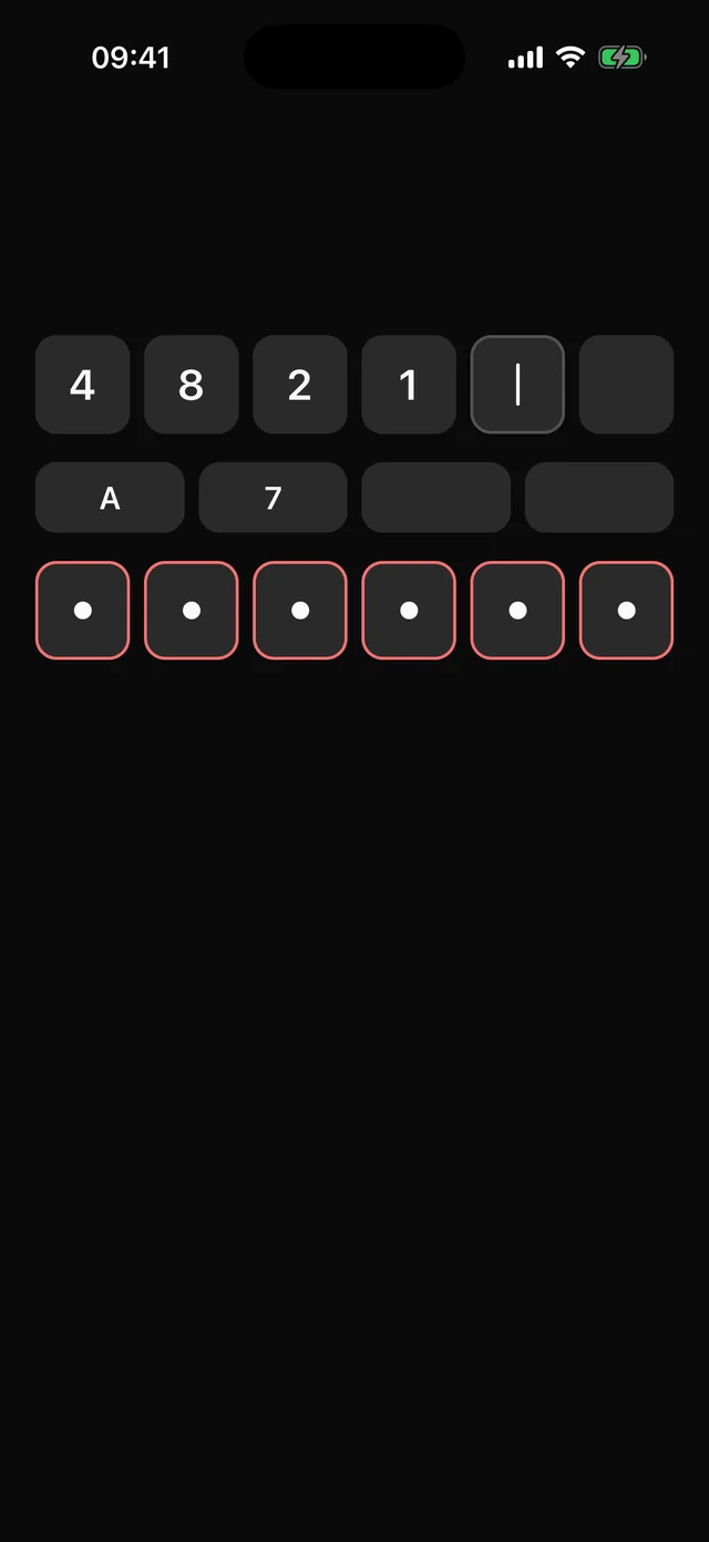 InputOTPOne-time code entry with a fixed number of cells, numeric or alphanumeric, with paste and SMS autofill.
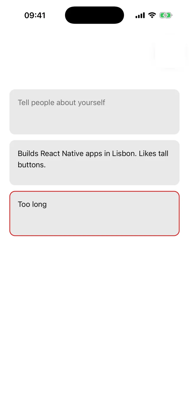
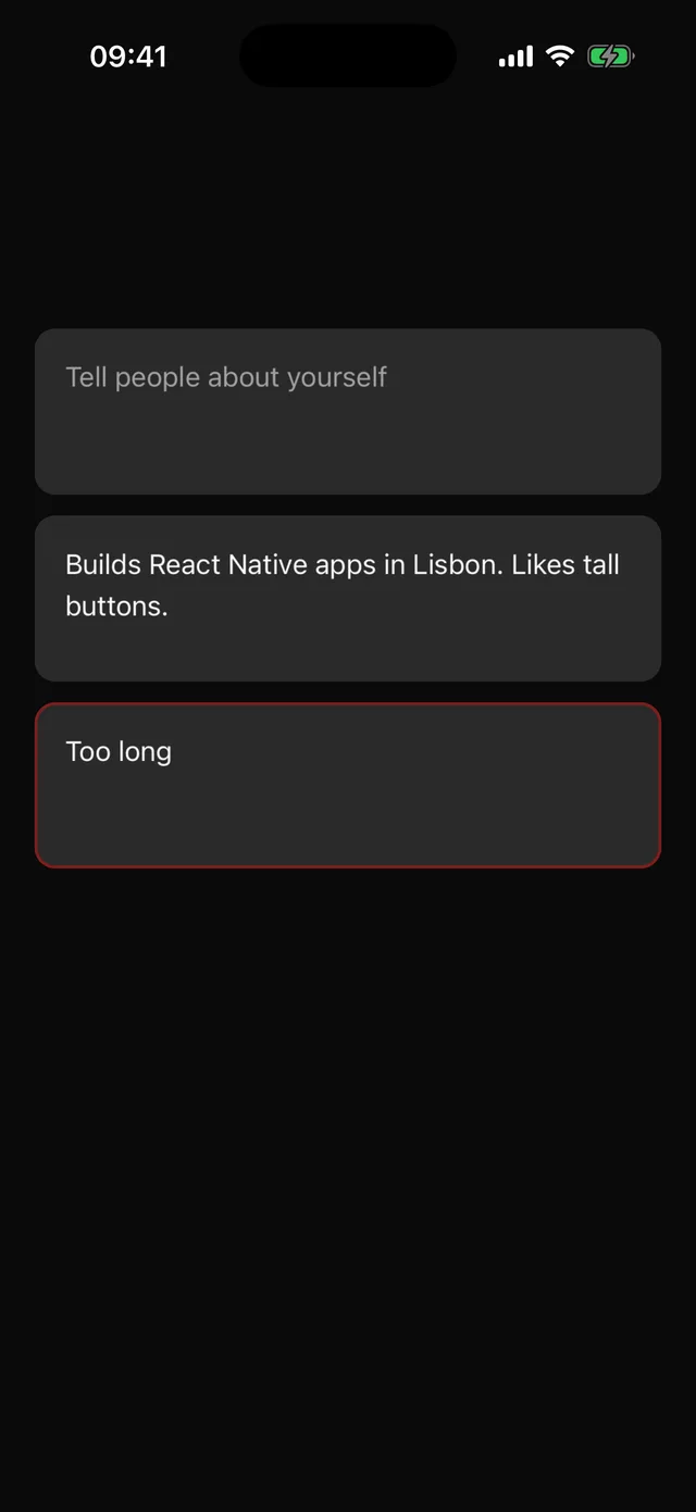 TextareaMultiline input. Extends the Input recipe, so edits to Input flow through.
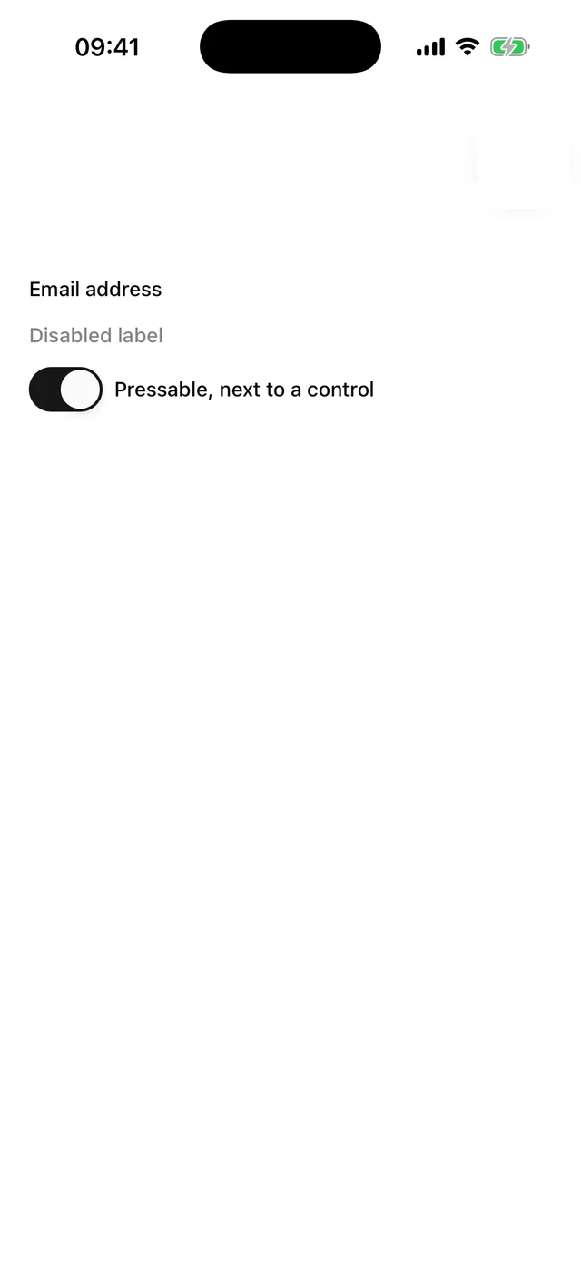
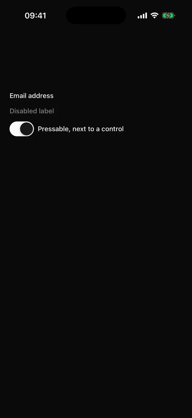 LabelForm label built on Text.
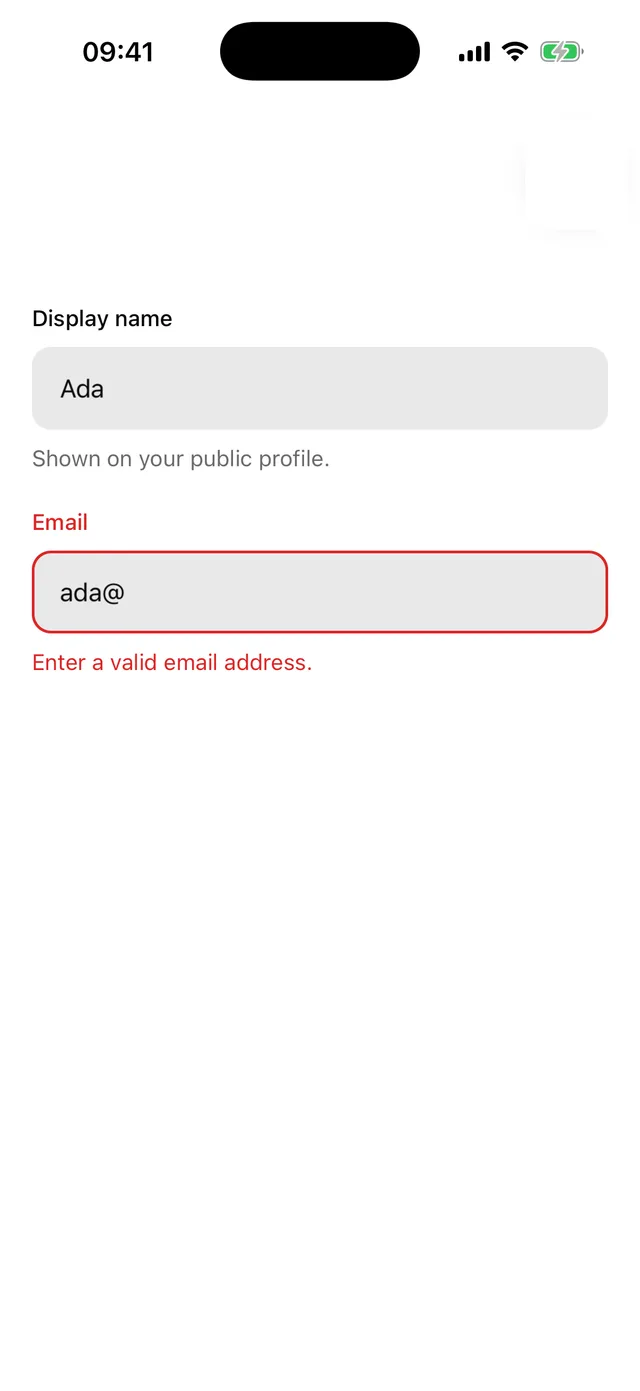
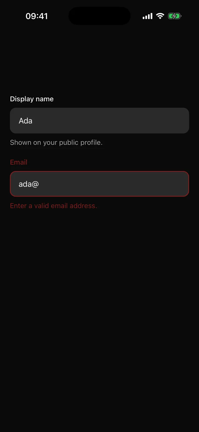 FieldLabel, control, description and error, wired for screen readers on both platforms.
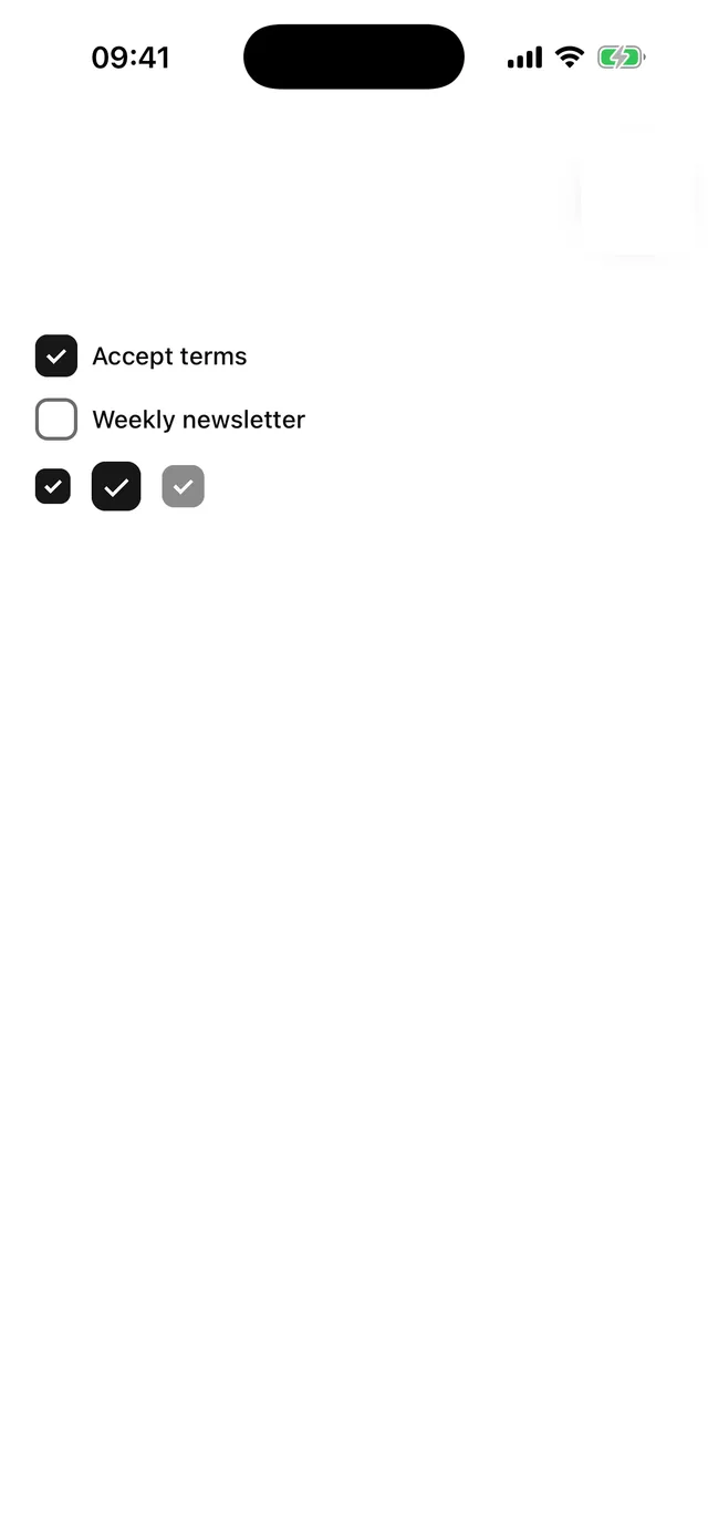
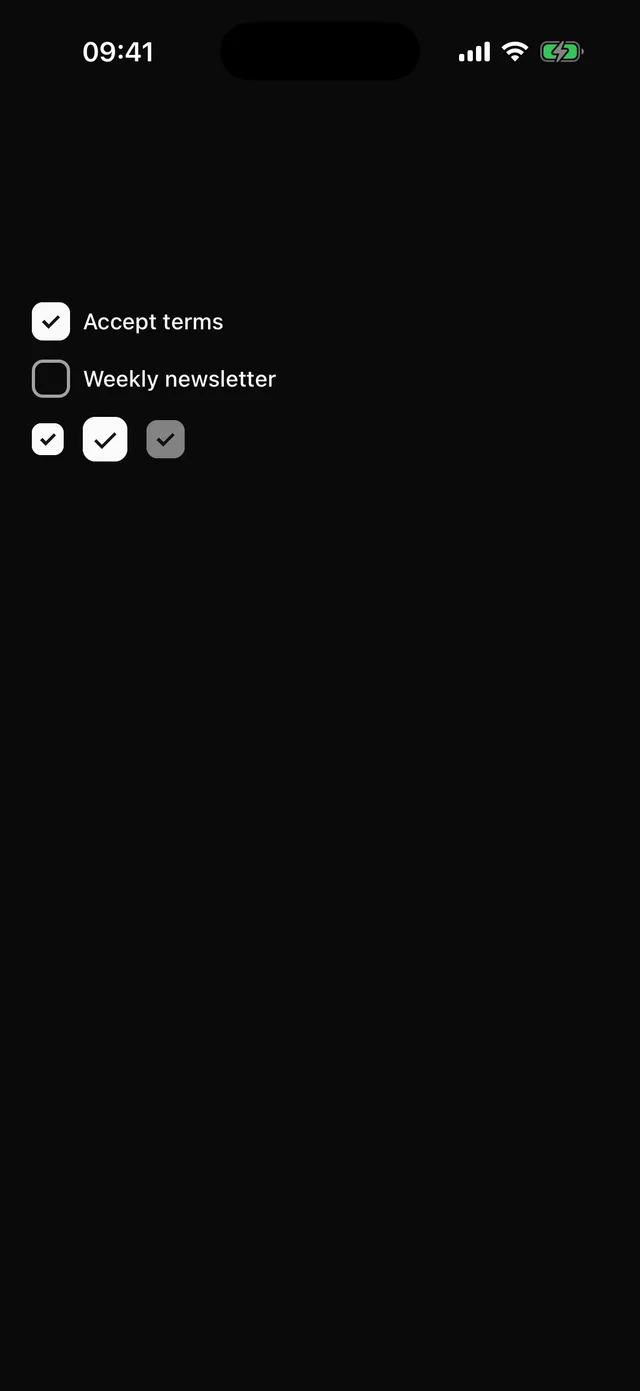 CheckboxRounded square toggle with a drawn check mark, no icon dependency.
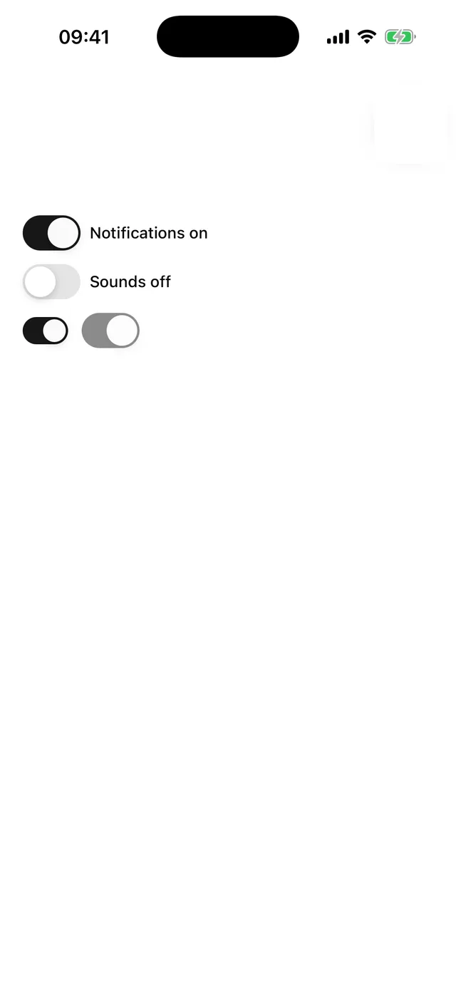
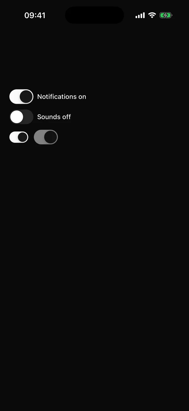 SwitchiOS-proportioned toggle.
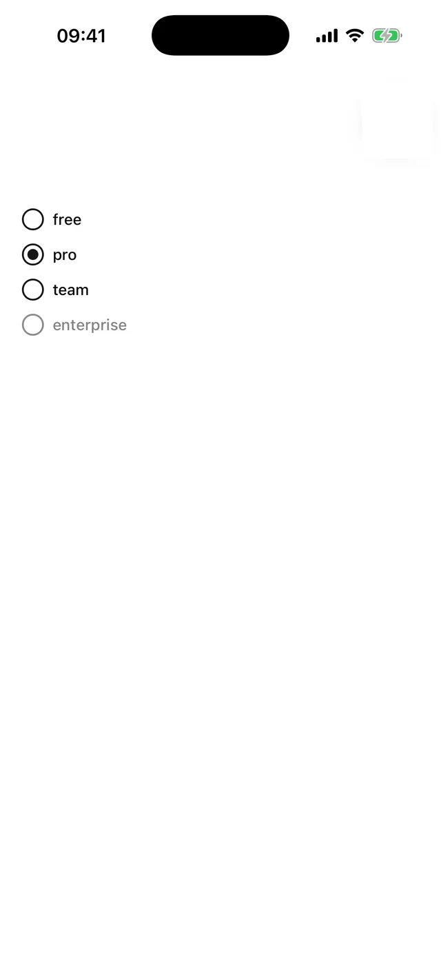
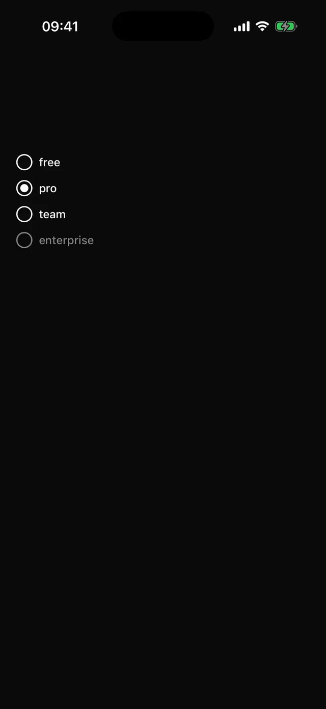 RadioGroupSingle choice from a set of items, controlled or uncontrolled.
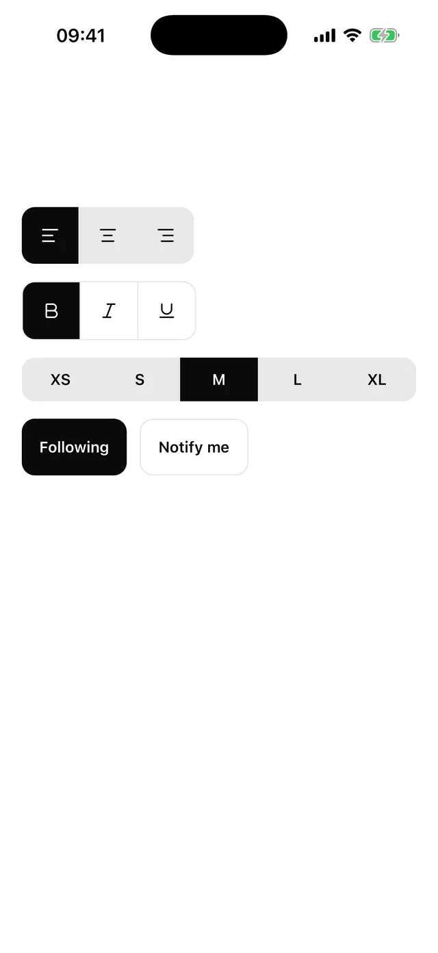
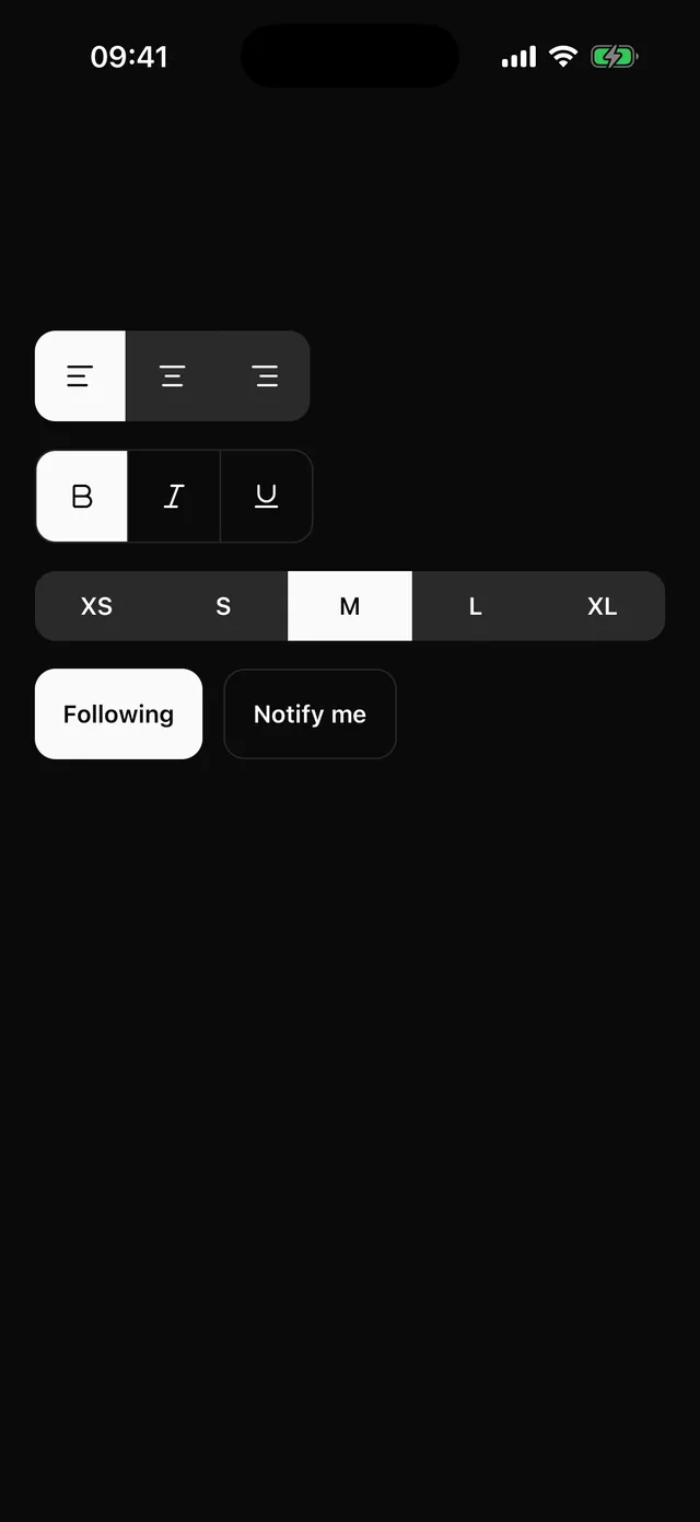 ToggleGroupTwo-state Toggle button, and a joined group of them for one choice or several.
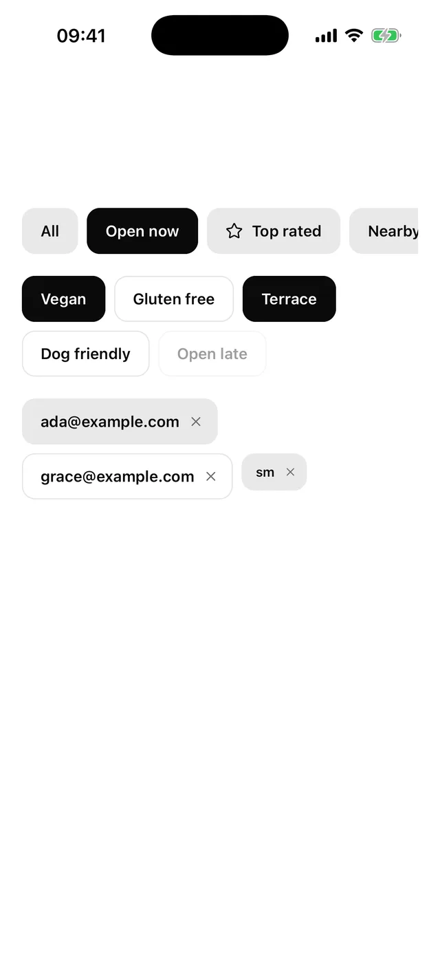
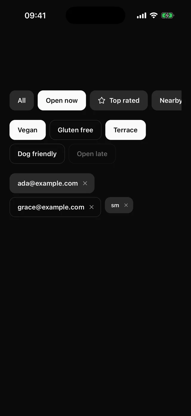 ChipPressable pill with a selected state, an optional icon and close target, and a group for single or multiple choice.
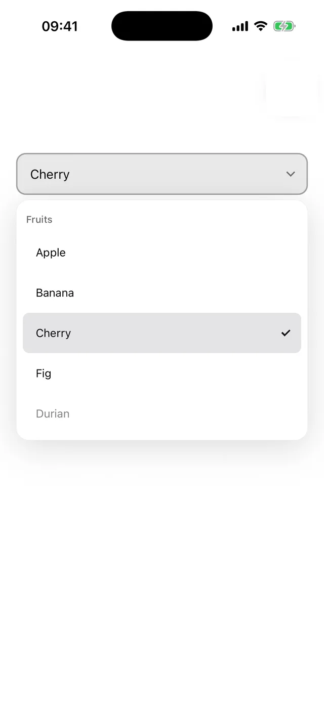
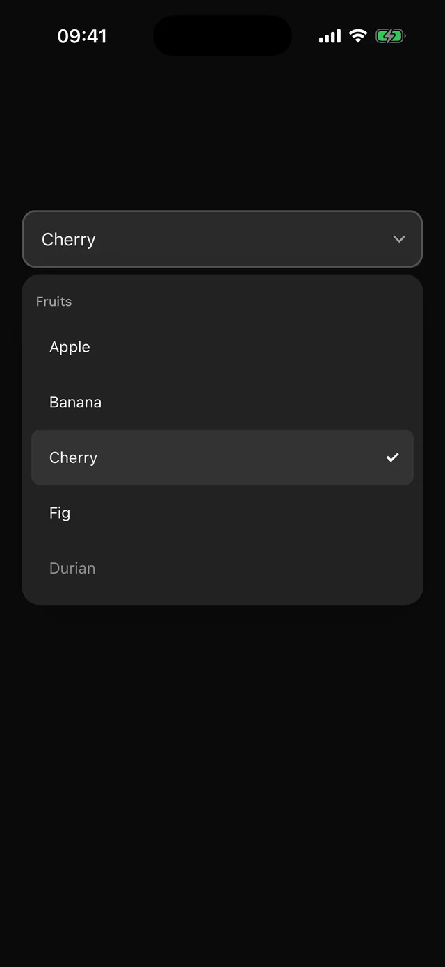 SelectAnchored single-choice list with labelled options. Options carry their label.
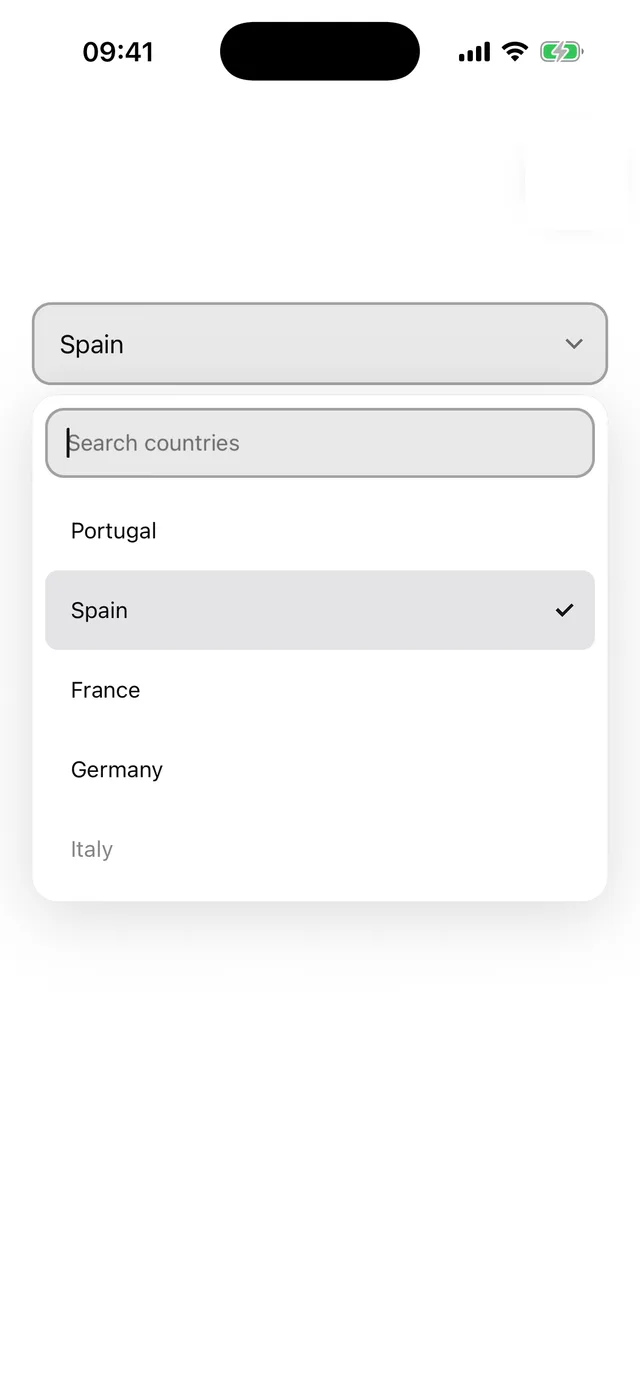
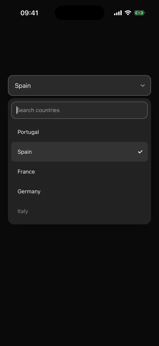 ComboboxSearchable single-choice list. Options are filtered as you type; the list shrinks to stay above the keyboard.
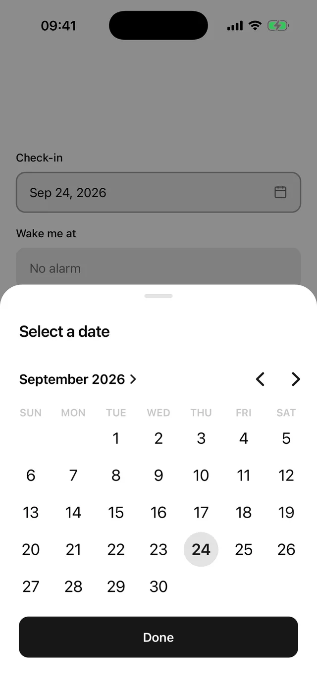
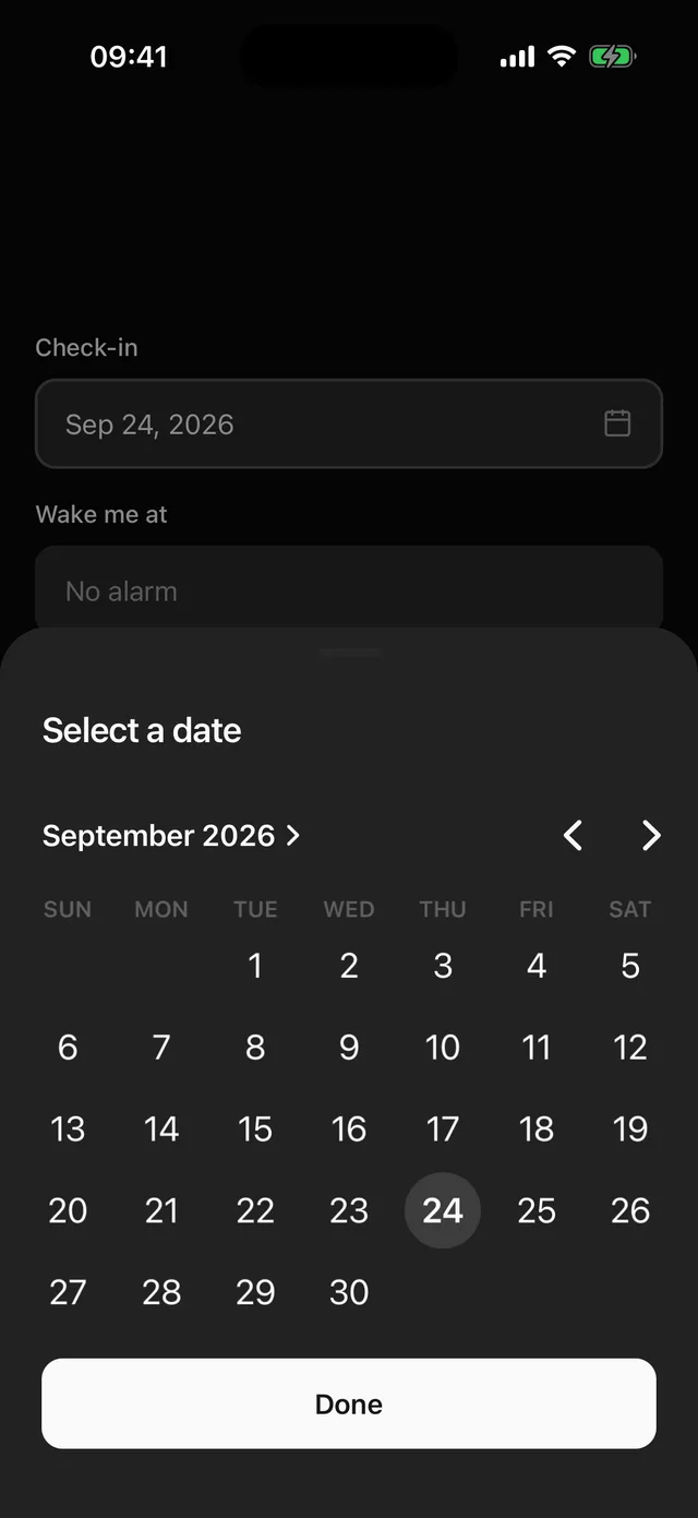 Date PickerA field that opens the platform date or time picker.
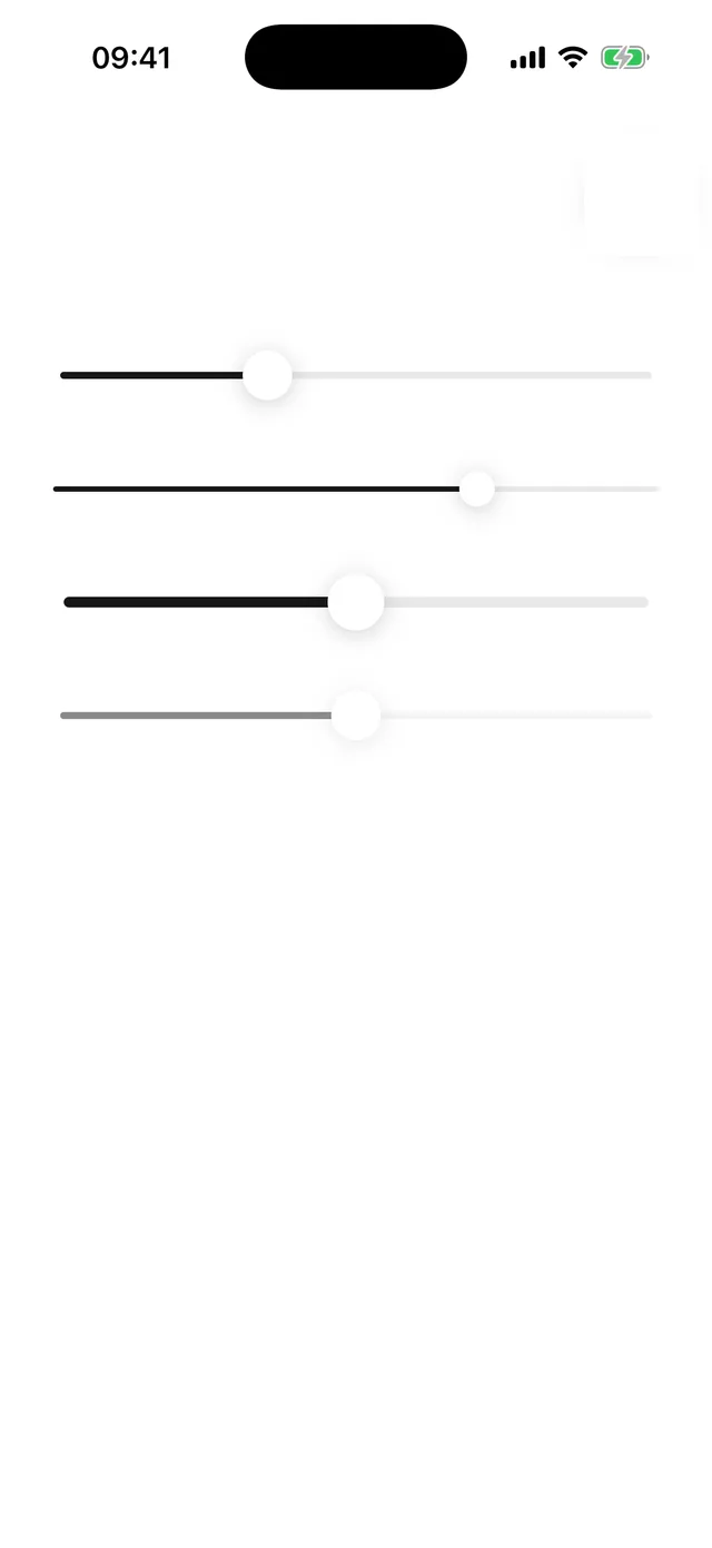
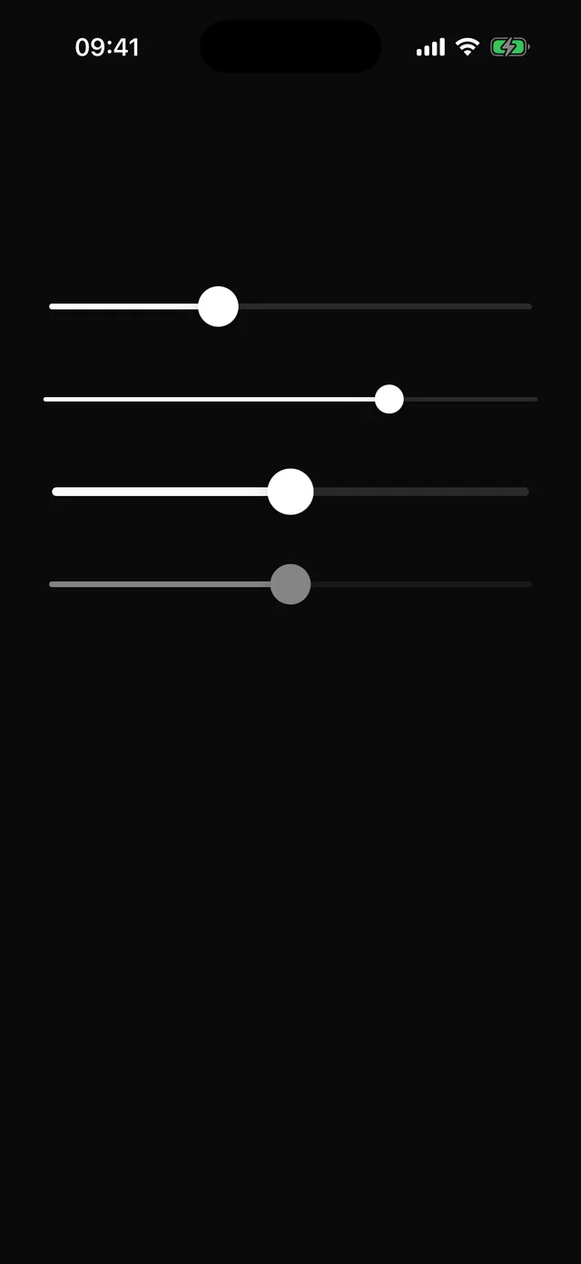 SliderSingle-thumb slider with step snapping, drag and tap, and screen-reader increment and decrement.
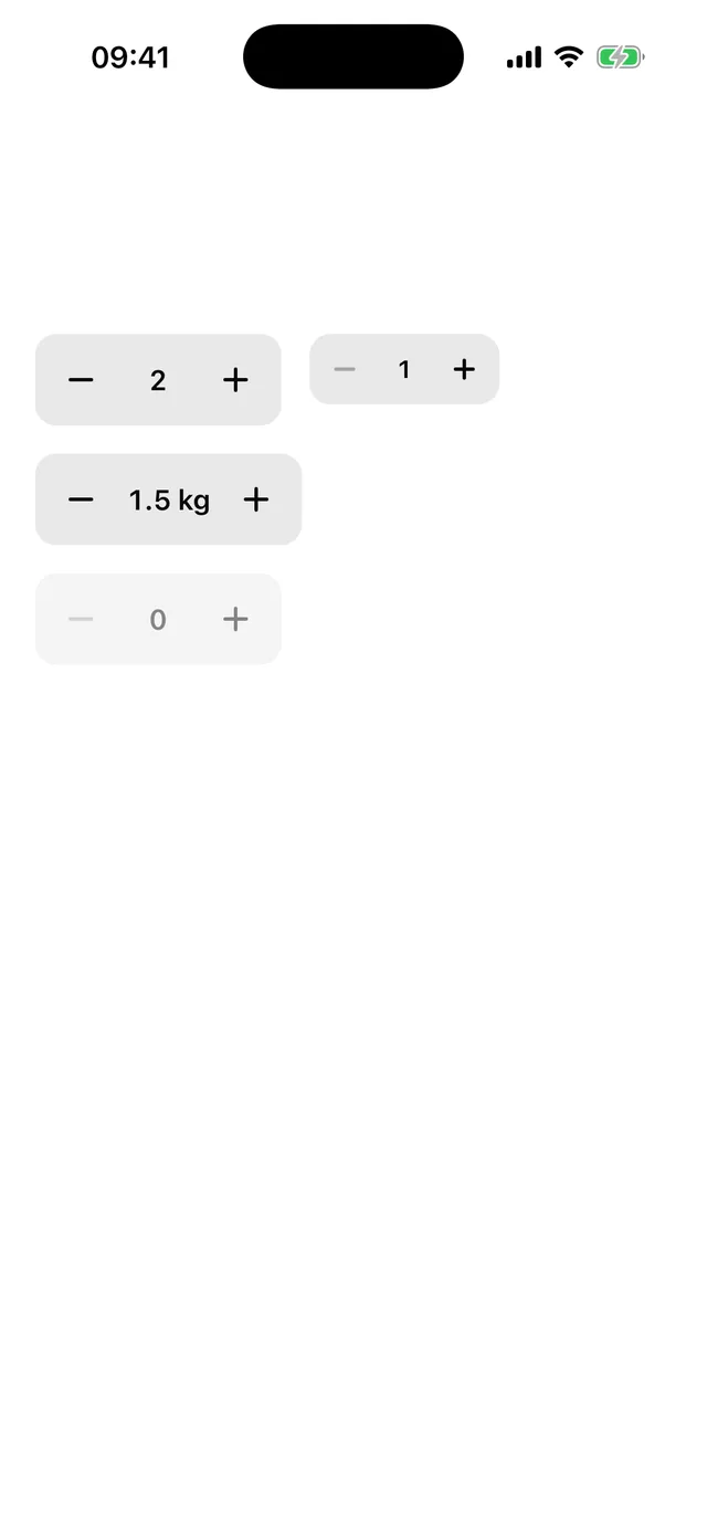
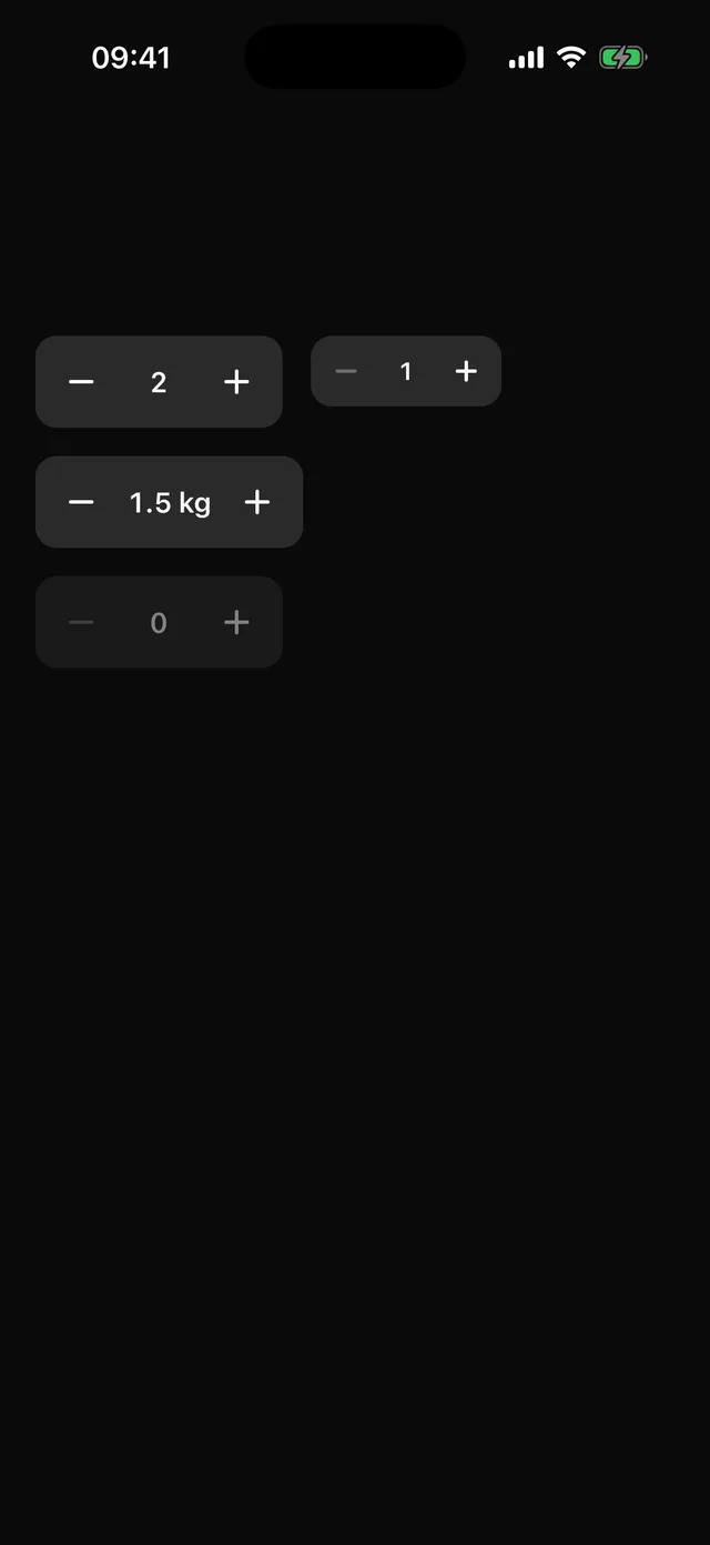 StepperNumber input as minus, value and plus, with press-and-hold repeat and screen-reader adjust actions.

 RatingStar rating with tap and drag to set, partial stars for fractions, and a read-only mode.
Display
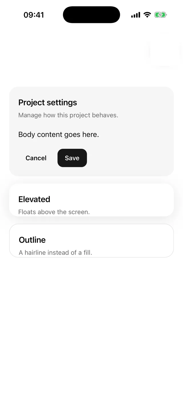
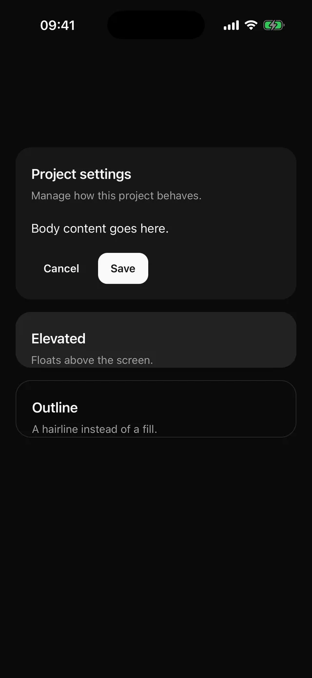 CardSurface tile with header, content and footer. Filled by default, no hairline border.
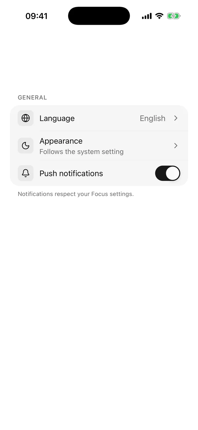
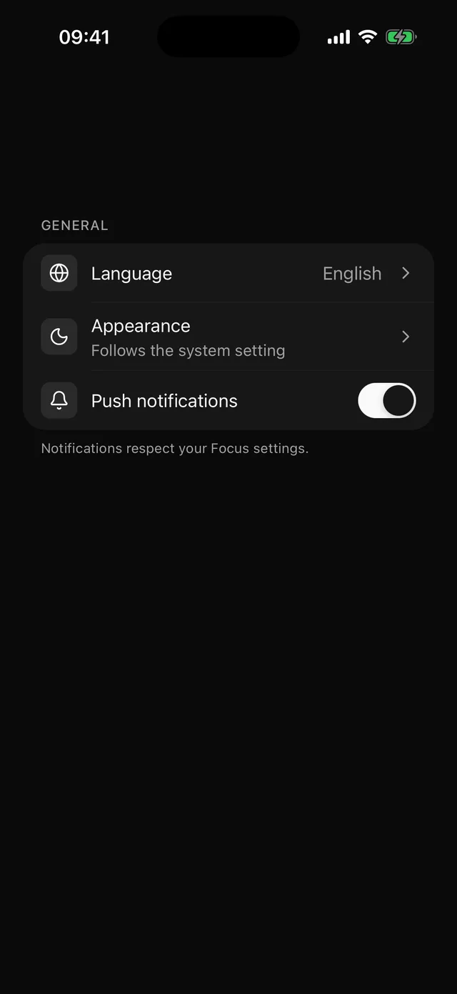 ItemList row with media, title, description and a trailing slot, plus a contained group with inset separators.
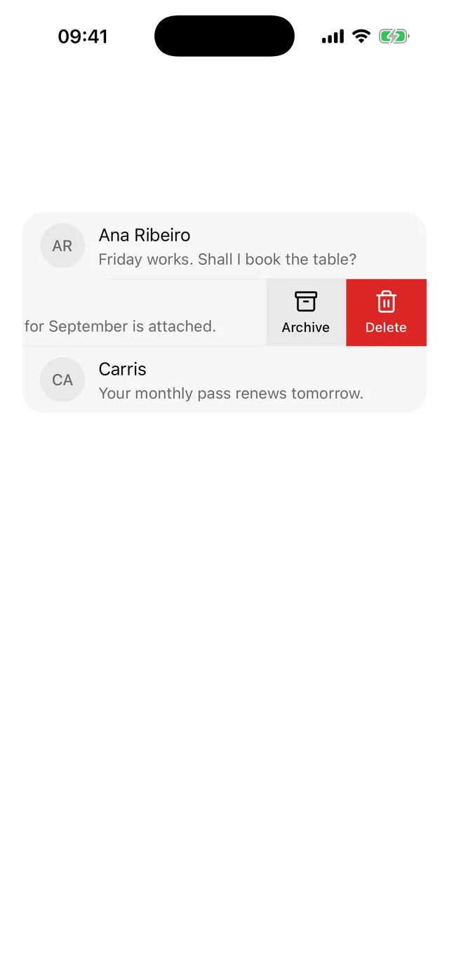
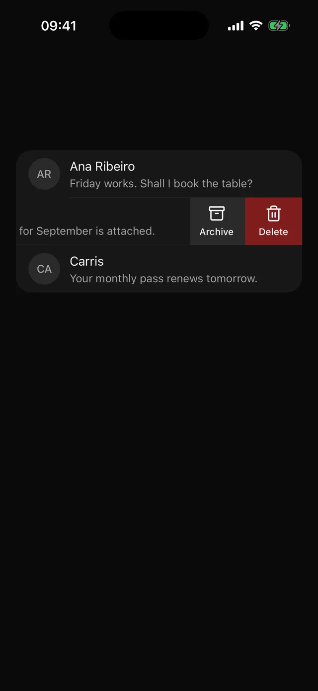 SwipeableRow that slides to show leading and trailing actions, with the same actions offered to screen readers.
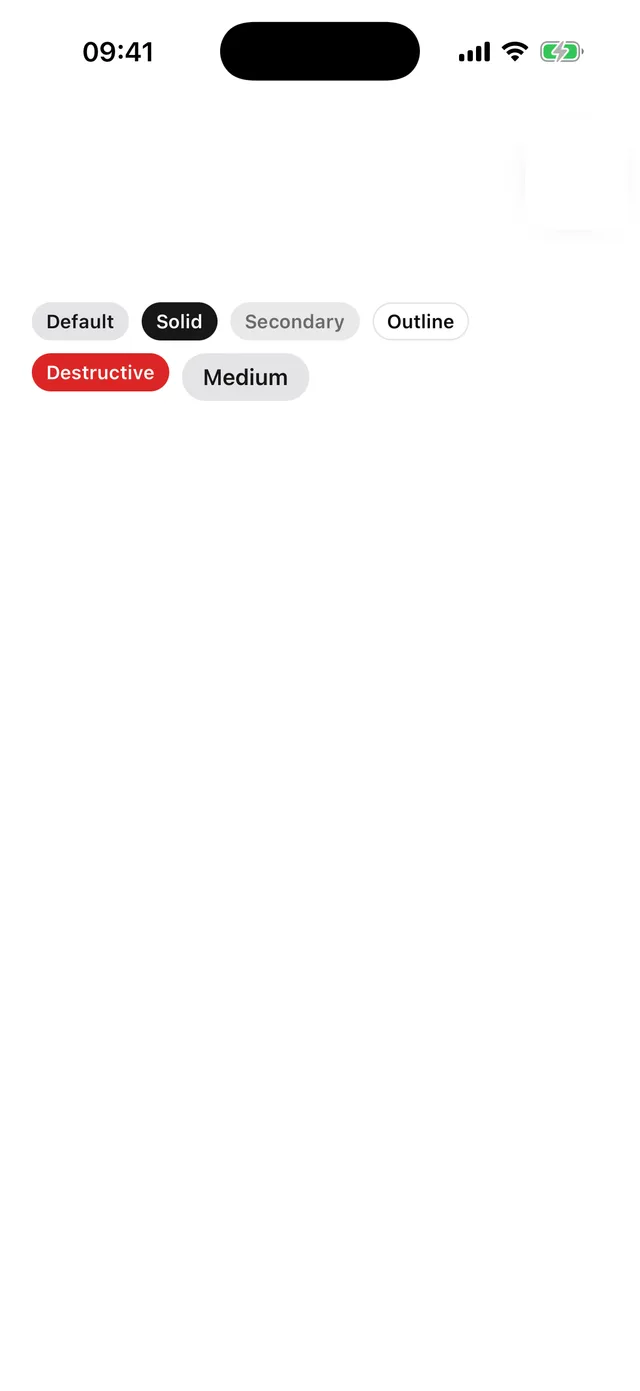
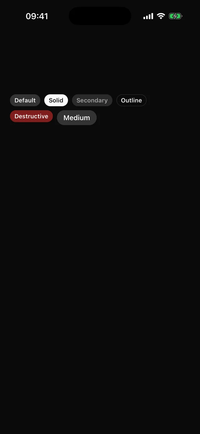 BadgeSmall status chip. Tinted by default, solid for emphasis.

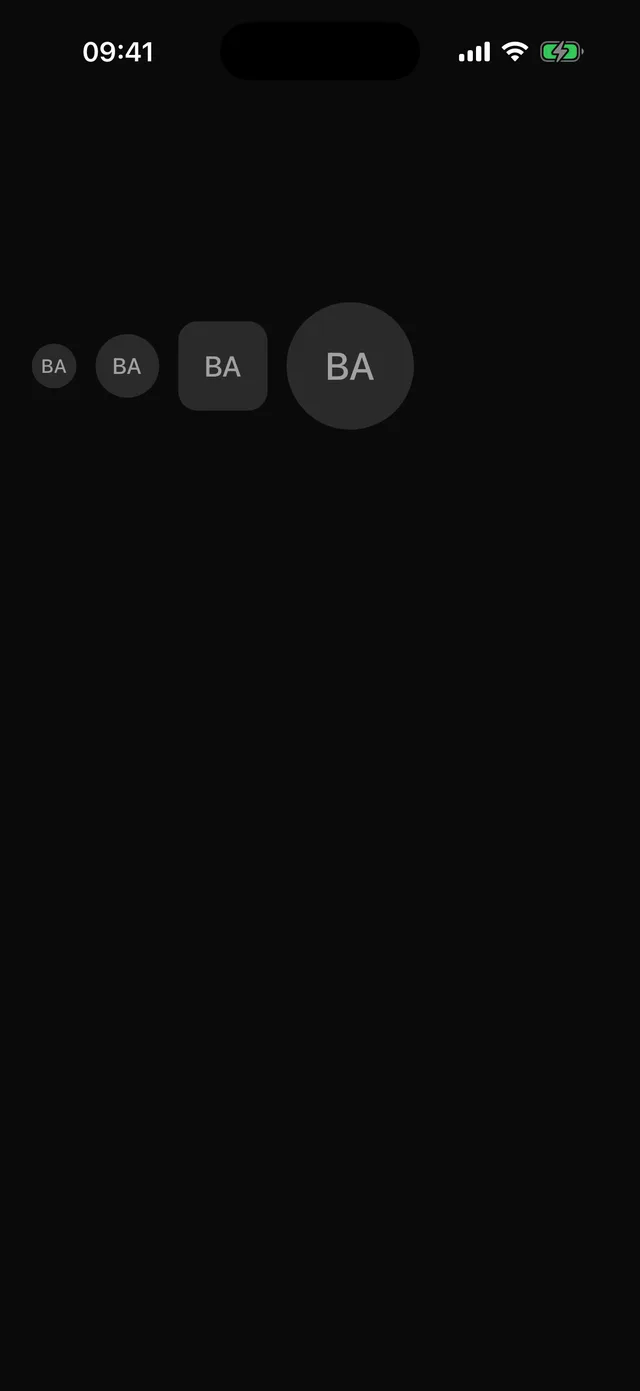 AvatarImage with an initials fallback. Sizes and shapes.
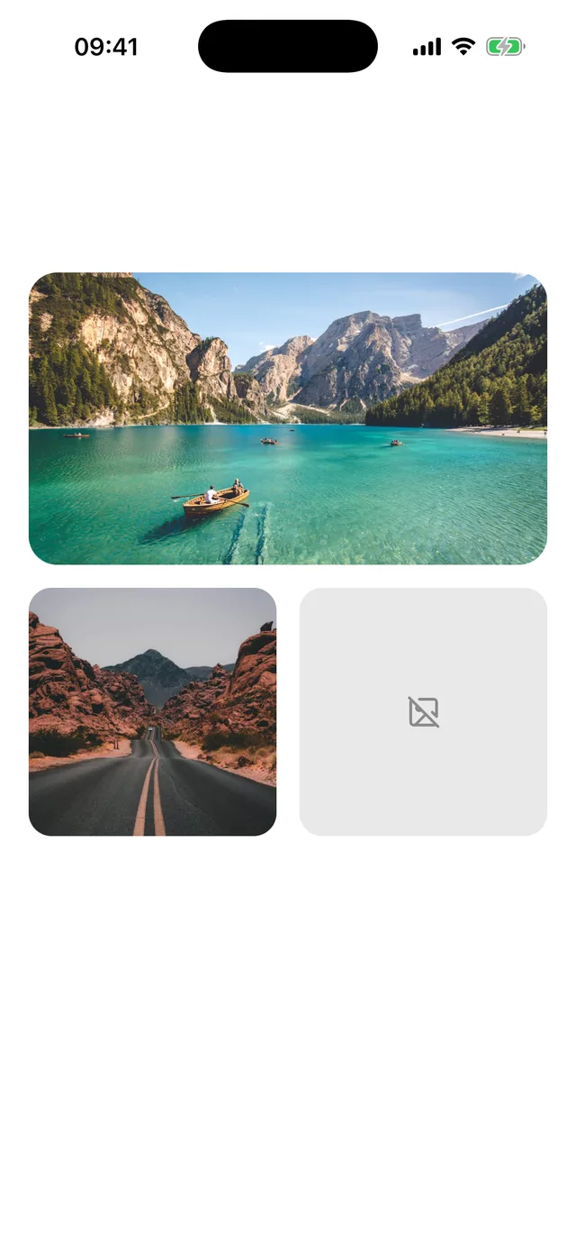
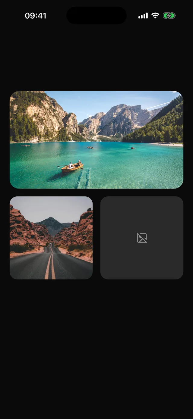 Imageexpo-image in a frame that keeps its shape, fades the picture in and handles failure.
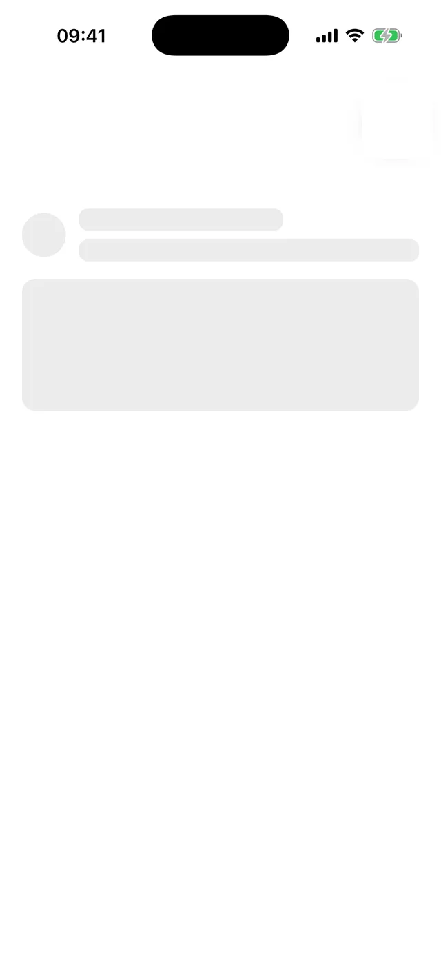
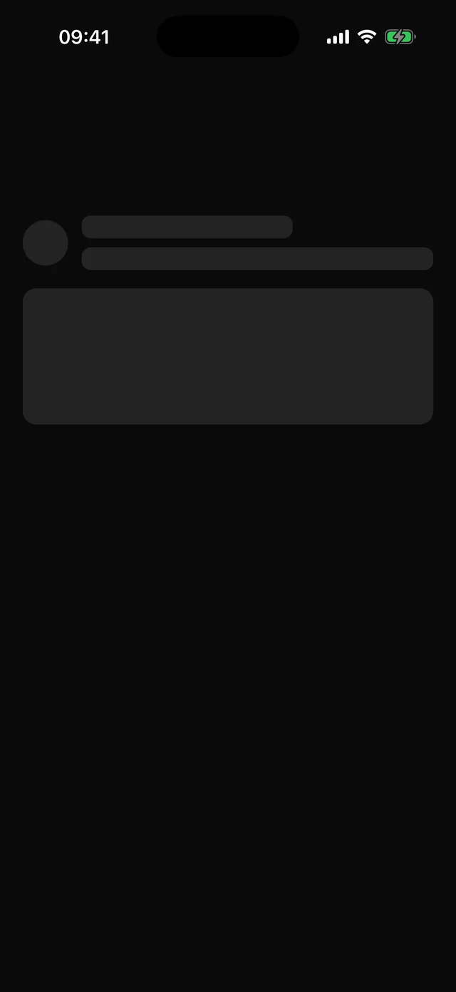 SkeletonLoading placeholder with a pulse that stops under reduce motion.
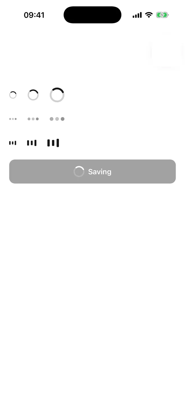
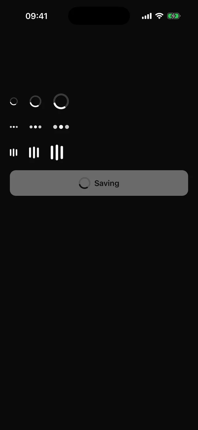 SpinnerIndeterminate loading indicator with ring, dots and bars styles.
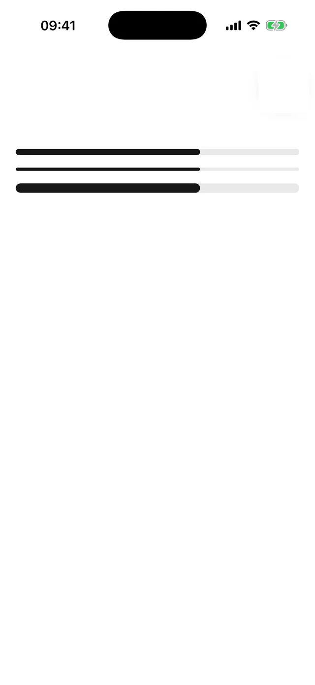
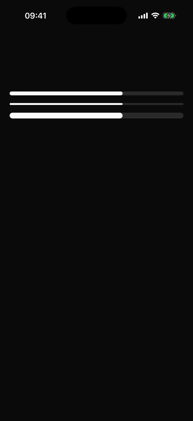 ProgressDeterminate progress bar with an accessibility value.
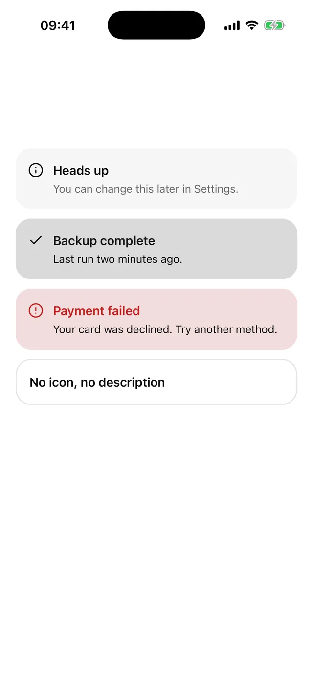
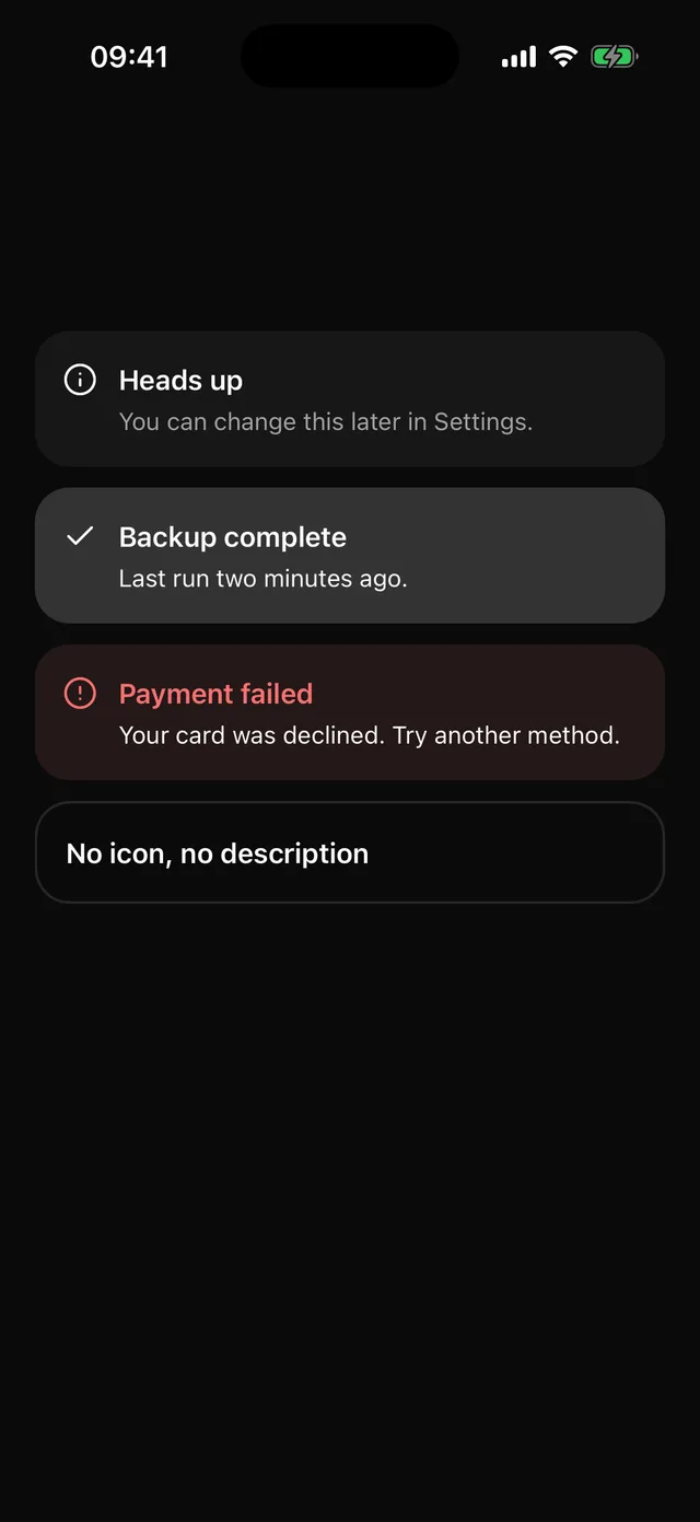 AlertInline banner with an icon, a title and a description. Tinted variants keep text at full contrast.
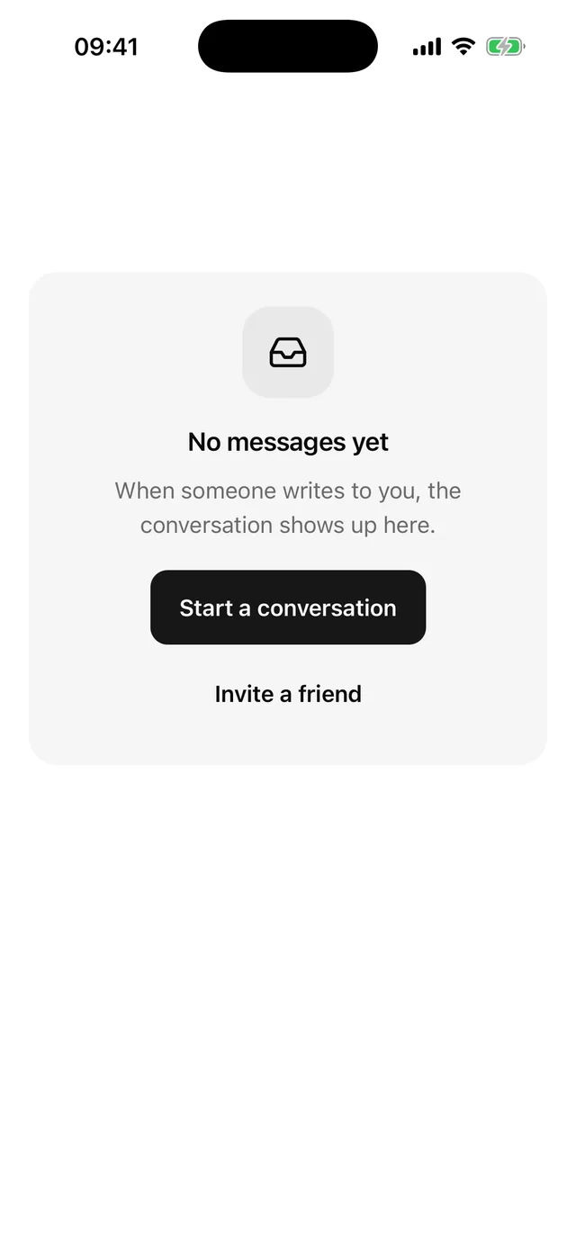
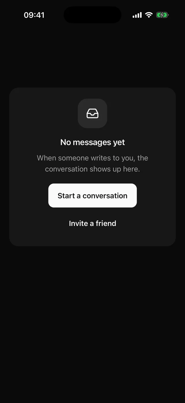 EmptyCentred empty state with media, a title, a description and actions.
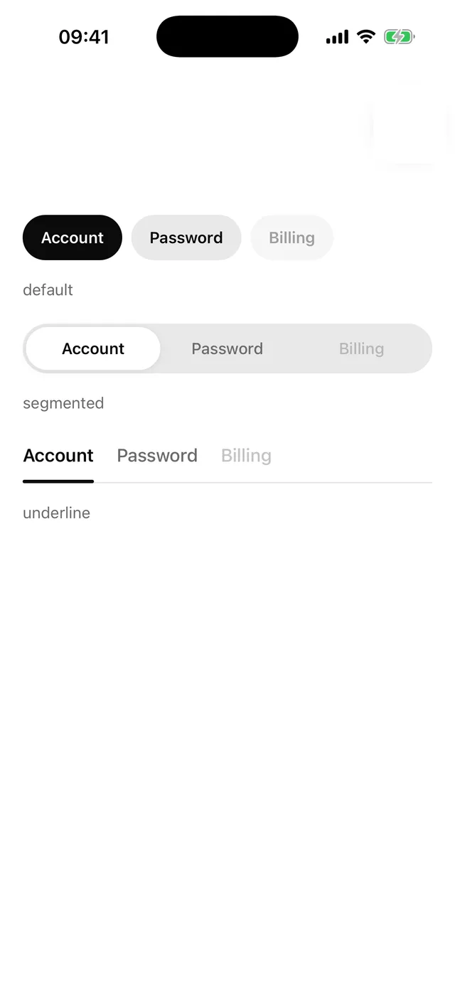
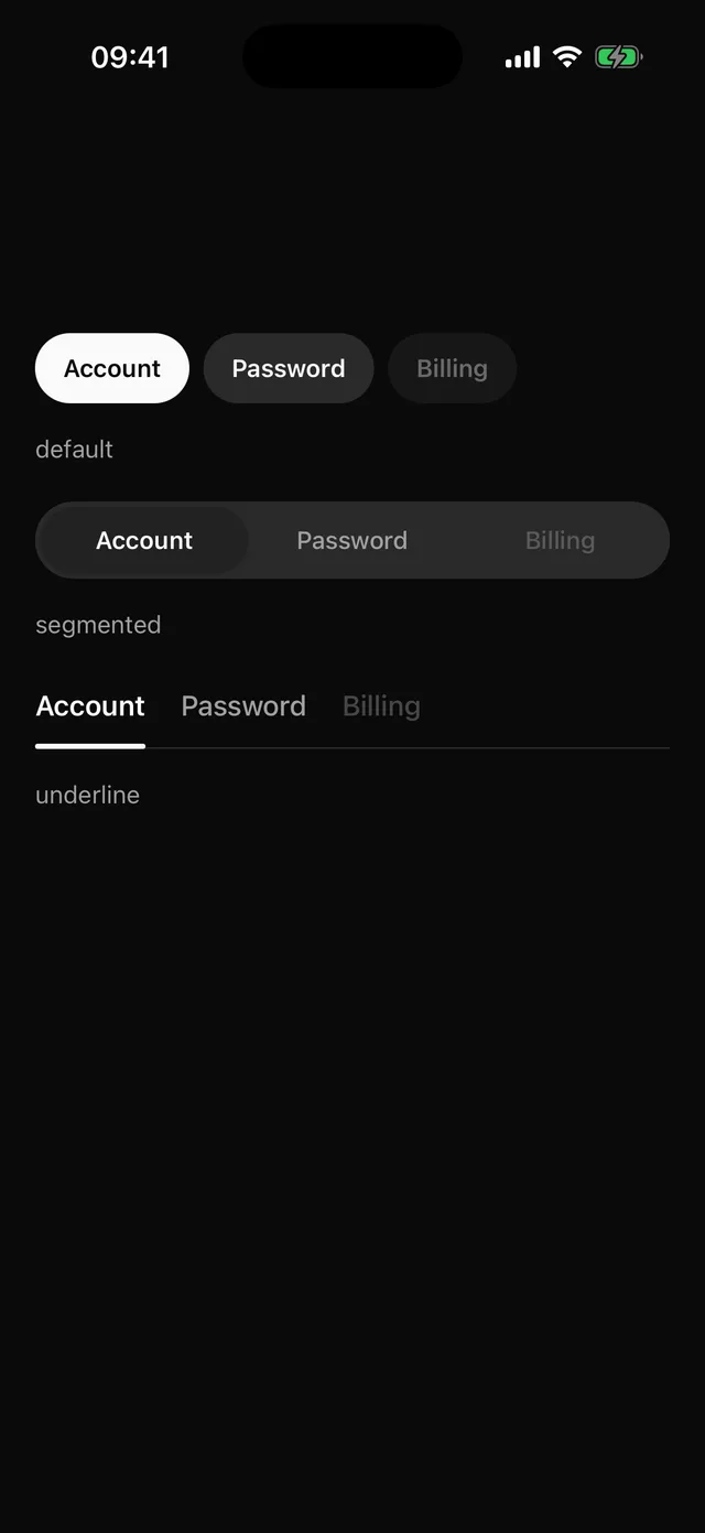 TabsPill chips by default, an iOS segmented control, or an underline bar.
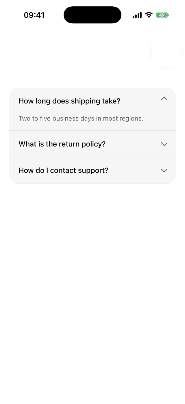
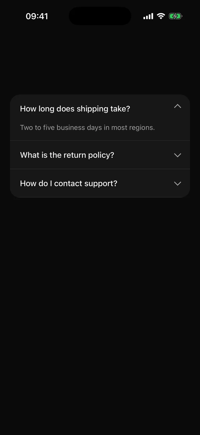 AccordionSingle or multiple expanding sections with a fade and layout transition.
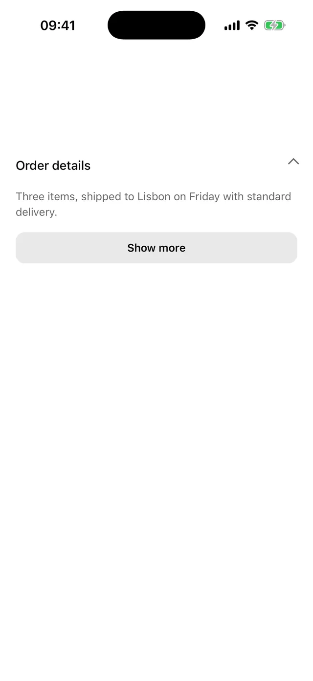
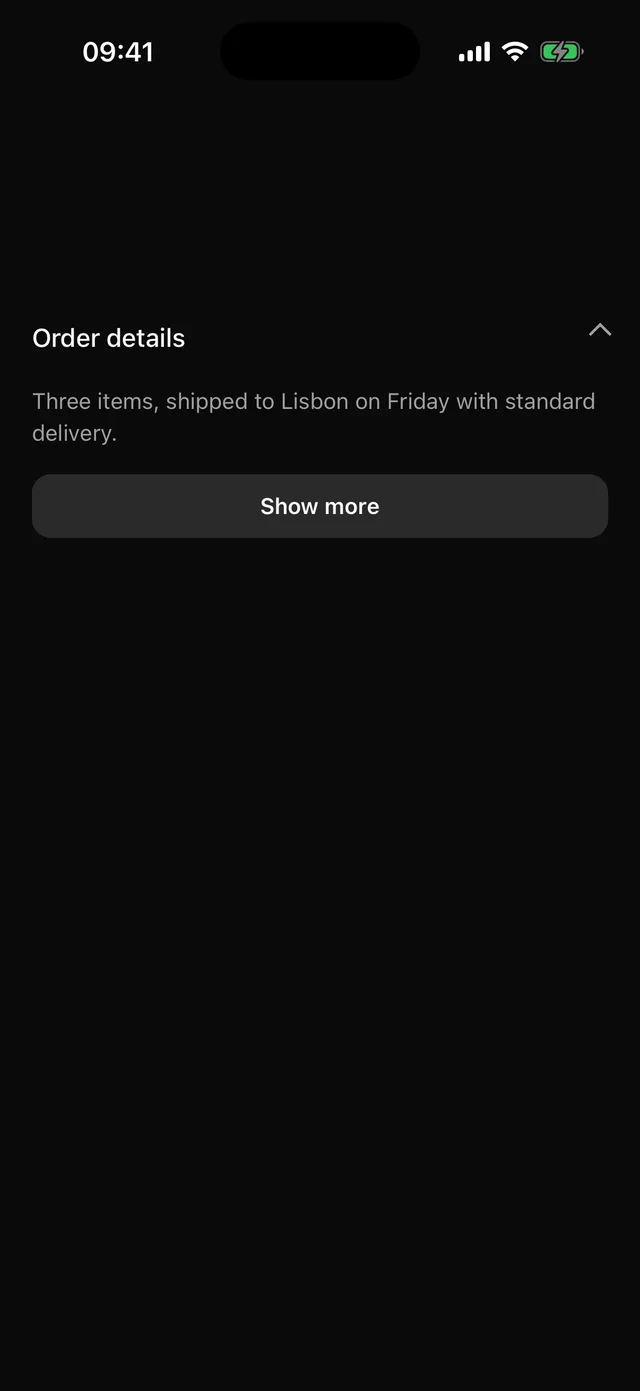 CollapsibleOne section that opens and closes, controlled or not, with the Accordion motion.
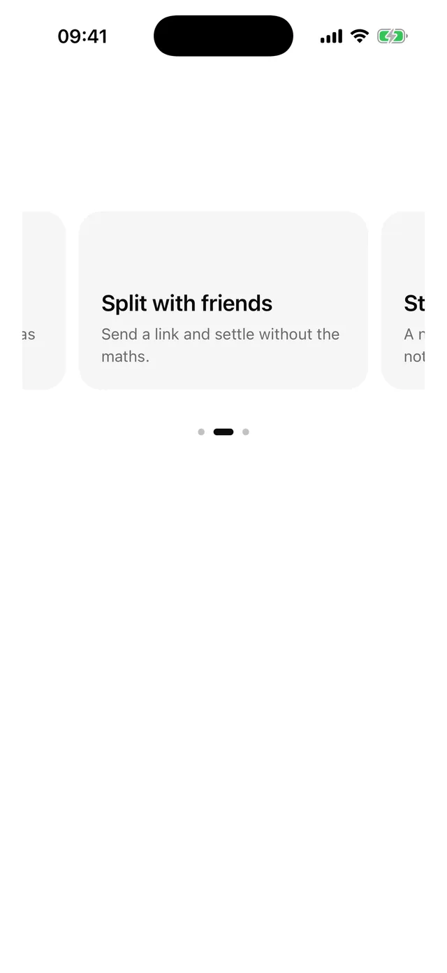
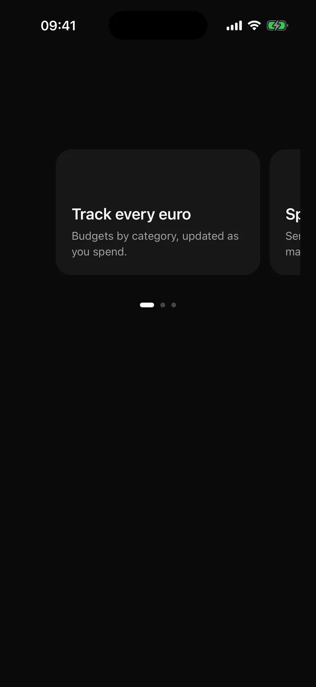 CarouselHorizontal pager with snapping, peeking items, dots that follow the scroll, and an imperative scrollTo.
Overlays
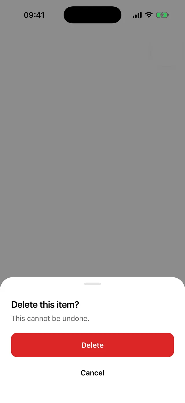
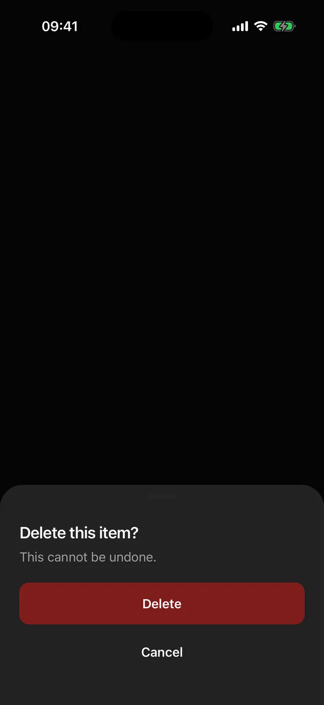 DialogBottom sheet by default with a grabber, or a centred card. Portalled above navigation.
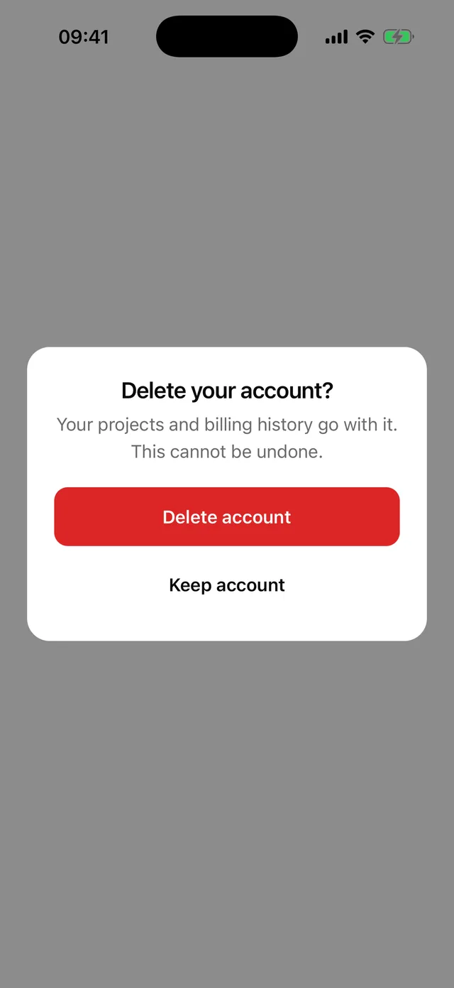
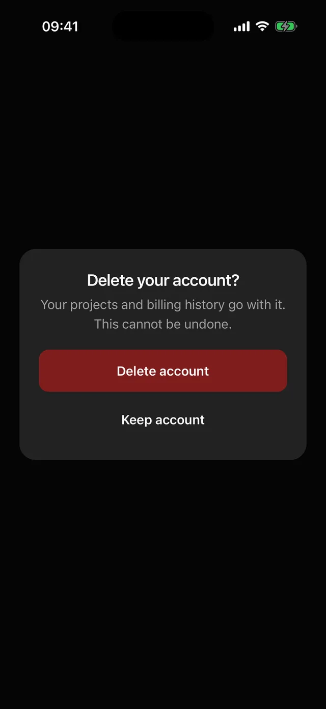 AlertDialogCentred dialog that waits for an answer. Overlay taps and Android back only close it when there is a Cancel.
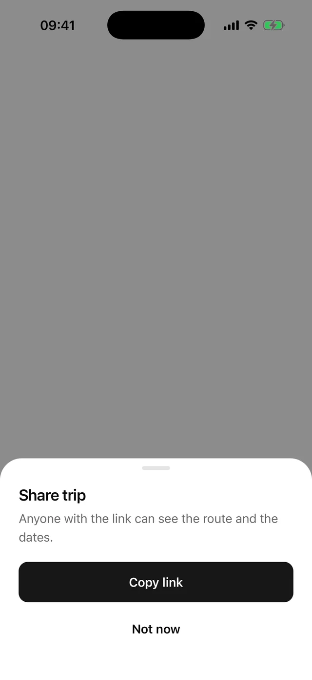
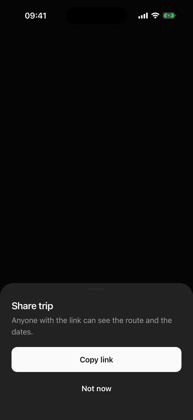 SheetDraggable bottom sheet with snap points, a pinned footer and a list body, built on @gorhom/bottom-sheet.
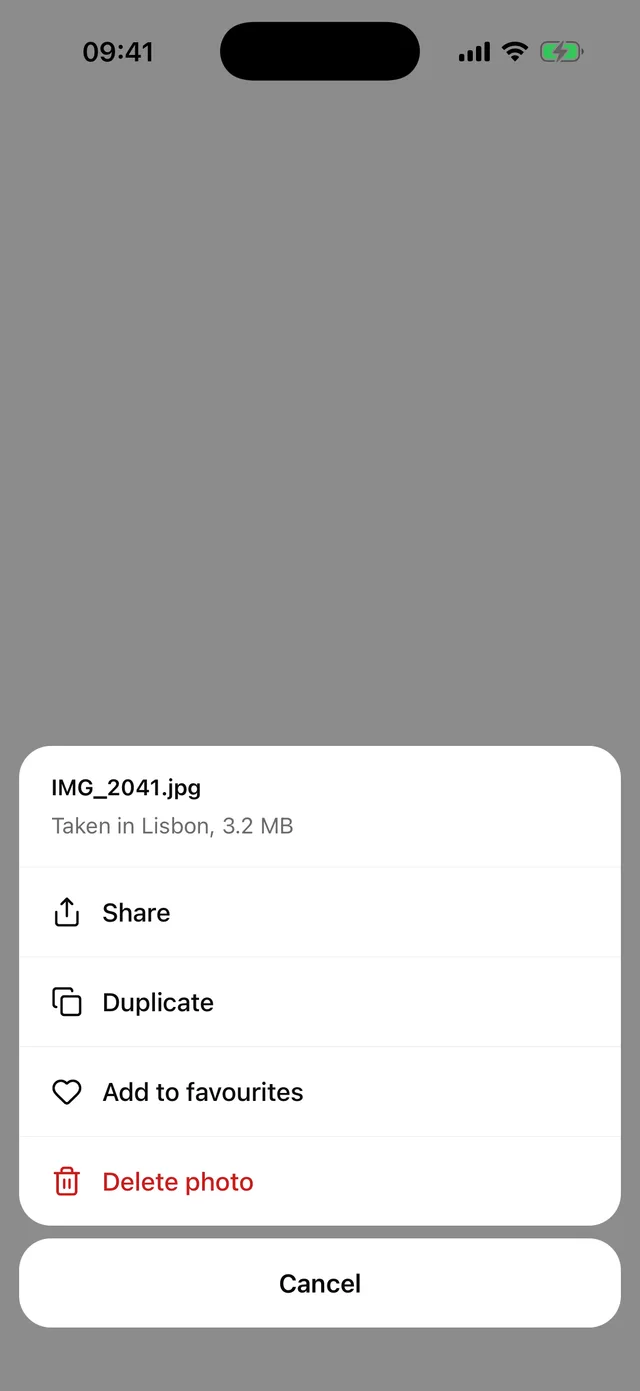
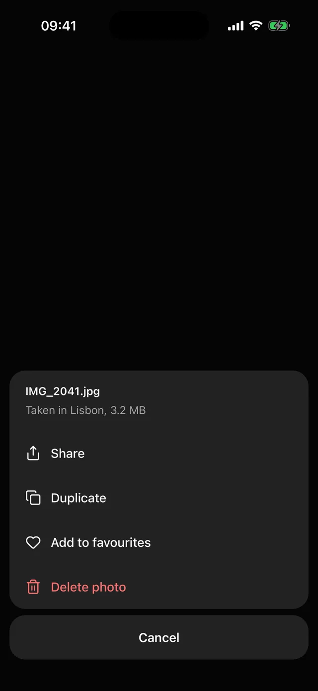 ActionSheetBottom sheet of actions with icons, a destructive variant and a separate Cancel block, as on iOS.
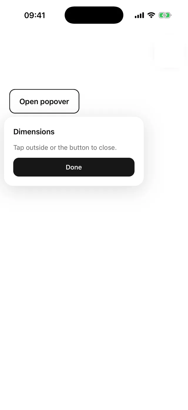
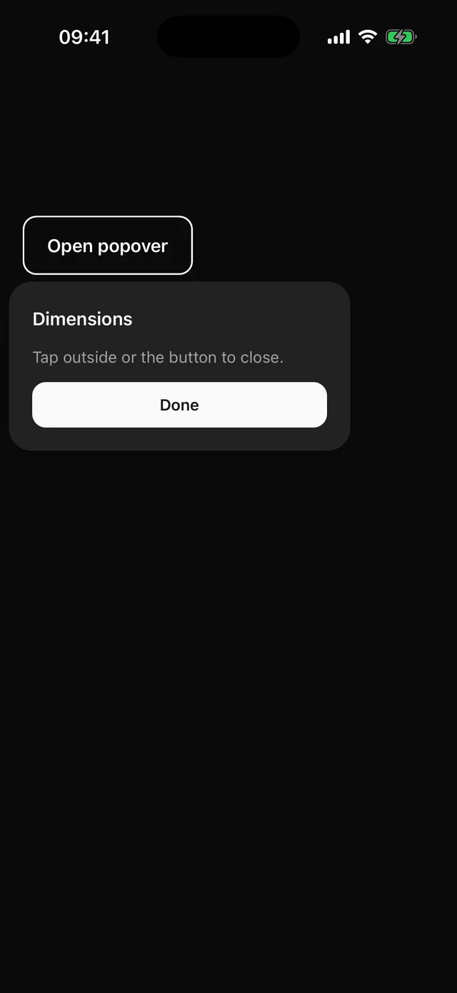 PopoverAnchored card with a title and description, dismissed by tapping outside.
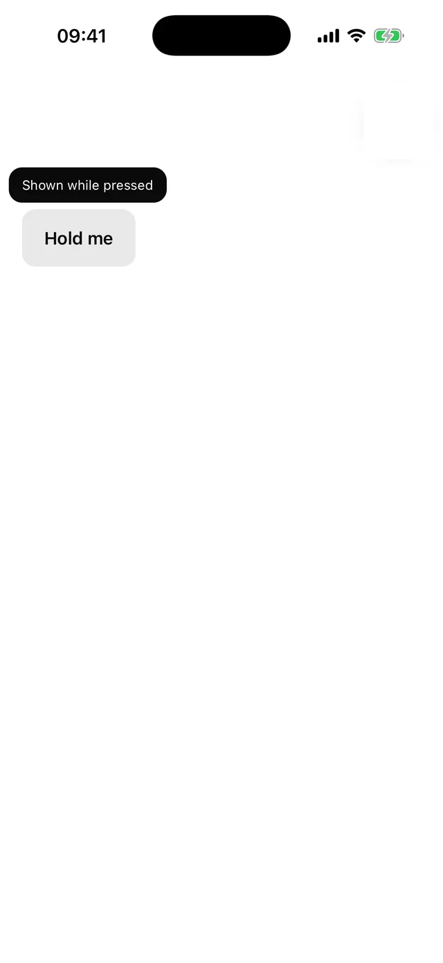
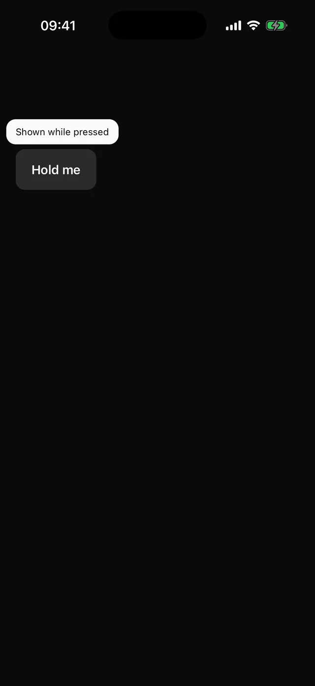 TooltipLabel shown while the trigger is held. Mirrors into the accessibility hint.
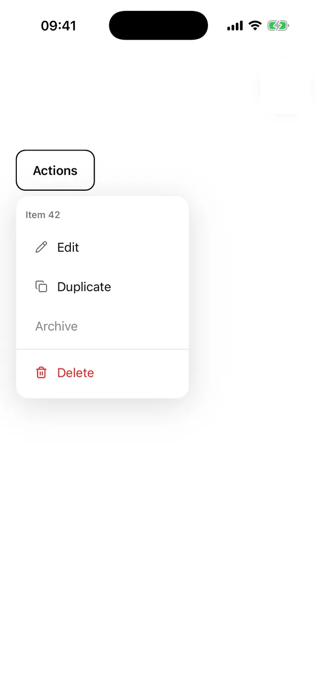
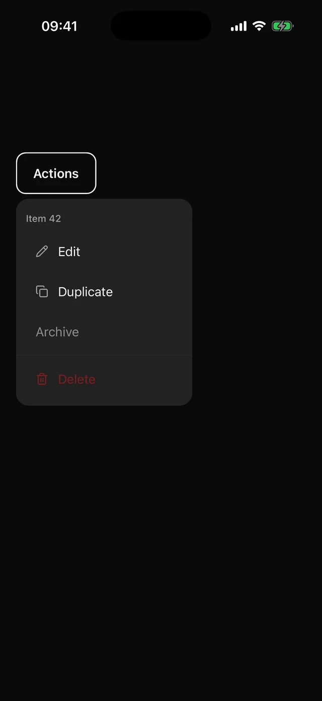 DropdownMenuAnchored menu with items, descriptions, labels, separators and icons.
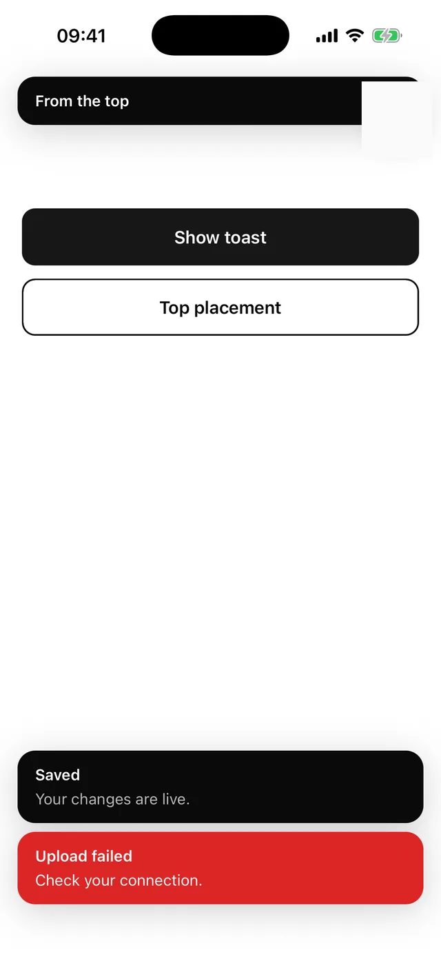
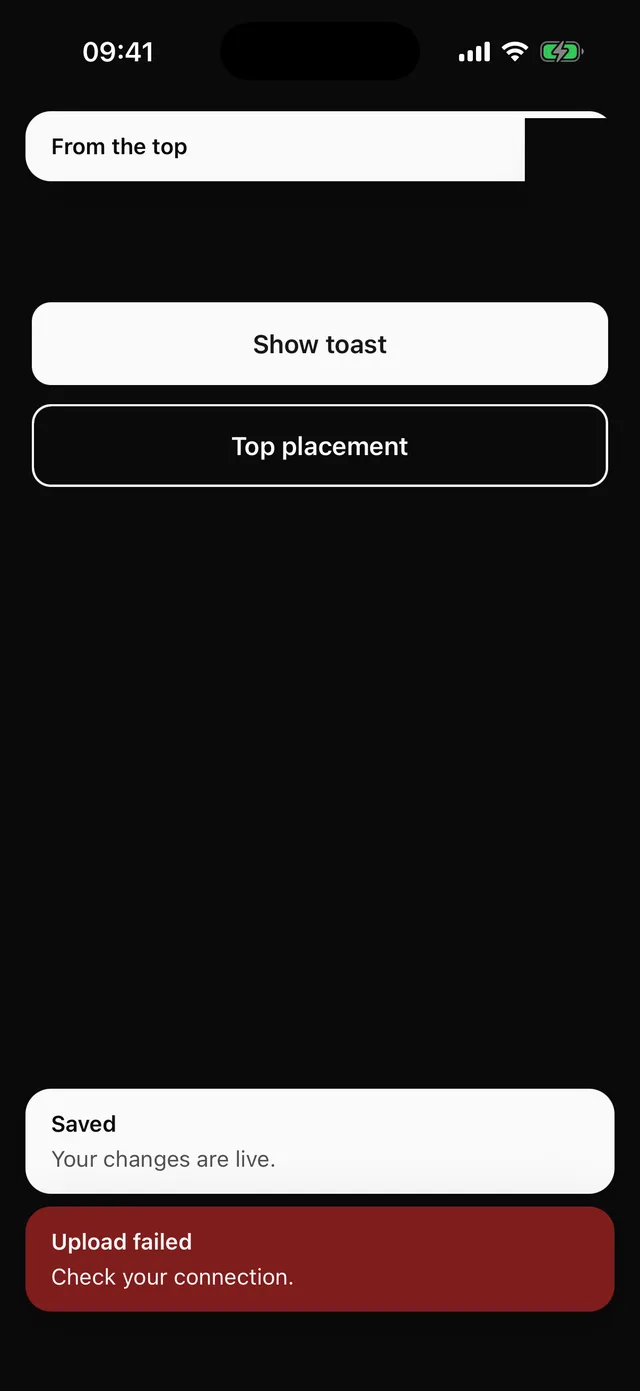 ToastImperative toast() store and a Toaster rendered through the portal. Top or bottom, per toast.