Badge
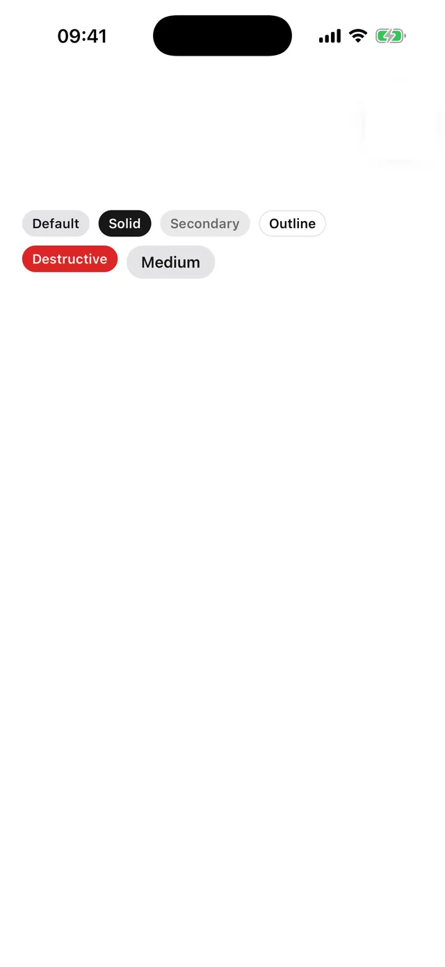
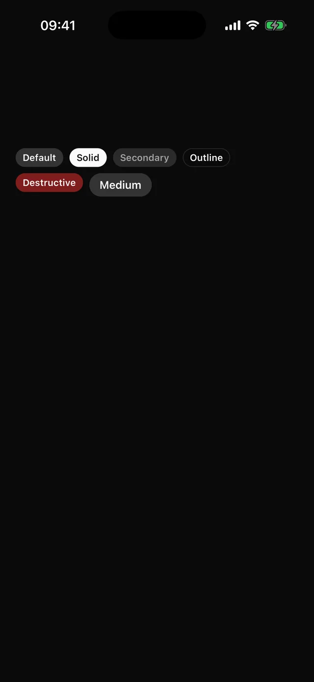
Small status chip. Tinted by default, solid for emphasis.
npx @eoria/cli add badgeUsage
import { Badge } from '@/components/ui/badge'
<Badge>Pro</Badge><Badge variant="solid">New</Badge><Badge variant="secondary" size="md">Draft</Badge>
Variants
| Prop | Values | Default |
|---|---|---|
variant |
default (accent tint), solid, secondary, outline, destructive |
default |
size |
sm, md |
sm |
String children render through the label slot. Anything else renders as is.