Sheet
Draggable bottom sheet with snap points, a pinned footer and a list body, built on @gorhom/bottom-sheet.
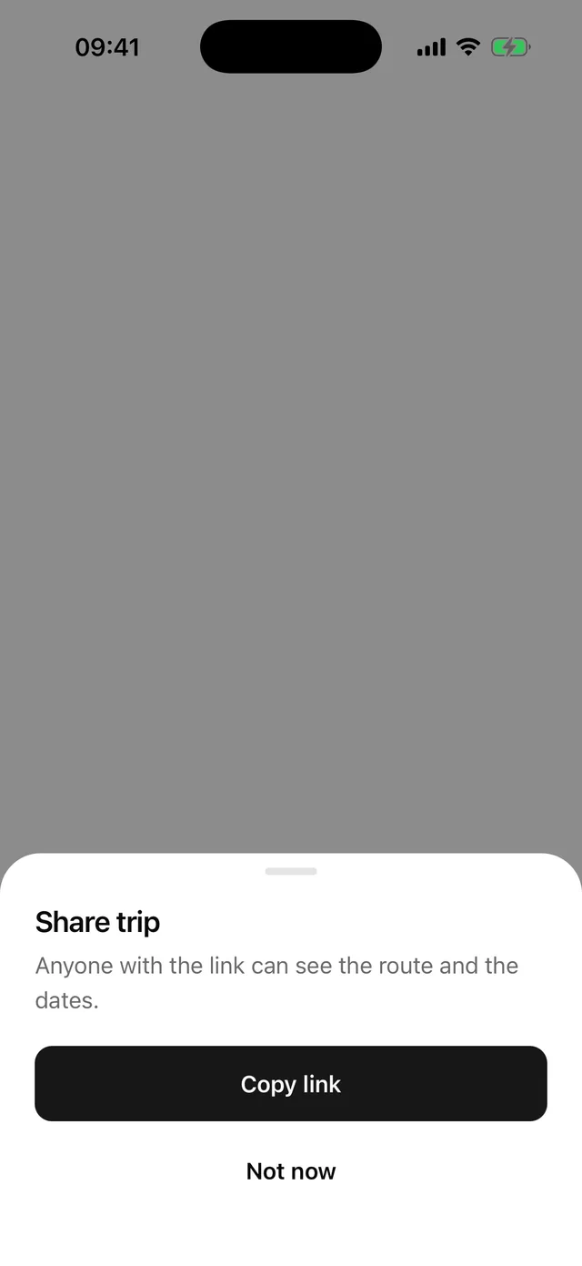
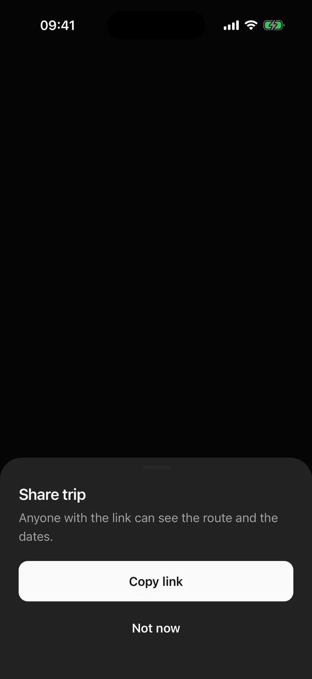
npx @eoria/cli add sheetNeeds @gorhom/bottom-sheet, which the CLI installs. It runs on Reanimated and Gesture Handler, so there is nothing native to rebuild if you already use eoria. Wrap the app once, inside GestureHandlerRootView:
import { BottomSheetModalProvider } from '@gorhom/bottom-sheet'
<GestureHandlerRootView style={{ flex: 1 }}>  <BottomSheetModalProvider>{/* app */}</BottomSheetModalProvider></GestureHandlerRootView>
The CLI also adds Input, because fields inside a sheet switch to the library’s text input through it.
Usage
import {  Sheet,  SheetClose,  SheetContent,  SheetDescription,  SheetFooter,  SheetHeader,  SheetTitle,  SheetTrigger,} from '@/components/ui/sheet'
<Sheet>  <SheetTrigger asChild>    <Button variant="secondary">Share</Button>  </SheetTrigger>  <SheetContent>    <SheetHeader>      <SheetTitle>Share trip</SheetTitle>      <SheetDescription>Anyone with the link can see the route.</SheetDescription>    </SheetHeader>    <SheetFooter>      <SheetClose asChild>        <Button width="full">Copy link</Button>      </SheetClose>    </SheetFooter>  </SheetContent></Sheet>
A long text that snaps to half and full height:
<Sheet> <SheetContent scroll snapPoints={['50%', '92%']}> {paragraphs} </SheetContent></Sheet>Open it from code
Give Sheet a ref when nothing on screen owns the open state. present() and dismiss() go through onOpenChange like a trigger does, so a controlled sheet still decides. snapToIndex(i) moves an open sheet to one of its snapPoints.
import { useRef, useState } from 'react'import { Sheet, SheetContent, SheetTitle, type SheetRef } from '@/components/ui/sheet'
export function RenameSheet({ onSave }: { onSave: (name: string) => void }) {  const sheet = useRef<SheetRef>(null)  const [name, setName] = useState('')  return (    <>      <Button onPress={() => sheet.current?.present()}>Rename</Button>      <Sheet ref={sheet}>        <SheetContent          footer={            <Button              width="full"              onPress={() => {                onSave(name)                sheet.current?.dismiss()              }}            >              Save            </Button>          }        >          <SheetTitle>Rename list</SheetTitle>          <Input value={name} onChangeText={setName} accessibilityLabel="List name" />        </SheetContent>      </Sheet>    </>  )}
A searchable list
SheetList is the library’s virtualised FlatList. Put it directly inside SheetContent with fixed snapPoints. The content then fills the sheet, and the list takes the height left under the header and the search bar. Any eoria field inside the sheet, including SearchBar, uses the library’s text input, so the keyboard lifts the sheet and the rows stay above it.
<Sheet ref={sheet} inset="flush" onDismiss={() => setQuery('')}> <SheetContent snapPoints={['65%']}> <SheetHeader style={{ paddingHorizontal: 24 }}> <SheetTitle>Country</SheetTitle> </SheetHeader> <SearchBar style={{ paddingHorizontal: 24 }} value={query} onChangeText={setQuery} /> <SheetList data={matches} keyExtractor={(country) => country.code} renderItem={({ item }) => ( <Item onPress={() => { onSelect(item) sheet.current?.dismiss() }} > <ItemContent> <ItemTitle>{item.name}</ItemTitle> </ItemContent> </Item> )} /> </SheetContent></Sheet>keyboardShouldPersistTaps defaults to handled, so the first tap on a row selects it while the keyboard is up. Every other FlatList prop passes through.
After it closes
onDismiss on Sheet runs once the close animation has finished, whether a drag, the backdrop, Android back, the ref, open or another sheet closed it. It runs once per close. Chain the next step there: open another sheet, focus a field, or navigate.
<Sheet ref={picker} onDismiss={() => { if (picked) noteField.current?.focus() }}>onOpenChange(false) means two things depending on who closes the sheet:
- The backdrop, Android back, the escape gesture,
SheetCloseand the ref request a close.onOpenChange(false)fires first, and the sheet starts closing only onceopenis false. A controlled sheet can refuse by keeping it true. - A drag, or the library closing it for another sheet (
stackBehaviorofswitchorreplace), is already done.onOpenChange(false)then fires after the close animation, just beforeonDismiss, to bringopenin line. Refusing it does not bring the sheet back.
onDismiss is not called when Sheet or SheetContent unmounts while the sheet is open. The sheet then closes on its own, and nothing is reported. Put cleanup that must run on unmount in your own effect.
Props
| Part | Prop | Values | Default |
|---|---|---|---|
Sheet |
open, defaultOpen, onOpenChange |
controlled or uncontrolled | closed |
Sheet |
onDismiss |
called after the close animation, not on unmount | |
Sheet |
ref |
present(), dismiss(), snapToIndex(index) |
|
Sheet |
inset |
padded, flush |
padded |
Sheet |
styles |
override background, handle, header, title, description, footer, pinnedFooter, list |
|
SheetContent |
dismissable |
drag down or tap the backdrop to close | true |
SheetContent |
closeLabel |
read out for the backdrop | Close |
SheetContent |
accessibilityLabel |
names a sheet without a SheetTitle |
|
SheetContent |
scroll |
wraps the content in the library’s scroll view | false |
SheetContent |
footer |
node kept on the bottom edge and above the keyboard | |
SheetContent |
stackBehavior |
push, switch, replace |
push |
SheetContent |
snapPoints, index |
heights in points or percent strings, and the one to open at | content height, 0 |
SheetContent |
enableDynamicSizing |
add the content height as a snap point | on without snapPoints |
SheetContent |
keyboardBlurBehavior |
none, restore |
restore |
SheetContent |
keyboardBehavior, topInset, … |
every other BottomSheetModal prop passes through, except enableDismissOnClose, which stays on |
|
SheetFooter |
View props |
stacked actions in the content, scrolling with it | |
SheetList |
FlatList props |
virtualised list body | |
SheetTrigger, SheetClose |
asChild |
inject onPress into the child |
false |
Sizes and snap points
Without snapPoints the sheet sizes to its content, grabber included. The library caps that at the height of its container, which is the screen less topInset. For a lower cap pass maxDynamicContentSize in points, for example maxDynamicContentSize={height * 0.9} with useWindowDimensions. Content taller than the cap needs scroll.
snapPoints takes points, or percent strings of the same container: ['60%'], [320, '90%']. List them from smallest to largest. index picks the one the sheet opens at and defaults to 0, the first.
With snapPoints, dynamic sizing is off unless you pass enableDynamicSizing. When it is on, the library inserts the content height into the list and sorts it, so index and snapToIndex no longer point at the heights you wrote. Leave it off whenever the indices matter.
Footers
SheetFooter sits in the content and scrolls with it. For actions that must stay put, pass them to SheetContent as footer. That node renders in the library’s footer slot, stays on the bottom edge while the content scrolls under it, and rides on top of the keyboard. It renders outside the sheet body, so a provider you put inside SheetContent does not reach it; the sheet’s own context and its text input do. The footer and pinnedFooter slots style the bar.
scroll and SheetList pad their content by the footer’s height, so the last row clears it.
The keyboard
Gorhom moves the sheet for the keyboard only when the focused field is its BottomSheetTextInput. SheetContent and its footer provide that input to Input, Textarea, InputGroup, SearchBar and PasswordInput, so you write the usual eoria field. A plain TextInput still needs BottomSheetTextInput by hand.
Three props decide what happens:
| Prop | Values | Default here | What it does |
|---|---|---|---|
keyboardBehavior |
interactive, extend, fillParent |
interactive |
interactive lifts the sheet by the keyboard height. A fixed 60% sheet keeps its full height above the keyboard. |
keyboardBlurBehavior |
none, restore |
restore |
restore puts the sheet back on its snap point when the keyboard closes. none leaves it lifted. |
android_keyboardInputMode |
adjustPan, adjustResize |
adjustPan |
adjustPan lets the sheet move itself. Use adjustResize only if your window really resizes for the keyboard. |
A lifted sheet never goes above topInset, so pass the safe-area top inset: topInset={insets.top}. A sheet taller than the room left keeps its top edge there and loses its bottom behind the keyboard, which is why a list sheet works best at 60 to 70%.
Sheet does not dismiss the keyboard for you. A field on the screen behind can keep it open while a sheet opens, so call Keyboard.dismiss() before present() if your app wants it gone.
Dismissal and Android back
Dragging down, tapping the backdrop, Android back, the VoiceOver escape gesture, SheetClose, the ref and open all close the sheet. After it closes lists which of them a controlled sheet can refuse. dismissable={false} removes the drag and the backdrop. Back and escape still ask, as they do for Dialog.
Android back belongs to the top sheet, the one presented last. Each presented sheet listens, but only the top one acts, so the order the listeners were added in does not matter and the press never reaches the sheet below or the navigator. A sheet keeps listening until its close animation has finished, so a press in that window does nothing. When the keyboard is up, Android uses the first press to hide it before any listener runs, so the sheet closes on the second.
Stacked sheets
Opening a sheet while another is open follows stackBehavior. Sheet defaults to push: the first sheet stays open under the second and is on top again when the second closes. Screen readers skip a sheet with another sheet above it, and focus returns to its title when it is on top again. A sheet that finishes opening under another one does not take focus.
The order is the order of presentation across the whole app. Sheets from two BottomSheetModalProviders, for example one inside a natively presented modal, are ordered by when they opened, which may not match what is on screen.
In @gorhom/bottom-sheet 5.2, switch and replace both dismiss the lower sheet. switch is meant to bring it back, but the lower sheet unmounts once it has moved out of sight, so its onOpenChange(false) and onDismiss fire and it does not return.
Accessibility
When the sheet has finished opening, focus moves to SheetTitle. Without a title, pass accessibilityLabel to SheetContent. The grabber becomes a header with that label and takes focus instead. With neither, focus stays where the screen reader left it.
On iOS the layer around the sheet is marked modal, so VoiceOver stays inside, and the escape gesture closes it. The backdrop is a button named by closeLabel. The library’s own English labels on the backdrop, grabber and container are turned off, so pass translated closeLabel and accessibilityLabel strings.
Upgrading
Earlier versions left dynamic sizing on when you passed snapPoints, so the content height joined your snap points. It is now off unless you pass enableDynamicSizing. A sheet that relied on the extra content-height stop needs enableDynamicSizing back, and index values written against the merged list need checking. The old default stackBehavior was the library’s switch; it is now push.
Notes
Dialog with placement="bottom" and Sheet share a frame, a grabber and a title style. Use Dialog for a short question with two buttons. Use Sheet when the content scrolls, snaps to heights, or the user expects to drag it.
The library springs by default. Sheet replaces that with a 220 ms ease-out so it moves like the rest of the kit, and Reanimated skips the animation under the OS reduce motion setting.
The library portals the sheet out of your tree. React context from between the provider and the sheet does not reach its children, so pass values as props or provide the context again inside SheetContent. containerComponent still passes through and wraps the sheet’s own layer.