Date Picker
A field that opens the platform date or time picker.
npx @eoria/cli add date-pickerNeeds @react-native-community/datetimepicker, a native module. Expo projects add it with npx expo install @react-native-community/datetimepicker and rebuild the development build. The item also brings dialog, button and text.
Usage
import { DatePicker } from '@/components/ui/date-picker'import { Calendar } from 'lucide-react-native'
const [date, setDate] = useState<Date>()
<DatePicker value={date} onValueChange={setDate} icon={<Calendar />} /><DatePicker mode="time" placeholder="No alarm" /><DatePicker  mode="datetime"  minimumDate={new Date()}  formatValue={(d) => d.toLocaleString('pt-PT', { dateStyle: 'full', timeStyle: 'short' })}/>
Props
| Prop | Values | Default |
|---|---|---|
value, defaultValue, onValueChange |
Date, controlled or uncontrolled |
|
open, defaultOpen, onOpenChange |
boolean, controlled or uncontrolled | false |
mode |
date, time, datetime |
date |
minimumDate, maximumDate |
Date |
|
placeholder |
text shown with no value | Select a date |
formatValue |
(date) => string |
device locale, medium |
title |
iOS dialog title and the field’s label | Select a date |
doneLabel |
iOS confirm button | Done |
closeLabel |
read out for the iOS dialog’s backdrop | Close dialog |
icon |
element taking size and color |
|
size |
sm, md, lg |
md |
invalid, disabled |
boolean | false |
styles |
override rootPressed, value, placeholder, icon, picker |
Notes
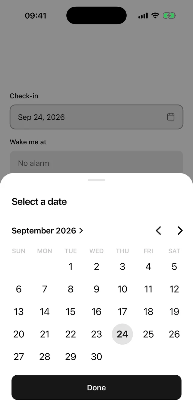
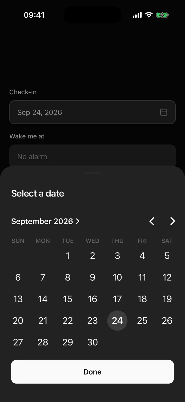
eoria does not draw a calendar. On iOS the field opens a bottom Dialog holding the system calendar for date and the wheels for time and datetime. The value is committed when the user taps Done, so scrolling the wheels fires nothing. On Android the field opens the system dialog, and datetime asks for the date and then the time. Locale, first day of the week, 12 or 24 hour time and screen reader support come from the OS.
The field opens the picker on press. Pass open and onOpenChange to open it from somewhere else, for example from a row in a settings list.
The iOS calendar measures itself about 330pt wide and keeps a margin of its own. The component stretches it to the dialog and pulls it out by that margin, so the month, the weekdays and the Done button share one edge. Change the picker slot if your dialog uses other padding.
The system picker takes the primary colour as its accent and follows light and dark. The field is the same frame as Input and Select, so the three line up in a form. Put it inside Field for a label and an error.
The field is a button whose value is the formatted date. Pass accessibilityLabel when the title does not describe the field.