Chip
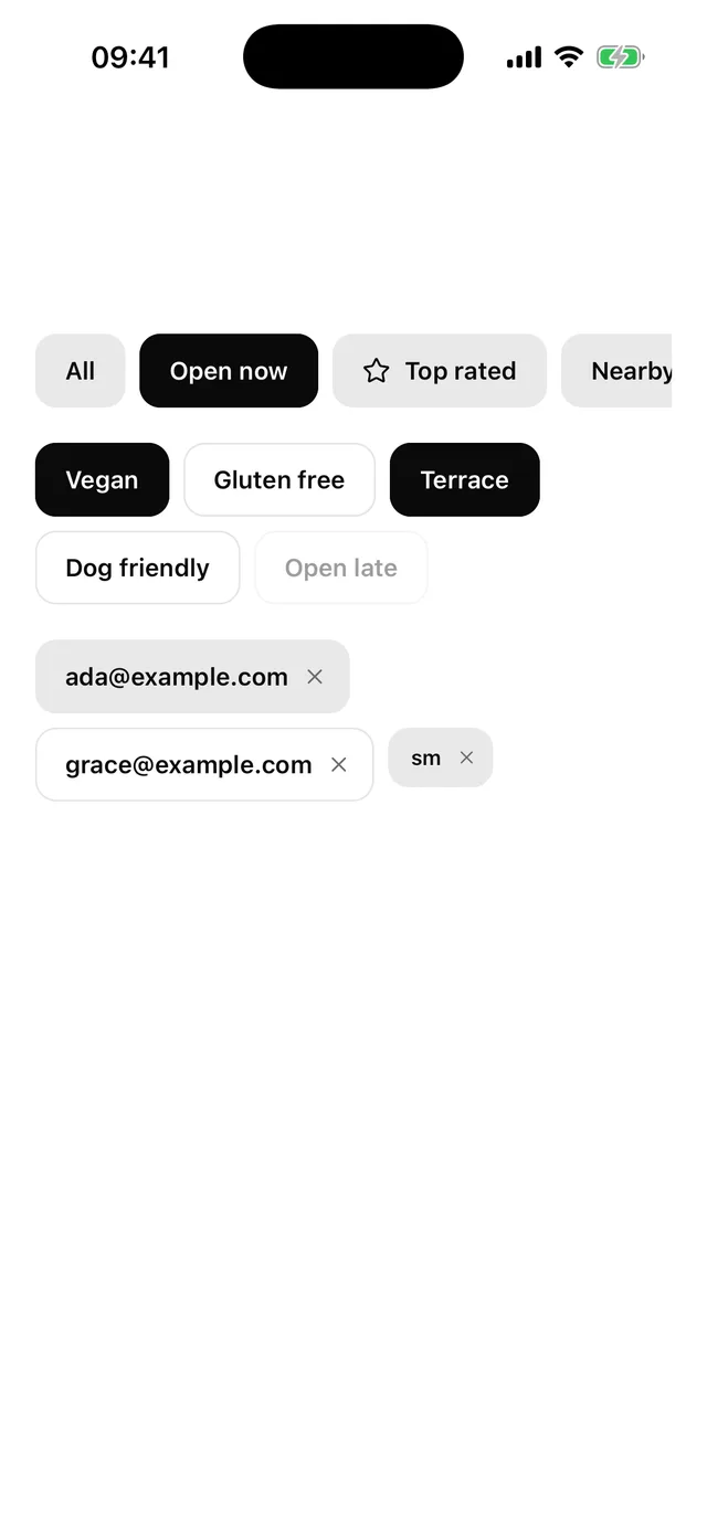
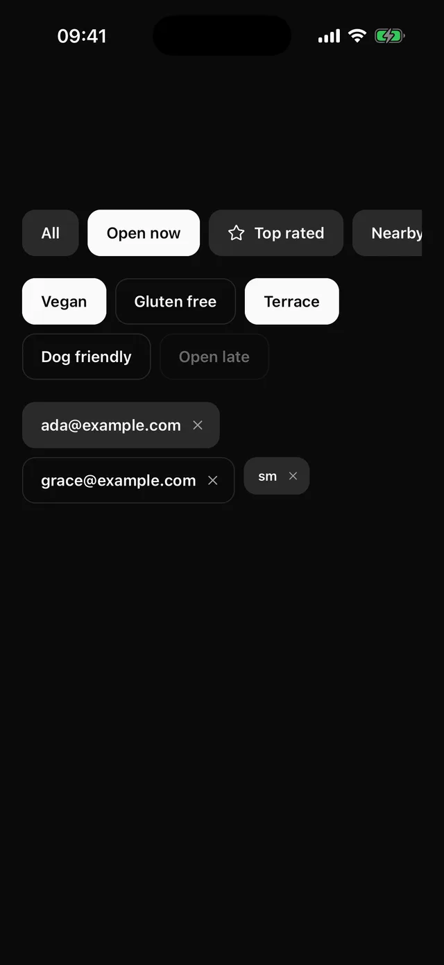
Pressable pill with a selected state, an optional icon and close target, and a group for single or multiple choice.
npx @eoria/cli add chipUsage
import { Chip, ChipGroup } from '@/components/ui/chip'import { Star } from 'lucide-react-native'
<ChipGroup type="single" defaultValue="all" scroll>  <Chip value="all">All</Chip>  <Chip value="open">Open now</Chip>  <Chip value="top" icon={<Star />}>Top rated</Chip></ChipGroup>
<ChipGroup type="multiple" value={tags} onValueChange={setTags} variant="outline">  <Chip value="vegan">Vegan</Chip>  <Chip value="gluten-free">Gluten free</Chip></ChipGroup>
<Chip onDismiss={() => remove('ada')}>ada@example.com</Chip>
Props
Chip
| Prop | Values | Default |
|---|---|---|
variant |
filled, outline |
filled |
size |
sm 32pt, md 40pt |
md |
selected |
boolean. Ignored inside a group, which owns it | false |
value |
string that identifies the chip to its group | |
icon |
element accepting size and color |
|
onDismiss |
adds the close target | |
dismissLabel |
string read out for the close target | Remove plus label |
disabled |
boolean | false |
styles |
overrides for body, bodyDismissible, label, icon, dismiss, dismissPressed, dismissIcon, rootPressed, rootDisabled |
Every other Pressable prop passes through to the main press target.
ChipGroup
| Prop | Values | Default |
|---|---|---|
type |
single, multiple |
single |
value, defaultValue, onValueChange |
a string for single, a string array for multiple |
|
variant, size |
passed to every chip that does not set its own | |
scroll |
boolean. One line in a horizontal scroller | false |
scrollProps |
props for that scroller | |
disabled |
boolean, disables every chip | false |
Notes
- A selected chip takes the
foregroundfill withbackgroundtext, in both variants. It is the same look as the active pill in Tabs. Use Tabs when the choice swaps a panel, and chips when it filters or tags. singleis a radio group. Pressing the selected chip keeps it selected, so add an “All” chip if the filter can be empty.multipletoggles each chip on its own.- Roles follow
type. The group is aradiogroupwithradiochips, or a plain view withcheckboxchips, and each chip reportschecked. A chip outside a group is abuttonthat reportsselected. With noonPresseither, as in a removable token, the label is plain text and the close target is the only button. - The close target is a second button beside the label, not a child of the chip’s press target. A screen reader reaches it on its own, and it reads “Remove” plus the label unless you pass
dismissLabel. - Press feedback is Button’s. The chip scales to 0.97 over 90 ms under a tint layer.
- Heights come from
theme.control.sm. Chips are shorter than 44pt by design, so both targets addhitSlopto reach it. Inside a horizontal scroller the scroller’s bounds cut the vertical slop off, so give a scrolling row some vertical padding if it sits close to other controls. - Badge is the display-only counterpart. Use it when nothing happens on press.