Item
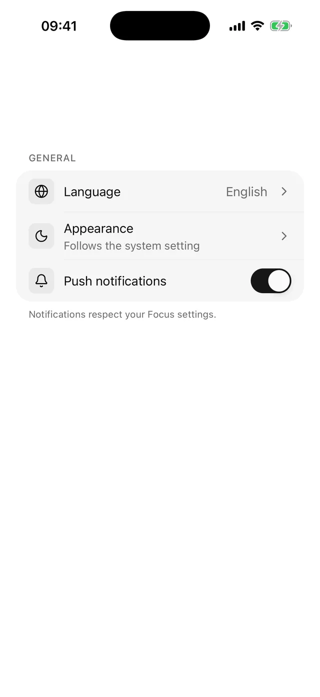
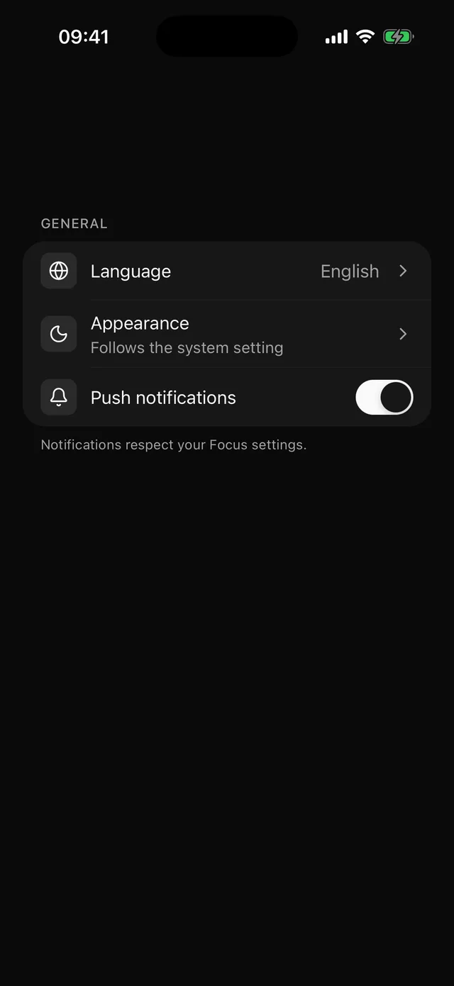
List row with media, title, description and a trailing slot, plus a contained group with inset separators.
npx @eoria/cli add itemNeeds lucide-react-native for the chevron. The CLI installs it as a dependency of the item.
Usage
import {  Item,  ItemChevron,  ItemContent,  ItemDescription,  ItemGroup,  ItemGroupFooter,  ItemGroupLabel,  ItemMedia,  ItemTitle,  ItemTrailing,} from '@/components/ui/item'
<ItemGroup>  <ItemGroupLabel>General</ItemGroupLabel>  <Item onPress={openLanguage}>    <ItemMedia>      <Globe />    </ItemMedia>    <ItemContent>      <ItemTitle>Language</ItemTitle>    </ItemContent>    <ItemTrailing>English</ItemTrailing>    <ItemChevron />  </Item>  <Item>    <ItemMedia>      <Bell />    </ItemMedia>    <ItemContent>      <ItemTitle>Push notifications</ItemTitle>      <ItemDescription>Mentions, replies and follows</ItemDescription>    </ItemContent>    <ItemTrailing>      <Switch checked={push} onCheckedChange={setPush} accessibilityLabel="Push notifications" />    </ItemTrailing>  </Item>  <ItemGroupFooter>Notifications respect your Focus settings.</ItemGroupFooter></ItemGroup>
A row works outside a group too, for example as one line of a Card.
<Item size="lg" onPress={openProfile}> <ItemMedia variant="avatar"> <Avatar accessibilityLabel="Ada Lovelace"> <AvatarFallback>al</AvatarFallback> </Avatar> </ItemMedia> <ItemContent> <ItemTitle>Ada Lovelace</ItemTitle> <ItemDescription>ada@example.com</ItemDescription> </ItemContent> <ItemChevron /></Item>Props
| Prop | Values | Default |
|---|---|---|
size |
sm, md, lg. Min height is theme.control, never under 44 |
md |
onPress, onLongPress |
make the row a button | |
disabled |
boolean | false |
styles |
override root, rootPressed, rootDisabled, content, title, description, trailing, trailingText, chevron, separator |
| Part | Takes |
|---|---|
ItemMedia |
variant of icon (default), avatar or image, and styles for root and icon |
ItemContent |
View props. Holds the title and the description |
ItemTitle |
Text props. One line |
ItemDescription |
Text props. Two lines |
ItemTrailing |
View props. A string child renders as the muted value of the row |
ItemChevron |
View props. Draws lucide ChevronRight in mutedForeground |
ItemGroup |
View props and styles for root, list, label, footer |
ItemGroupLabel |
Text props. Section header above the container |
ItemGroupFooter |
Text props. Footnote under the container |
ItemMedia with the icon variant puts the icon in a 32pt muted well and sets its size and color from the icon slot, the way Button does. avatar renders an Avatar child as is. image is a 48pt rounded box that clips an Image child.
Notes
A row with onPress is one button and fills with accent while pressed, the same feedback as a DropdownMenu row. It sets no accessibilityLabel, so VoiceOver and TalkBack read the text inside the row in order, which is the title, the description and then the trailing value. Pass accessibilityLabel to replace that.
A row without onPress is a plain View and does not group its children. Put a Switch in it and the Switch stays its own element, so give the Switch an accessibilityLabel. Avoid onPress on a row that holds a Switch. The row would become one button and hide the Switch from screen readers.
ItemGroup fills with surface, takes theme.radius.card and theme.stroke, and clips the first and last row to its corners. Every direct child counts as one row, which is what lets a Swipeable wrap a row and keep its separator. ItemGroupLabel and ItemGroupFooter must be direct children as well. The group moves them outside the container.
Each row but the last draws a hairline at its bottom edge. The line starts at the title, as in iOS Settings. ItemMedia reports its width to the row for that, so an Avatar of any size lines up. Rows in a group paint the surface fill themselves. If you change the fill of list, change styles.root of the rows too.
The chevron mirrors in right-to-left layouts and is hidden from screen readers.