Input
Filled single-line text field with focus, invalid and disabled states.
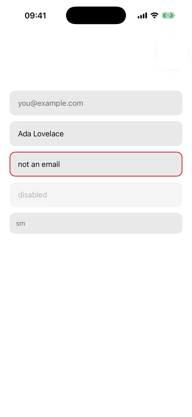
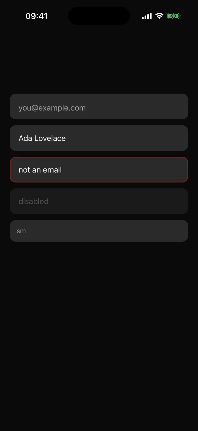
npx @eoria/cli add inputUsage
import { Input } from '@/components/ui/input'
<Input placeholder="you@example.com" keyboardType="email-address" value={email} onChangeText={setEmail} /><Input invalid placeholder="Required" /><Input disabled value="locked" />
Variants
| Prop | Values | Default |
|---|---|---|
size |
sm 44pt, md 52pt, lg 56pt |
md |
invalid |
boolean | false |
disabled |
boolean | false |
Focus is tracked internally and drives the ring colour. Every TextInput prop passes through.
TextInputContext decides which text field Input, Textarea and InputGroup render. It defaults to React Native’s TextInput. Sheet provides BottomSheetTextInput inside its content, so these fields work with the sheet’s keyboard handling without changes. Provide your own value for a container that needs a different input.
Notes
- The frame is a 1.5pt transparent border over the
mutedfill, so the focus and error borders appear without a layout shift. placeholderTextColorandselectionColorcome from the theme.- Pair with Field for a label, description and error message wired for screen readers.