DropdownMenu
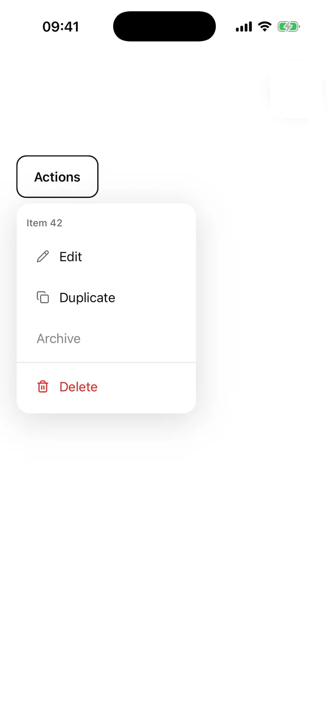
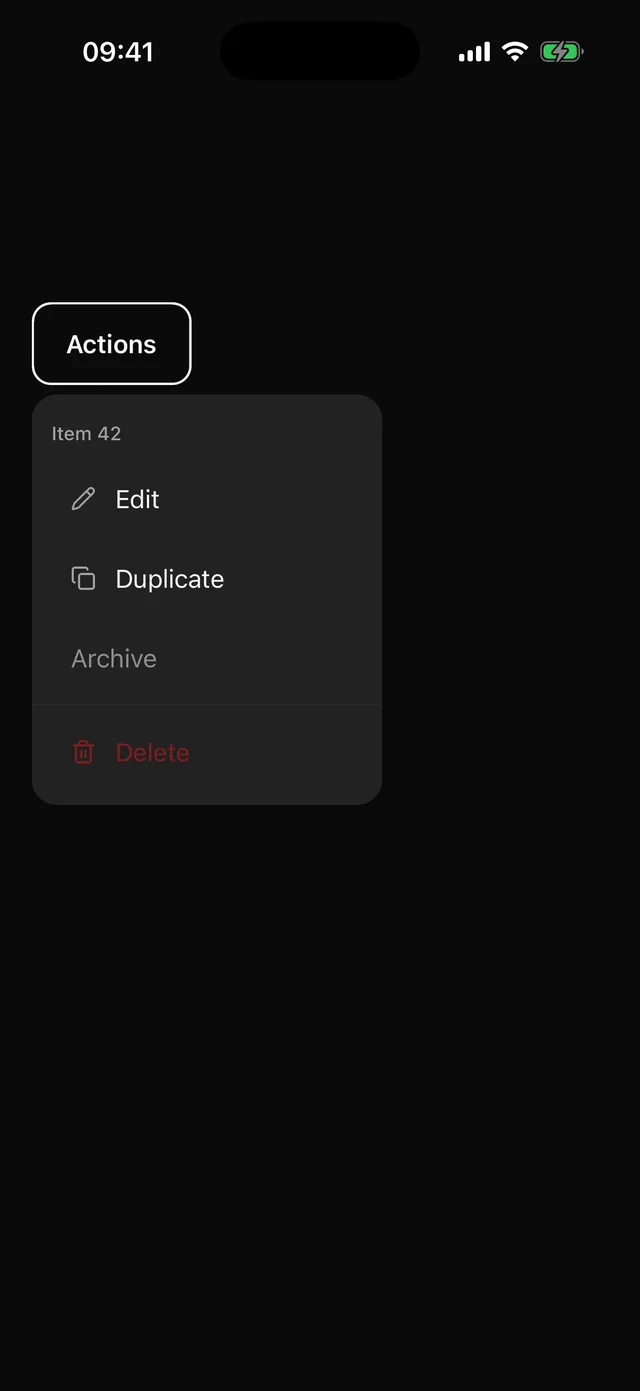
Anchored menu with items, descriptions, labels, separators and icons.
npx @eoria/cli add dropdown-menuUsage
import {  DropdownMenu,  DropdownMenuContent,  DropdownMenuItem,  DropdownMenuLabel,  DropdownMenuSeparator,  DropdownMenuTrigger,} from '@/components/ui/dropdown-menu'
<DropdownMenu>  <DropdownMenuTrigger asChild>    <Button variant="ghost" size="icon" icon={<MoreHorizontal />} accessibilityLabel="More" />  </DropdownMenuTrigger>  <DropdownMenuContent align="end">    <DropdownMenuLabel>Item 42</DropdownMenuLabel>    <DropdownMenuItem icon={<Pencil />} onSelect={edit}>      Edit    </DropdownMenuItem>    <DropdownMenuItem icon={<Share />} description="Anyone with the link can view" onSelect={share}>      Share    </DropdownMenuItem>    <DropdownMenuItem onSelect={archive}>Archive</DropdownMenuItem>    <DropdownMenuSeparator />    <DropdownMenuItem destructive icon={<Trash2 />} onSelect={remove}>      Delete    </DropdownMenuItem>  </DropdownMenuContent></DropdownMenu>
Props
DropdownMenuItem takes onSelect, closeOnSelect (default true), destructive, disabled, icon and description. The title is the item’s children and is the only required part; description adds a muted second line. The icon adapter reads the icon slot the same way Button does. When any item in a menu has an icon, items without one reserve the same gutter, so titles line up and nothing shifts between rows. Content accepts the Popper placement props, with align defaulting to start instead of center.
DropdownMenuContent also takes scrollProps for the list inside it, and closeLabel for the tap-outside layer (default Close).
Rows are 50pt with a 16pt label. The menu sits on the elevated colour with a hairline and a soft shadow, scrolls past 360pt (the list slot), and closes on tap outside or Android back.