Sign up
Account creation screen with name, email, password and a terms checkbox that must be ticked.
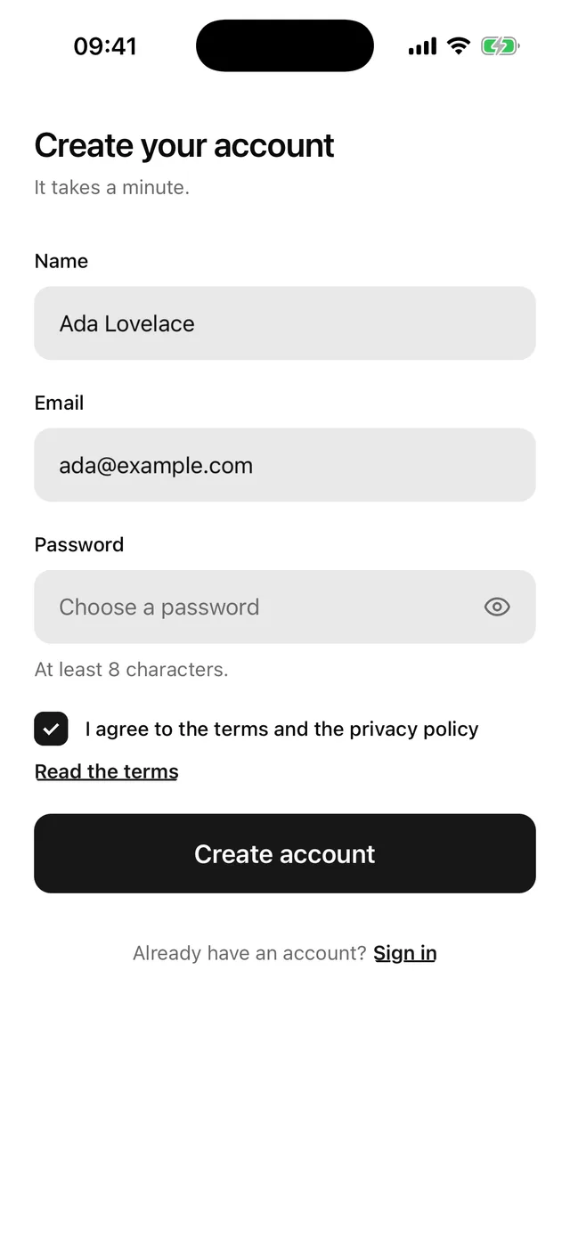
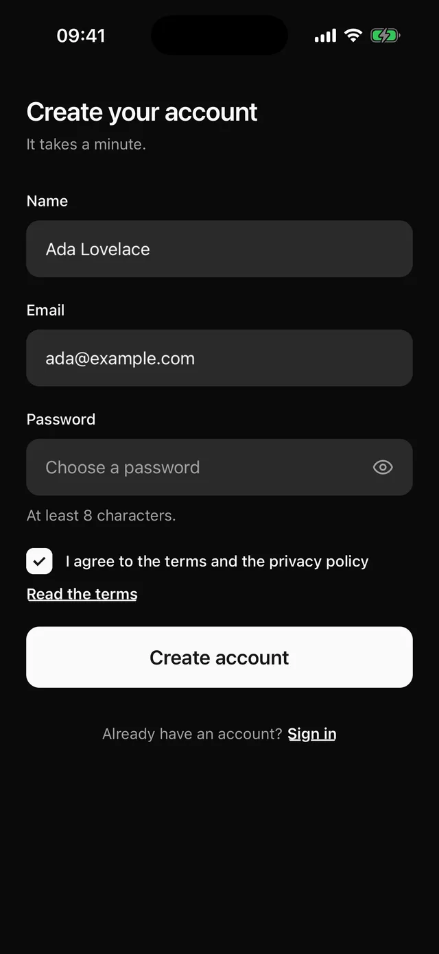
npx @eoria/cli add sign-upThe CLI also adds alert, button, checkbox, field, input, keyboard, label, password-input, separator, stack and text. The file lands at components/blocks/sign-up.tsx and is yours to edit.
The form scrolls inside KeyboardScrollView, so the app needs KeyboardProvider at its root. The Keyboard page has the setup.
Usage
import { router } from 'expo-router'import { SignUp } from '@/components/blocks/sign-up'import { createAccount } from '@/lib/auth'
export default function SignUpRoute() {  return (    <SignUp      onSubmit={async (values) => {        await createAccount(values)        router.push('/verify-otp')      }}      onSignIn={() => router.push('/sign-in')}      onTerms={() => router.push('/terms')}    />  )}
Props
| Prop | Type | Notes |
|---|---|---|
onSubmit |
(values: SignUpValues) => void | Promise<void> |
Gets { name, email, password }. Name and email are trimmed. |
onSignIn |
() => void |
Renders the “Already have an account? Sign in” line. |
onTerms |
() => void |
Renders a “Read the terms” link under the checkbox. |
onApple |
() => void |
Renders “Continue with Apple” under an “or” separator. |
onGoogle |
() => void |
Renders “Continue with Google” under the same separator. |
defaultValues |
Partial<SignUpValues> & { terms?: boolean } |
Starting values, including the checkbox. |
insetTop |
boolean |
Pads the top by the safe area. Pass insetTop={false} when the screen sits under a navigation header. Defaults to true. |
style |
StyleProp<ViewStyle> |
Merged into the root, after the block’s own styles. |
Notes
- The root fills the screen, paints
theme.colors.backgroundand pads the top and bottom by the safe area. Under a navigation header passinsetTop={false}, because the header already covers the top inset. - The name must not be empty, the email must match
^[^\s@]+@[^\s@]+\.[^\s@]+$, the password needs 8 characters and the terms checkbox must be ticked.onSubmitnever runs with the box empty, soSignUpValueshas notermskey. Errors stay hidden until the first submit. - The password field sets
autoComplete="new-password"andtextContentType="newPassword", which lets iOS and Android offer a generated password. - The checkbox sits in its own
Field, which draws and announces “Accept the terms to continue.” The checkbox is not aFieldControlchild, so the block gives it the label text and passes the error as its accessibility hint. Pressing the label text also toggles the box. - When
onSubmitreturns a promise, the block setsloadingon the button until the promise settles. The button shows a spinner, ignores presses and keeps its colours. A rejection putserror.messagein a destructive Alert above the form. The block skips state updates after it unmounts. - The return key moves from name to email to password. It does not submit from the password field, because the checkbox comes after it.
- To use a form library, replace the
useStatecalls and theErrorconstants with the library’s values and errors. KeepField,FieldControlandFieldError. - Change the terms label first. It is the
TERMS_LABELconstant at the top of the file, and your lawyer probably has opinions about it.